
Key Takeaways from the April 2025 Nonfarm Payrolls Report

Eric Pachman
Published
May 2nd 2025
Eric Pachman
Published
May 2nd 2025
Nonfarm payrolls increase by 177k in April. Private payrolls up 167k.
Total nonfarm payrolls rose by 177k, inclusive of a 167k increase in Total private jobs. Today's release also included a two-month payroll net downward revision of -58k jobs. This downward revision lowered March 2025's month-over-month job additions to 185k jobs, 170k of which were private jobs.
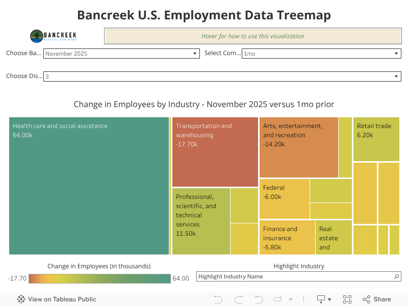
As always, you can explore all the data yourself using our the Bancreek U.S. Employment data treemap, which can be accessed here and also is embedded below. For an in-depth tutorial on how we built this visualization, and how to best use it, please read our Visualizing Changes in Nonfarm Payroll Data post.
Where is the DOGE impact?
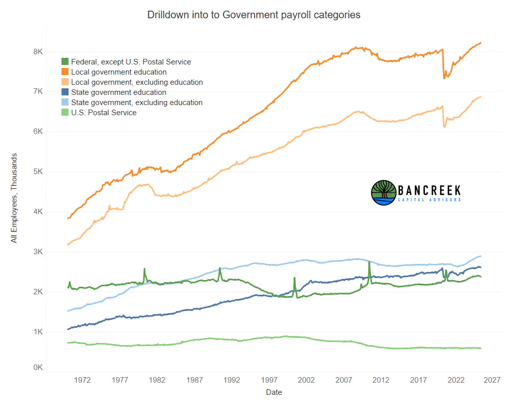
We'll kick off today's analysis of the data with the following chart, which shows the entire history of government employee payroll data.
Source: Bancreek Capital Advisors, LLC analysis of Bureau of Labor Statistics data
With how much press DOGE's efforts have received, our first stop in analyzing today's data was to consult this chart to see the "wreckage" in Federal government jobs, which happens to be the dark green series in the above chart. A quick googling of the impact DOGE has had on government jobs (between confirmed cuts and buyouts) would give you the expectation that this series should be down well over 100k from its peak. It turns out its down just -24k from its peak in December 2024. And this drop has been more than offset by strong growth in essentially all other government categories, which together have increased by 76k over the same period. Even if we remove education jobs, we still see 54k new net jobs between local government, state government, and the U.S. Postal Service.
To be fair, our expertise is in analyzing complex data sets... not in the nuanced understanding of what the nonfarm payroll report measures and what it doesn't measure. It's conceivable that the DOGE impact on Federal government jobs won't show up in this data set for a while due to sampling lag, or maybe won't show up at all due to methodology oddities that are beyond our knowledge. Who knows... all we know is that a reasonable individual would have expected to see more of an impact on Federal government jobs in this data source by now. And as we have been saying for months (and is made very clear in the above chart) even if the impact is eventually captured in this data, don't expect it to move the needle that much as it could be washed out by gains in the much larger local and state government categories.
Private payroll gains broad-based, but once again led by Health care
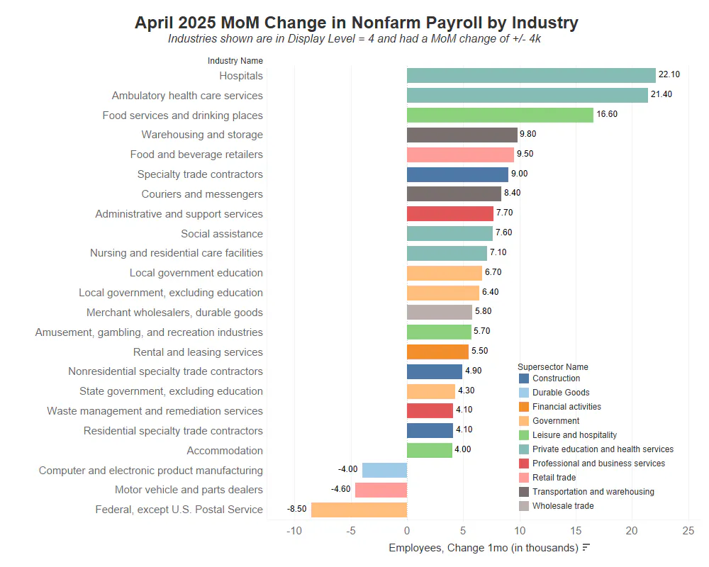
Moving to Private jobs, we're dropping a new chart this month, which shows the top MoM gainers and losers by industry.
Source: Bancreek Capital Advisors, LLC analysis of Bureau of Labor Statistics data
In creating the above chart, we filtered all industries down to those that are classified by the BLS in Display Level = 4. Think of Display Level as the BLS' hierarchy, where the higher the Display Level number, the more granular the industry. In our work, we have found Display Level = 4 to be the most granular level of the hierarchy that still provides decent overall coverage of the total change in nonfarm payrolls. The color of the bar on the chart corresponds to the "Supersector" in which each industry is classified. Please refer to the legend for a list of all Supersectors. The last item to note is that we are only displaying industries that saw a MoM change +/- 4k, simply because we would run out of real estate for this chart if we displayed the many industries that experienced smaller changes in payrolls.
So what can we learn from this chart?
First, Health care hiring remains unphased by the unfavorable policy developments in the industry. Hospitals and Ambulatory health care services were by far the largest gainers in payrolls within this Display Level, while Social Assistance and Nursing and residential care facilities were also in the top 10 industries when ranked on net payroll additions.
Second, Food services and drinking places posted another very strong month, adding a net 16.6k payrolls. This continues what has largely been the narrative over the past year with Health care and what we'll broadly call, "eating out," driving a disproportionate amount of jobs gains.
Third, check out the peach colored Government supersector, which had three "industries" gaining more than 4k jobs and only one losing more than -4k jobs. This is just another way to view what you already learned in the prior section.
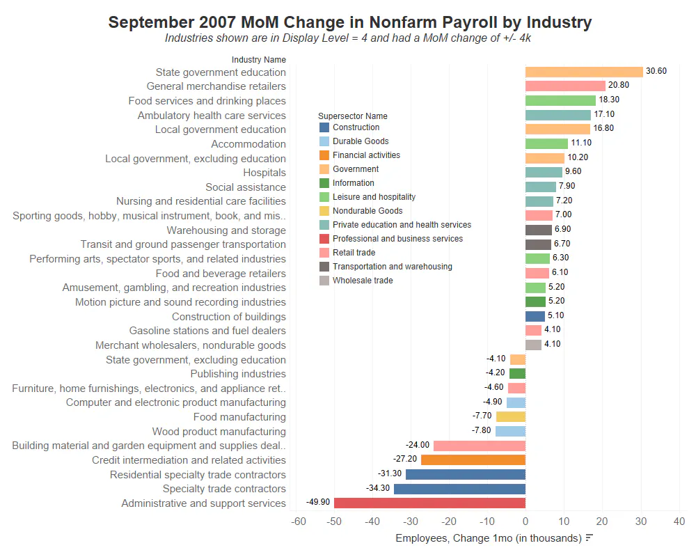
And last (and most obvious), this chart doesn't feel recessionary... Note how imbalanced the +4k gainers to -4k losers are in the chart. For comparison take a look at this same chart from back in September 2007, three months before the official start of the Great Recession. Clearly, this chart paints a very different picture.
Source: Bancreek Capital Advisors, LLC analysis of Bureau of Labor Statistics data
"I hear and forget. I see and remember. I do and I understand." - Confucius
Now we will release you to explore the data yourself using the Bancreek U.S. Employment Data Treemap. However, before you depart on this all-important quest, please consider skimming through our in-depth tutorial on this visualization, if you have not already. We created this tutorial to help you get the most value - and understanding - out of this complex, multi-faceted data set.
As always, please feel free to let us know what you are finding interesting in the data. We love hearing from folks who use our tools. Or better yet, consider letting others know your thoughts on this data on LinkedIn and make sure to tag us!
Happy researching, and best of luck out there!
Enjoying this post?
Tell others about it.

Bancreek's Actively Managed ETFs
If you are interested in learning more about Bancreek Capital Advisors' actively managed ETFs click the link below
Learn MoreMore articles like this
Fetching Related Posts
There are no other articles tagged with Research