Broad Based Inflation is Back

Eric Pachman
Published
June 10th 2026
Eric Pachman
Published
June 10th 2026
The May 2026 print put headline CPI at 4.2% year-over-year. Actually, it was 4.2487% - about as close to rounding up to 4.3% as you can get. Either way, headline CPI is up markedly from the 2.4% inflation printed by the BLS in the long-ago pre-war days (i.e., February 2026). This sharp rise alone is worth your attention.
But you already know all about headline CPI.
What you may not know is the answer to the question we set out to research today: What is the breadth of this latest inflationary surge? In other words, how many different items are misbehaving at the same time?
The Analysis
To perform this analysis, we drilled down to the item level. Nearly 180 of them. For each item, we took its year-over-year inflation rate and asked how far it sits from that item's own normal, using its pre-pandemic behavior (2005–2019) to define "normal." One standard deviation above its own baseline means an item is running hot for itself. Two standard deviations means it's doing something it very rarely does.
The reason to normalize each item against itself is that "hot" means different things for different goods. A 4% increase is alarming for televisions, which normally deflate, and unremarkable for medical services, which always climb. A z-score lets every item be judged on its own terms, then lets us count how much of the basket is in the tail.
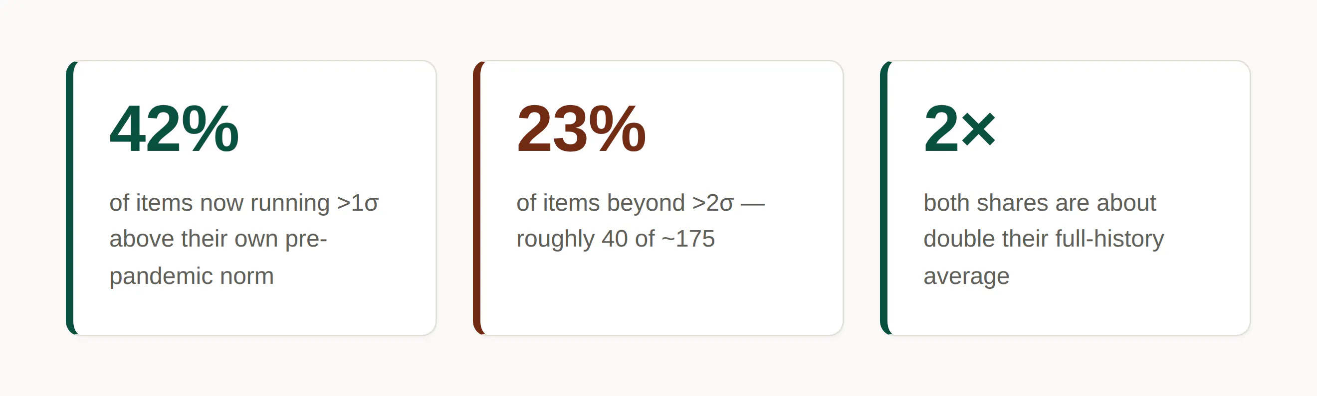
The following infographic is where we stand right now:
Source: Bancreek Capital Advisors, LLC analysis of bls.gov data
The breadth, over twenty years
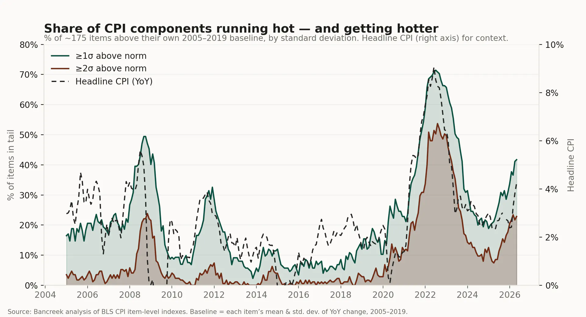
Here's what the picture looks like over the past twenty years.
The shaded bands show, for every month since 2007, the share of the basket sitting more than one and more than two standard deviations above its own historical norm. The line is headline CPI, for reference. If you want to compare today's inflation with previous cycles, explore our full history of US inflation by category, which lets you examine long term price trends across every major CPI component.
Source: Bancreek analysis of BLS CPI item-level indexes. Baseline = each item's mean and standard deviation of YoY change, 2005–2019.
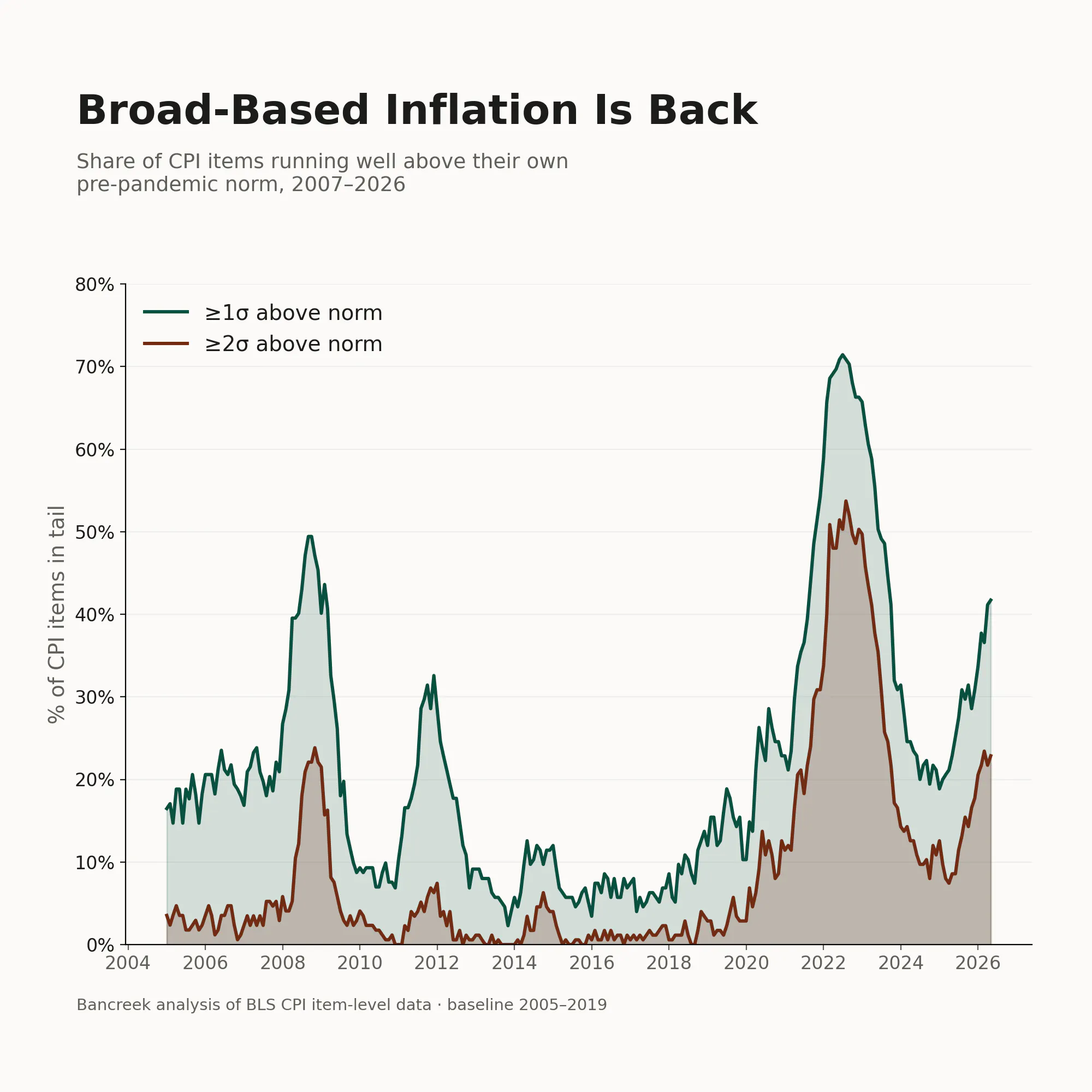
Two things stand out. First, the obvious one: nothing here rivals 2022, when at the peak more than 70% of items were beyond 1σ and over half were beyond 2σ. That was the most broad-based inflation episode in the series, full stop. We are not there... yet.
But second, the tail has been filling back in steadily since the middle of 2025, and it hasn't paused. The >2σ share has climbed from single digits last summer to 23% now, more or less in a straight line. This isn't one or two categories doing something dramatic and dragging the average. It's a lot of unrelated things drifting out of their lanes at the same time.
What's actually in the tail
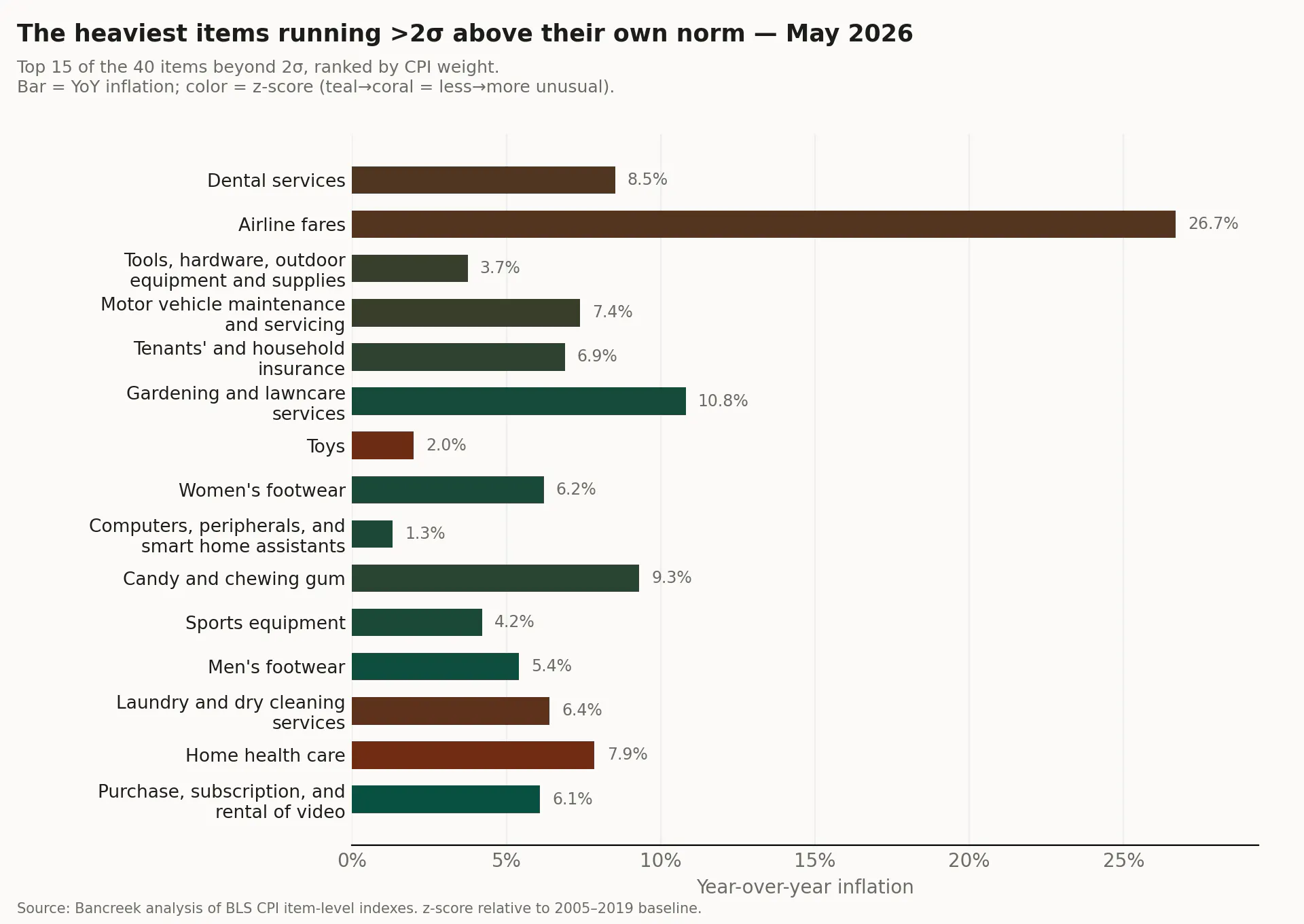
Forty items are beyond 2σ right now. Most of them carry trivial weight in the index - jewelry, postage, sewing supplies - so rather than list all forty, here are the fifteen heaviest by their weight of the CPI basket. These are the unusual items that actually move the number, and together they account for roughly 6% of the basket. Notice that the common thread between these items is that there is no common thread. Abnormal inflation is just popping up in random items that don't have much to do with energy and food.
Source: Bancreek analysis of BLS CPI item-level indexes. z-score relative to 2005–2019 baseline.
A fair caveat on the z-scores. An item that normally barely moves can post a huge z-score on a modest price change - toys show up in the list at only ~2% YoY because toy prices almost always fall, so even mild firmness is several standard deviations from normal. That's why the chart shows the actual YoY rate as the bar and uses the z-score only for color and ranking. The point isn't that any one of these items is on fire. It's that so many different, unrelated ones are all unusual at once.
We don't want to over-react quite yet. None of the genuinely scary breadth of 2022 is back - the median item is up about 3.3%, not 6%. What the data says, narrowly and defensibly, is this: the tail of the distribution is widening, it's been widening for the better part of a year without interruption, and the items filling it are scattered across food, apparel, recreation, and household goods rather than concentrated in the usual suspects. Headline at 4.2% tells you inflation re-accelerated. The breadth tells you it's also getting less selective about where.
That's the kind of pattern that, if it continues, stops being a collection of quirky line items and starts being a story. For now it's worth watching, and worth measuring properly - which is the whole reason we built our CPI visualization tool.
We hope this analysis helped you better understand not just where inflation stands today, but how broadly it is spreading across the economy. At Bancreek Capital Advisors, our goal is to provide objective, data driven research that helps investors make more informed decisions.

Enjoying this post?
Tell others about it.

Bancreek's Actively Managed ETFs
If you are interested in learning more about Bancreek Capital Advisors' actively managed ETFs click the link below
Learn MoreMore articles like this
Fetching Related Posts
There are no other articles tagged with Research