Can the U.S. achieve 2% headline inflation without housing cooperation?

Eric Pachman
Published
March 7th 2024
Updated
June 12th 2024
Key Takeaways
- Today Bancreek released its second interactive data visualization, which displays the Bureau of Labor and Statistics (BLS) CPI-U data going back as far as 1914.
- This new visualization can be filtered by inflation “category” and date range.
- We used this visualization to explore the inflation data to find any historical precedent for the U.S. achieving inflation approaching 2% without housing inflation moderating to a similar level.
- Overall, we only found one month in all the historical data where headline inflation was below 2.5% with housing inflation roughly at current sequential (i.e., month-over-month) run rates.
- We conclude that it would be essentially unprecedented for inflation to glide down towards 2% without an improvement in sequential housing inflation.
No end to the research process
One thing we have learned throughout our years researching complex problems is that the process never ends. Research is a lot like running. Unless you are Forrest Gump, there is an end to each training run. But, barring injury, there is no end to the process. Instead, you’re back out there the next day, picking up where you left off, improving your fitness each time you lace up your shoes and head out the door. Just as there is no “solving” running, there is no solving complex problems. Instead, there is only following your intellectual curiosity as you dig deeper into the data, letting yourself grow comfortable that for each answer found, two more questions may arise. There will be a new end, followed by another new beginning. And on and on it goes, with you becoming a more astute problem solver and decision maker along the way.
The next step...
To that end, after letting our work on the Bancreek Inflation Visualizer settle for a couple weeks, we brought out our dry erase board to develop a list of questions and curiosities that arose from our usage of the tool. As you can imagine, there were many interesting ideas for us for us to dig into next. Here’s a couple that came to mind that we put on the back burner for now (which – spoiler alert! – will likely get turned into future visualizations):
- What is going on with motor vehicle insurance? What does this look like by region/geography? Actually, what do all items look like by region/geography?
- How do owners’ equivalents rent of residences (i.e., “OER”) and rental of primary residences (i.e., “rents”) in CPI-U compare to their corollaries in the Personal Consumption Expenditures Price Index (i.e., PCE)? Is the weight of these items much different in the PCE? Clearly PCE appears to be moderating far quicker than CPI-U, so a side-by-side comparison by granular item could be quite helpful.
We’ll dig into those two questions another time. For now, we started with what seemed to be the obvious (and glaring) question after spending time with the data:
- In the history of all CPI data, has there ever been a time when we have been able to maintain 2% inflation without housing cooperating?
New visualization: Full History of U.S. Inflation by Category
In researching this question, we quickly realized that we could kill two birds with one stone – better understand historical housing inflation AND release a new visualization to help folks gain a better perspective for the entire history of U.S. inflation. And so today we are excited to release our second data visualization (i.e., “viz”), which we have called, “Full History of U.S. Inflation by Category.”
Before getting into how we used this viz to study housing, let’s start with a brief tour.
First off, compared to the Bancreek Inflation Visualizer, this viz is quite simple. All we do is provide you with a trend chart, displaying all the historical inflation data buried in the BLS’ databases. When opened, the viz will default to inflation on “all items,” better known as “headline” inflation. The chart gives you a few basic statistics for the chosen series: mean, +/- one standard deviation, and +/- two standard deviations. While we have displayed the mean for you directly on the dashboard, you can find the standard deviation values simply by hovering over the top or bottom of the colored standard deviation bands.
On the dashboard you will find a few filters. Towards the top of the dashboard, we’ve placed a “category” filter. Please note that “category” is a term we conjured up rather than anything official from the BLS. In our parlance, if an item is at the highest level of the BLS’ inflation hierarchy, it is a category. There are eight categories in the BLS data:
- Apparel
- Education and communication
- Food and beverages
- Housing
- Medical care
- Other goods and services
- Recreation
- Transportation
Note that these eight inflation categories are the most granular breakdowns we can assign if we want to have like-for-like comparisons across different decades (e.g., 1970s vs.1990s).
There’s one more filter at the bottom of the dashboard that lets you change the date range displayed on the chart. Note that when you change the date range, the chart’s statistics will update automatically. A word of caution: the date filter does not automatically reset after you change it! If you narrow your filter and then change the category and are looking to see all the data in this new category, you must reset the filter by stretching the right and left date range ticks back out to the edges of the date filter container.
Lastly, if you want to download the data to work with it yourself, just click on the download icon in the bottom right of the viz. We find it easiest to download as crosstab and in csv format.
If you are looking for a more detailed methodology, keep reading and you’ll find it at the very end of this blog post.
Analysis: 2% inflation without housing cooperation?
The reason we publish these visualizations is because we are all different. As such, different things within the data may inspire us to dig deeper. For some it may be the wild food and beverage inflation of the 1970s, or the dramatically higher volatility in transportation starting at the turn of the 21st century. For us it was housing, and specifically, if there was any time in the history of our country’s inflation data that we were able to approach 2% inflation without housing cooperating.
We should step back a bit to provide some context around why this question fascinated us. Like most other people in the investment industry, we have been watching housing like a hawk these last few years for two reasons. First, it’s by far and away the largest driver of inflation, comprising nearly 44% of CPI-U. Second, there has been a lot of heated discussion about the BLS’ methodology for measuring housing inflation, especially when it comes to the infamous owner’s equivalents rents of residences (i.e., “OER”) and rent of primary residences (i.e., “rents”) items. The debate all throughout 2022 was about how much lag was embedded into these items, with prognosticators competing to call the exact moment when the two would break and return to some semblance of normalcy.
But then an interesting thing happened. Housing inflation bent but didn’t break.
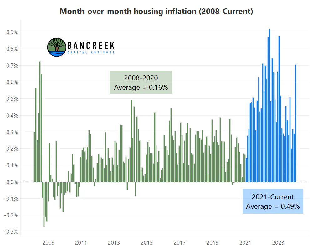
Source: Bancreek Capital Advisors, LLC analysis of bls.gov data
Let’s put January 2024 aside for now with fingers crossed that it was an outlier. Before January’s print, you may have been celebrating the drop in sequential housing inflation from a staggering 0.9% to inflation of around 0.3%, which is where it appeared to settle in late-2023. We were encouraged by this progress, and excitedly looked forward to downward pressure on overall inflation as we moved past the worst of the inflationary housing cycle.
And then we did some simple but sobering math. Try annualizing 0.3% month-over-month inflation and see what you get. You get 3.7% annualized inflation.
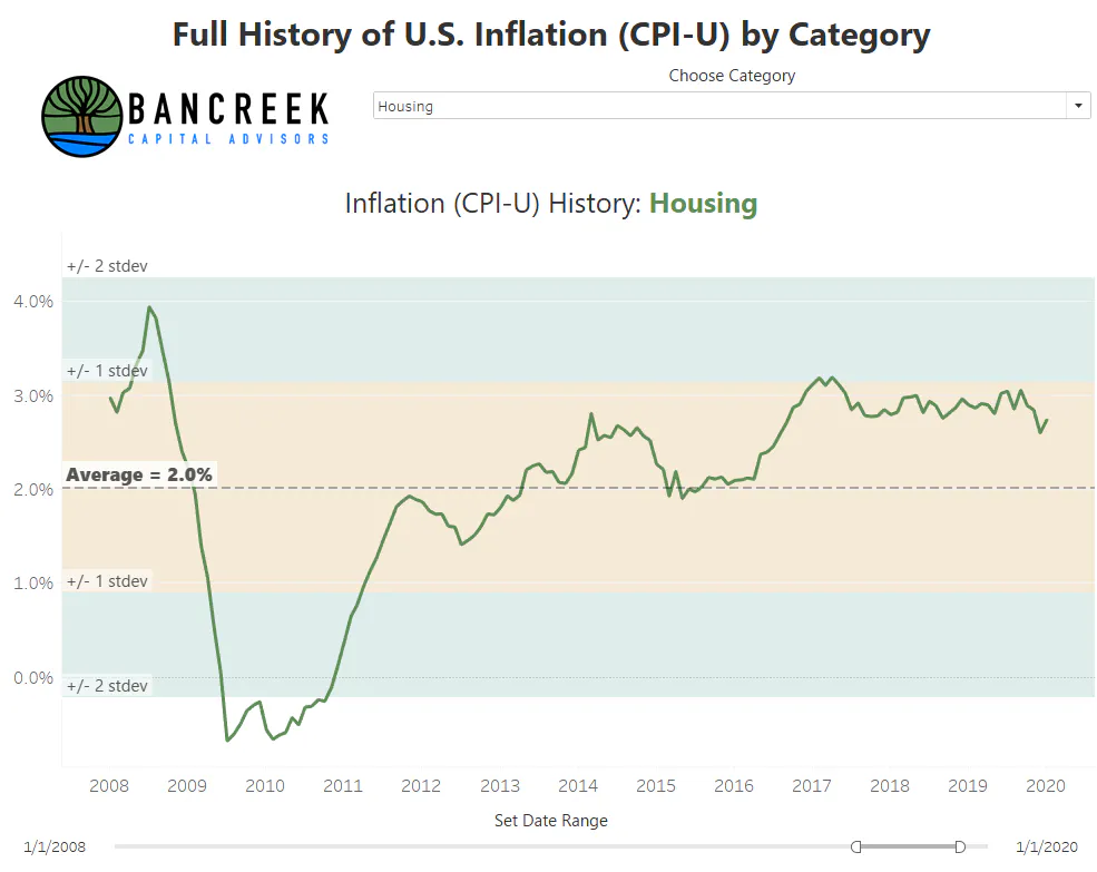
Wait a second… this is still a relatively high number. Certainly, far higher than the 2008-2020 period of subdued inflation, which we can see averaged just 2.0%.
Source: Bancreek Capital Advisors, LLC analysis of bls.gov data
So, our current run-rate in housing inflation (again, minus Jan 2024) is still roughly double what it was from 2008 through pre-COVID. And just so you know, average headline inflation during that period was 1.8%.
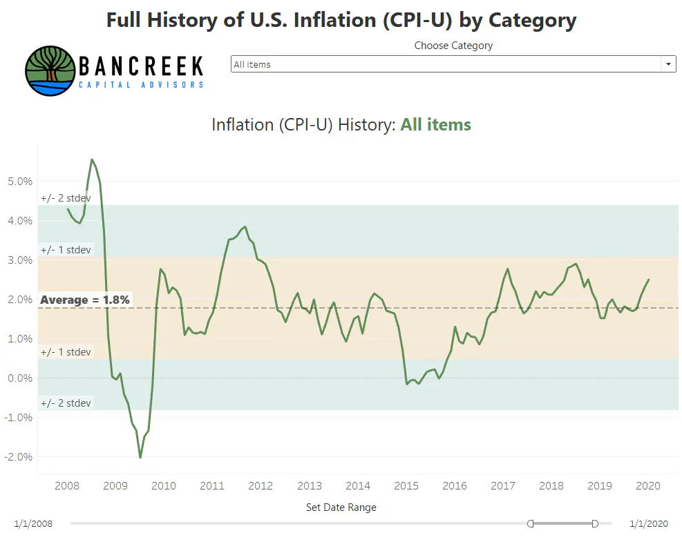
Source: Bancreek Capital Advisors, LLC analysis of bls.gov data
In other words, we can’t just “cycle” our way down to normal housing inflation at this current run rate – we need sequential month-over-month inflation to decline further.
Housing in 2008 vs. housing in 2024
The issue we see now is that the housing market today is in a very different position than it was at the start of 2008. As we all likely recall, leading up to 2008, the (in hindsight) irresponsible slicing and dicing of risk through mortgage-backed securities and credit default swaps stoked wild speculation in the housing market, which drove a surge in housing supply. As we know this eventually ended with a messy and chaotic thud (if you need a refresher, watch The Big Short). Coming out of the chaos, we inherited an oversupplied housing market coupled with a cautious and conservative banking system, which put together was, in our view, the perfect setup for many years of subdued housing inflation. But the oversupply of houses eventually got absorbed thanks to the boring but quite consistent (since it’s driven by demographics) upward march in household formation.
And that brings us to the present. Housing is arguably no longer in oversupply. Some may argue it is in undersupply at this stage. Moreover, it’s not even clear that a more restrictive rate environment would even be able to directly bring down housing costs as higher rates put upward pressure on mortgage costs and reduce discretionary mobility as people remain locked into their low COVID-era mortgages, reducing the supply of existing homes. Regardless, one thing that we believe is crystal clear is that it’s dangerous to look at our “success” between 2008 and 2020 in hitting 2% inflation and use that as evidence that we can do this prospectively simply because of the difference in our housing situation.
Rather than rely on this narrative, we consulted the data to see if there was any period where housing inflation was 3.7% or more (which is roughly our current run-rate) where we were able to achieve headline inflation of 2.5% or less. Why 2.5%? We don’t have an elegant reason here besides the hope that if we are able to get below 2.5% the Fed may just round down and call it a day.
And then there was one
To start, there are 673 months of inflation data in the BLS’ databases with reported housing inflation data (1968 through current). Of those 673 months, housing inflation was greater than or equal to 3.7% in 286 months, or 42% of the time. With this as backdrop, we are now prepared to answer our guiding question. Out of those 286 months, how many times did the BLS report that we were below 2.5% annual headline inflation?
The answer is that this happened once in the entire history of the data – September 2006. And it just so happens that this month happened to have meaningful transportation deflation (-3.2%) weighing on headline inflation. But as our tool shows, transportation is highly volatile and swings deflationary from time to time (17.6% of all months to be precise). And even with this being the case, headline inflation below 2.5% with housing inflation at current run rates has only occurred once in the history of our inflation records.
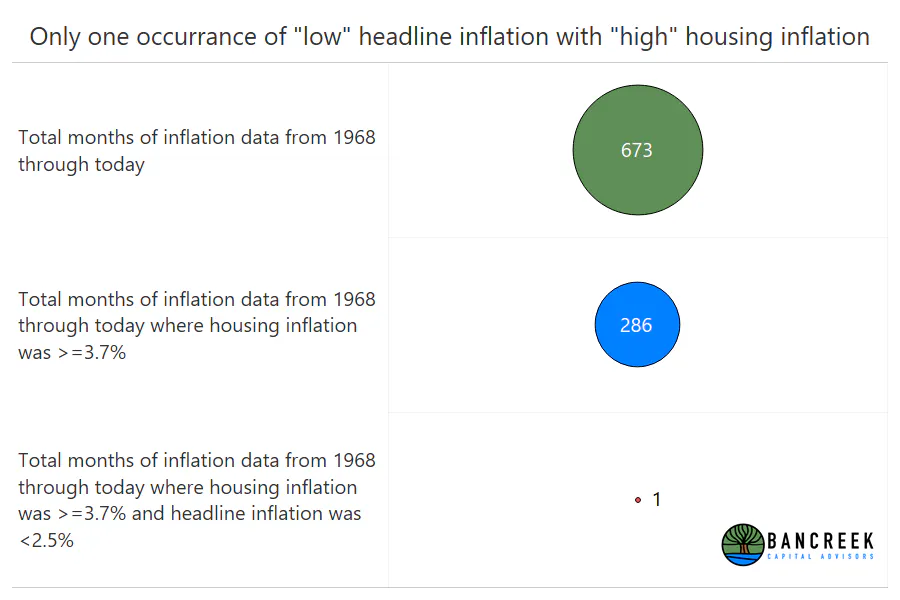
Source: Bancreek Capital Advisors, LLC analysis of bls.gov data
The final mile
We should clarify that nothing we have presented in this blog post should be interpreted as a forecast. We are simply performing math and analyzing historical data. Together, they tell us that if sequential housing inflation stalls where we are now, bringing overall inflation down below 2.5% would be essentially unprecedented.
Of course, as we alluded to earlier, the research process typically dredges up more questions than answers, and this exercise was no exception to that rule. Here are some of our questions:
- If for argument’s sake we assume that housing is marching more to the beat of its own supply and demand drummer and less to the Fed’s rate beat, will the Fed keep rates restrictive to push down the items that are more sensitive to rates?
- How far would it be willing to go to get inflation closer to 2% without housing leading the charge down?
- Will it be willing to push the economy into the dreaded “R” word to achieve this target?
- Or will the Fed instead gracefully start to back away from the housing super-charged CPI-U and lean more heavily on other measures that are less sensitive to housing to defend rate cuts?
Sadly, the data can’t help us answer any of those questions, which means this blog post has reached its end. Going back to our running analogy, today’s run is now over and it’s time to do active stretching, eat a healthy meal, and get a good night’s sleep. But the research process never ends. So, we’ll be back at it again looking at the data from another angle and working to transform it into helpful visualizations for you to use!
Visualization methodology
The first step in creating a Tableau visualization is to clean and make any necessary transformations to the data. We like using Tableau Prep for this step, given its flowchart design lends itself to relatively intuitive visuals that we can drop into posts as we have done below:
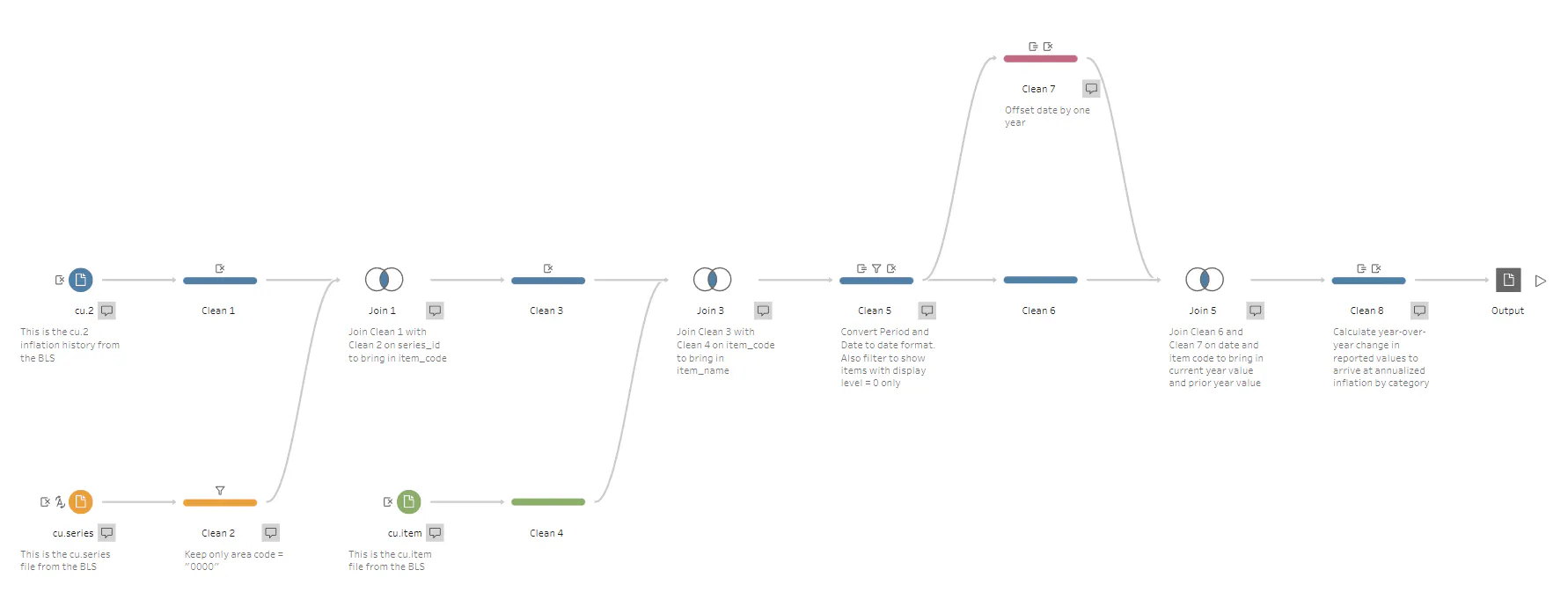
Source: Bancreek Capital Advisors
We can now just follow the flowchart from left to right to explain our methodology.
Our process starts with bringing in three data files, all available for download on bls.gov. The three files we used are:
- Cu.data.2.summaries
- Cu.series
- Cu.item
The cu.data.2.summaries file houses all of the raw inflation values dating back as far as 1914 – although not all categories have data reported back that far.
We first join this file together with cu.series to bring in descriptors to help us make sense out of series_ids that looks like this: “CUSR0000SA0”. The most critical descriptor in this file is one called “item_code,” which is brought into Clean 3 through the join.
Once we have added item_codes to the database, we then join in cu.item to convert the codes to item_names, which is ultimately the field we display in our visualization.
Now that we have all the descriptors we need, we must calculate year-over-year inflation. To do this we split off a separate clean step (Clean 7) and then offset each month/year combination forward by one year. For example, the values in March 2021 get assigned to March 2022. We then join this back into the unadjusted database (Clean 6) which gives us two values for each row – one for the current year and one for the prior year.
The last step is to simply divide these two values to calculate year-over-year inflation, output the finished database and bring it into Tableau Desktop.
Our goal with this visualization was to present the eight item names (which we call “categories” that are at the highest level of the BLS’ current hierarchy. We should note that in building this flow, we identified some other item names in cu.2 which are not currently at the highest level of the hierarchy. These item names are:
- Commodities
- Services
- Men’s and boys’ apparel
- Women’s and girls’ apparel
All these item names show up at a display_level = 1, while the item names we wanted to keep were at a display_level = 0. As such, we just filtered out the item names with a display_level = 1 to keep only those items we thought were most helpful to display.
Enjoying this post?
Tell others about it.

Bancreek's Actively Managed ETFs
If you are interested in learning more about Bancreek Capital Advisors' actively managed ETFs click the link below
Learn MoreMore articles like this
Fetching Related Posts
There are no other articles tagged with Research