Checking the tape – Key takeaways from January 2024 inflation

Eric Pachman
Published
February 17th 2024
Updated
April 9th 2024
Earlier this week we released the Bancreek Inflation Visualizer, which we designed to provide an intuitive and visual way to analyze the key drivers of inflation each month. Hopefully you have had a chance to interact with the tool and have found some value in using it to cut through all the noise that seems to endlessly swirl around inflation.
Now that we have released this tool into the wild, we clearly have a responsibility to update it each month. With that in mind, we have officially pushed out the first update to the Bancreek Inflation Visualizer, rolling it forward to include January 2024 inflation (with some new features that we detail below). Going forward you can expect this update to get posted the week inflation is released, along with our thoughts on the key takeaways from the print.
Anyway, if you’re here just for the data, head on over to interact with the updated visualization. On the other hand, if you want to stick around and read our thoughts on the release, keep on reading for a few of our key takeaways.
Key Takeaway #1:
Key categories are still decelerating.
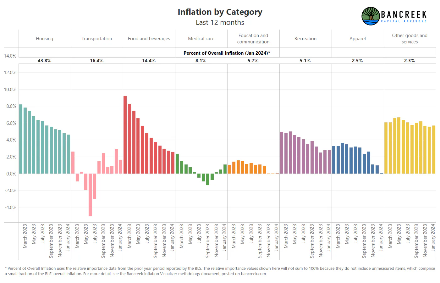
The first thing we noticed when we started to crunch the data was that inflation within some of the larger categories continued to moderate in January. To illustrate this, we created the chart shown below, which breaks inflation down into its eight highest level categories (e.g., housing, transportation, food and beverages, etc.). For each category, we’ve displayed its year-over-year inflation for the last 12 months. We also show the size of each category at the top of the chart to help you get a sense for what matters the most to inflation.
Source: Bancreek Capital Advisors, LLC analysis of bls.gov data
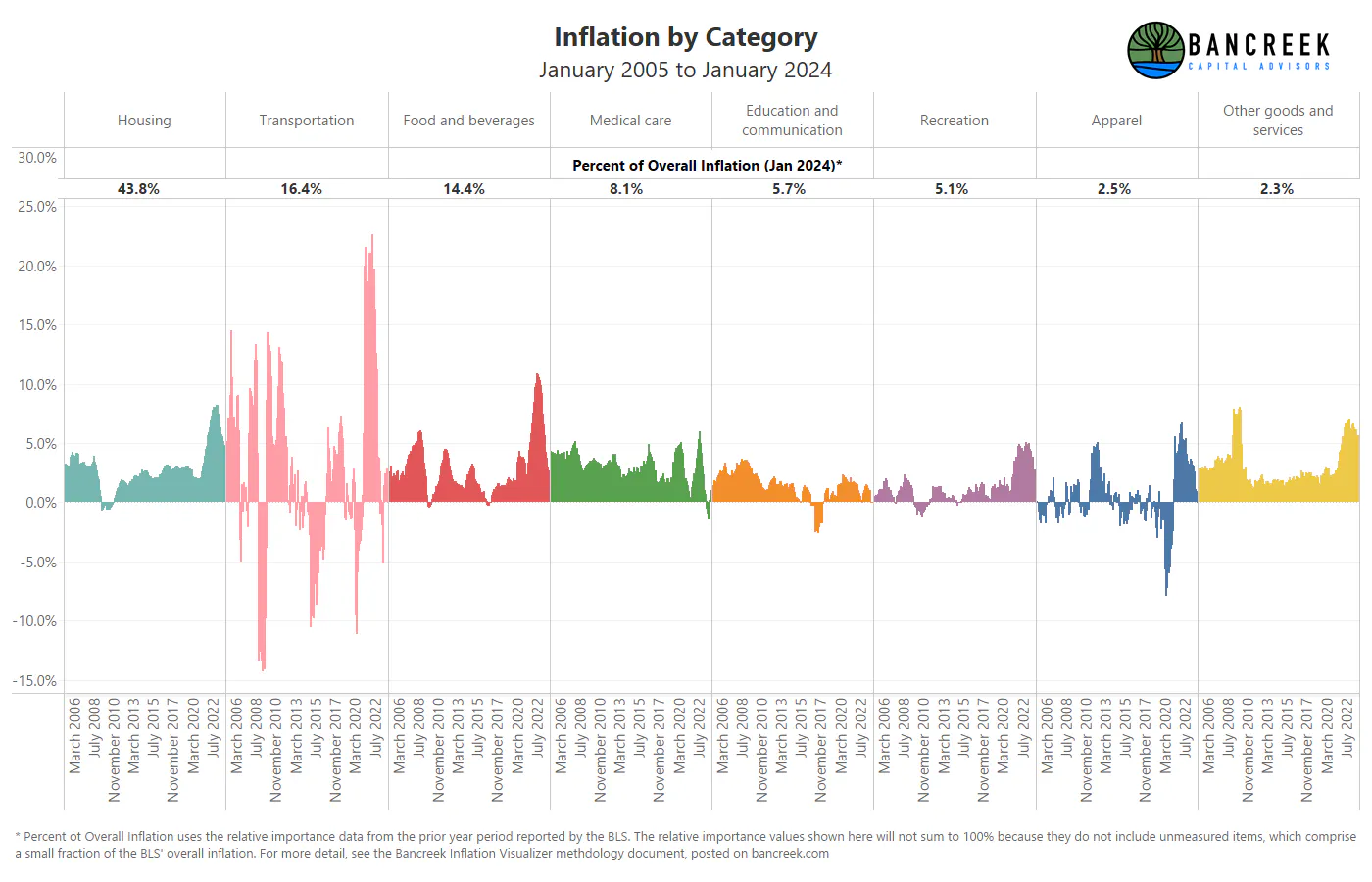
Looking for more historical perspective on the category level? Here’s the same chart except with that last 19 years of inflation data.
Source: Bancreek Capital Advisors, LLC analysis of bls.gov data
Our main takeaway from these two charts is that inflation on the all-important housing and food and beverage categories continued to moderate in January 2024 from historically elevated levels seen in 2022 and 2023. Three other sub-takeaways here are:
- Transportation is wildly volatile!
- Other goods and services remain stubbornly high relative to their historical norm, but at only a 2.3% weight of inflation are not that meaningful to overall inflation.
- Medical care inflation remains depressed… but is now on the rise again. More on this in Key Takeaway #4.
Key Takeaway #2:
The big three get even bigger (relatively).
Earlier in the week we called out that out of the ~175 items that comprise inflation, there were three individual items that were responsible for the preponderance of inflation. These three items are:
- Owner’s equivalent rent of residences,
- Rent of primary residences, and
- Motor vehicle insurance.
Last month, these three items alone combined their powers to add 2.6 points of inflation in December. Given that total inflation was 3.4%, that means all other categories netted out to just 0.8 points of inflation.
This month, we consulted our tool to see the inflation impact on these items and found that the three once again posted an impressive 2.6 points of total inflation. But overall inflation declined to 3.1%, meaning that all other categories netted out to just 0.5 points of inflation.
In other words, 84% of all net inflation in January 2024 was driven by just three categories. Our comments hold from earlier in the week – if you are boldly attempting to forecast inflation, you will get the most bang for your buck by focusing your attention on the Big 3. It’s looking more and more like as the Big 3 go, so goes (reported) inflation!
Key Takeaway #3:
Save money by eating at home?
The more we worked with the Bancreek Inflation Visualizer these last few days, the more we wanted to have a way to drill down into categories with the tool.
A quick aside here before we move forward. We are using the term “category” to refer to the highest-level items in the inflation hierarchy. Technically categories are still “items,” but we decided to come up with another term to avoid confusion. So, from here on out we’ll use the term “category” when referring to the big buckets of inflation groups (e.g. “housing”) and “items” when referring to the more granular drivers of inflation that live within each category (e.g. “rent of primary residences”). Aside complete.
What we were most curious about this week was which specific items were moving around within the food and beverage category. We tried to use the tool to do this, but it quickly became onerous to hover over items one at a time to see what’s food and what’s not. So, we spent a bit of time rebuilding the back end of the tool to be able to filter the visualization by category, as shown below.
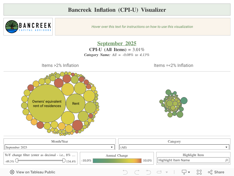
The main difference you will notice is a “Category” filter has now been added at the bottom of the tool. Just select a category, and the packed bubble chart will filter to show you only the items that roll up to this category.
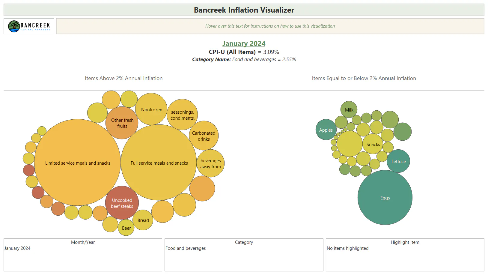
With this new functionality built, we were finally able to visualize food and beverage alone, which as shown below, is a fascinating chart.
Source: Bancreek Capital Advisors, LLC analysis of bls.gov data
What really jumps out to us is just how significant of an impact the “Limited service meals and snacks” and “Full service meals and snacks” items have on food and beverage inflation. We like to think of these items as the proxy for “dining out” inflation, just at different types of restaurants.
To provide some context for the disconnect between dining out and the rest of food and beverages inflation (which is largely food at home), when you sum the relative importance (i.e., weight) of these two dining out items you get 4.5%. In other words, 4.5% of an average U.S. urban consumer’s basket of goods and services is attributed to dining out. Meanwhile the total relative importance of food and beverages for that same average U.S. urban consumer is 14.4%. This means that if all food and beverages items were inflating at the same pace, we should expect the two dining out items to be responsible for just under a third of food and beverages’ total inflation impact. Instead, we calculate these two items were responsible for just over 60% of all the category’s inflation in January 2024.
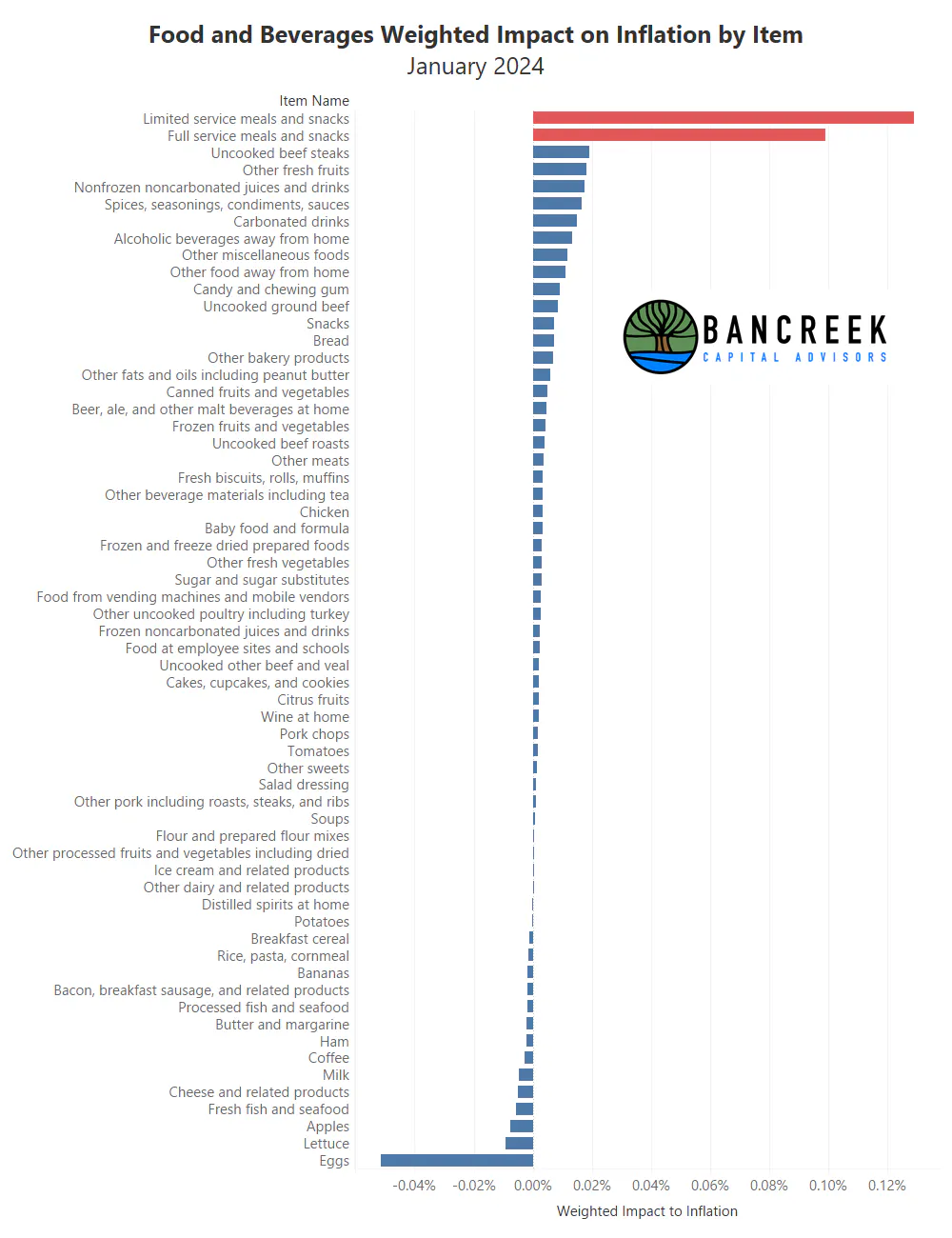
Source: Bancreek Capital Advisors, LLC analysis of bls.gov data
The charts below provide a different view showing that these two dining out items have been quite sticky in their decline from their 2022-2023 heights, especially in comparison to some of the larger grocery items. Note that we have put several charts into a carousel below. Click on the arrows to flip from one chart to the next.
So, if you are looking to save some money on feeding yourself and happen to believe the BLS’ data is reflective of reality, may we recommend preparing a few extra meals at home! And while you are at it, maybe consider picking up some eggs, which are starting to meaningfully correct in price after peaking out at a whopping 70% year-over-year inflation this time last year.
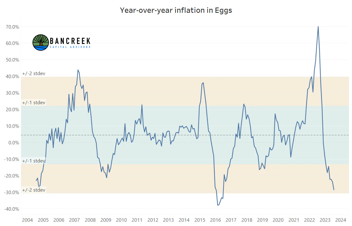
Source: Bancreek Capital Advisors, LLC analysis of bls.gov data
Key Takeaway #4:
Keep a close eye on the medical care items…
Over the past couple years while most items were reaching levels of inflation not seen in decades, one category was in an unprecedented slump – medical care. Now, it’s important to have some historical perspective on what’s recently occurred in medical care, which hopefully will be brought to light in the following chart.
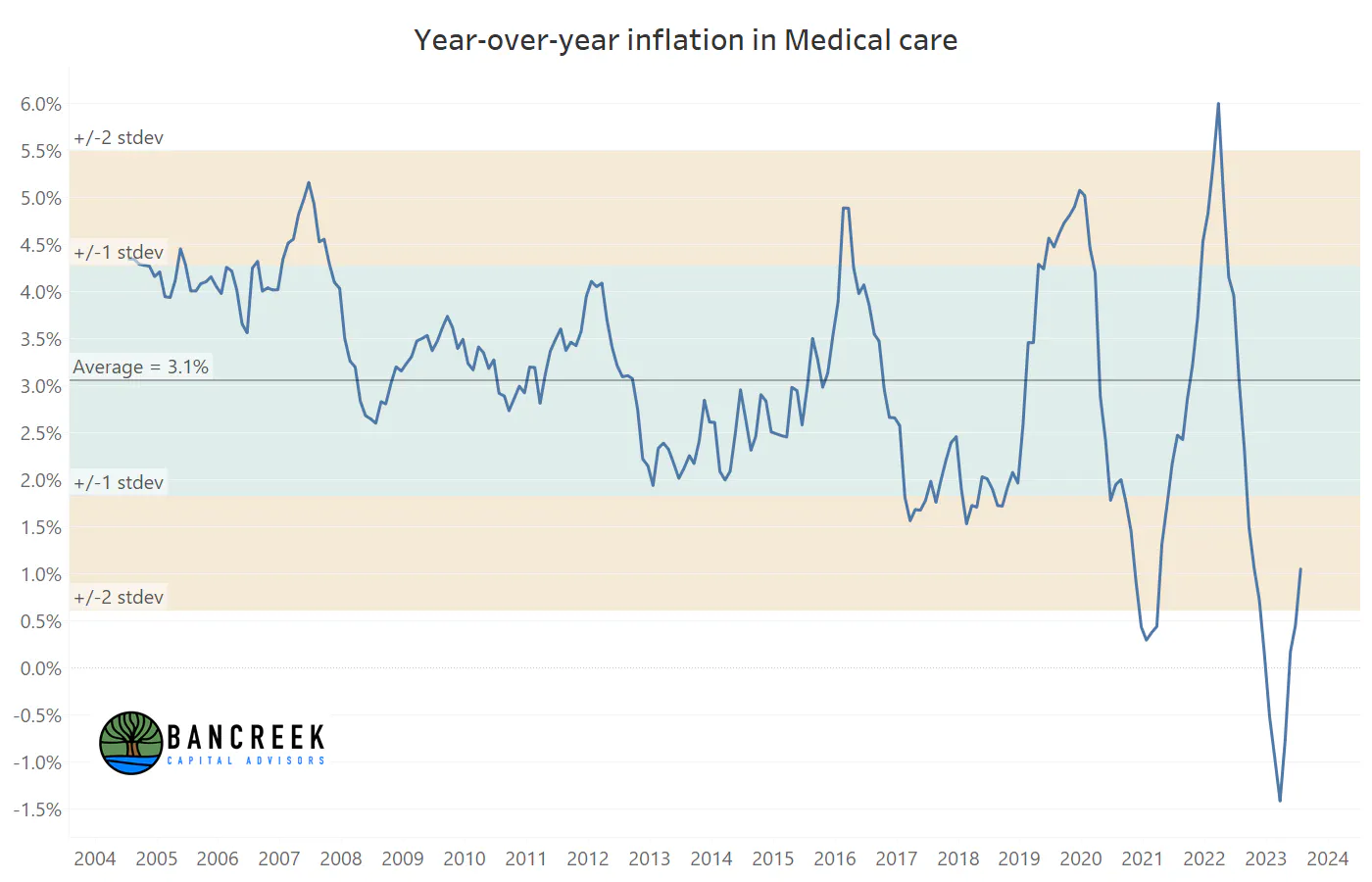
Source: Bancreek Capital Advisors, LLC analysis of bls.gov data
As shown above, inflation in this relatively large (~8% of the U.S. urban consumer’s basket) category has been subdued since the start of 2023, reaching deflationary lows not seen in the past 19 years of data. As shown below, much of this has been driven by health care insurance, which the BLS reported topping out at over 37% deflation in September 2023!
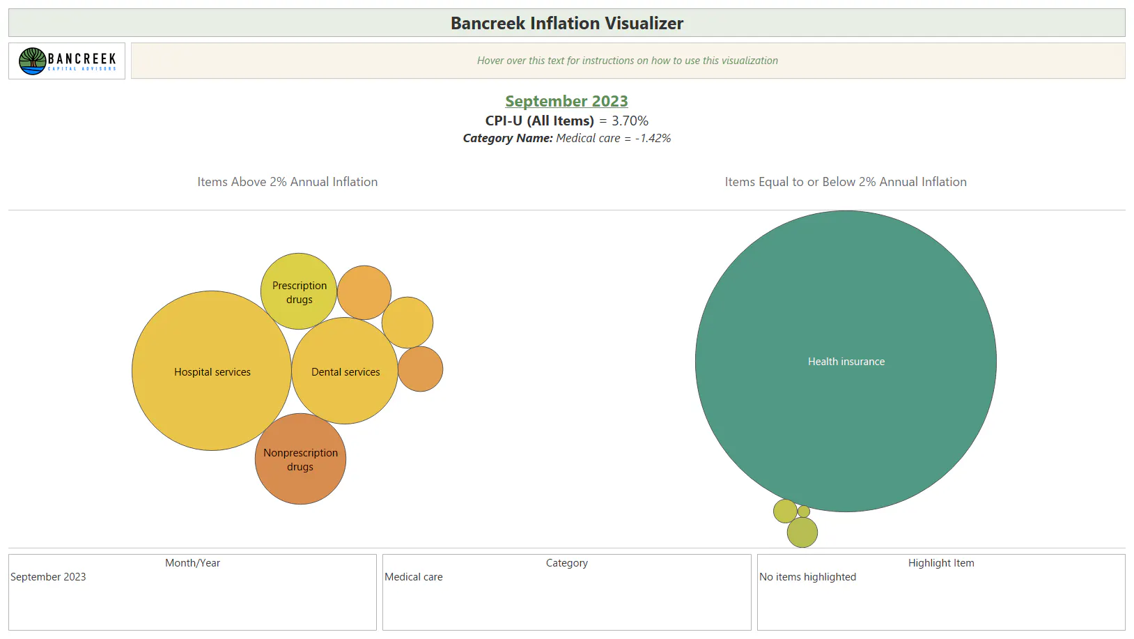
Source: Bancreek Capital Advisors, LLC analysis of bls.gov data
But this anomaly is reversing now, driven by shrinking deflation on health care insurance (as it laps harder comps) and an acceleration in hospital services inflation, which is now closing in on 7% year-over-year.
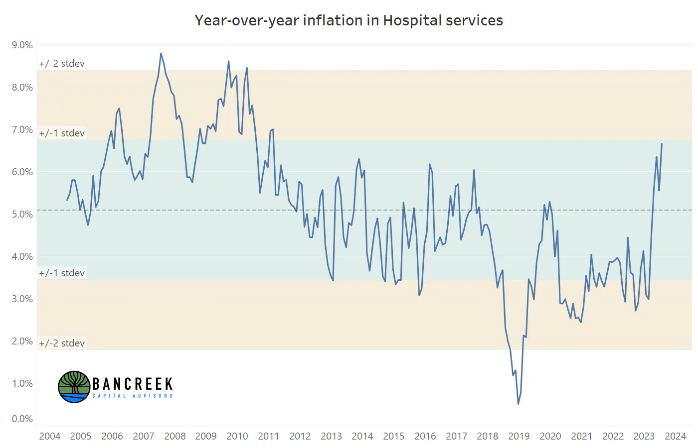
Source: Bancreek Capital Advisors, LLC analysis of bls.gov data
The point of calling this out is for everyone to be aware that it looks quite likely that this category is on its way back to a more normal historical band of inflation. For instance, if medical care returns to its longer-term average of 3.1%, we estimate this will add nearly 20 bps of upward pressure to inflation. To be sure, this is not a huge number, but considering how challenging it could be to get into the low 2% range, any prospective “bad guys” are important to keep an eye on.
Key Takeaway #5:
The sideshow items.
The spectacle around inflation prints the past couple of years has reminded us at times of being at a carnival. And if inflation is a carnival, then this key takeaway focuses on those sideshow oddities and curiosities – the items that are too small in relative importance to move the overall inflation needle, but nonetheless have captured our attention for their strange behavior. We’ll call out two such items this month for your viewing pleasure.
First up is the “non-prescription drugs” item, which we can only assume has steadily marched upwards due to the spate of recent drug shortages.
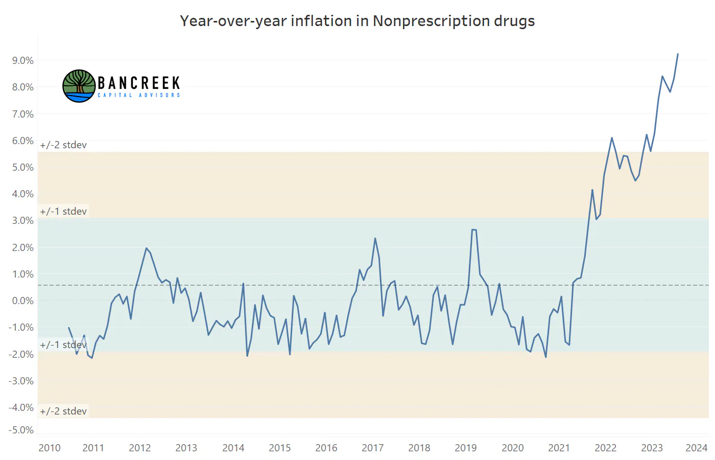
Source: Bancreek Capital Advisors, LLC analysis of bls.gov data
And then we’ll close with the king of all inflation curiosities – frozen noncarbonated juices and drinks. While this item has attracted quite a bit of attention in recent months (probably given how wild the below chart looks), it comprises just 0.01% of the spend of an average U.S. urban consumer. In other words, unless you drink gallons of thawed orange juice each day, there’s no need to lose sleep over this interesting sideshow data point.
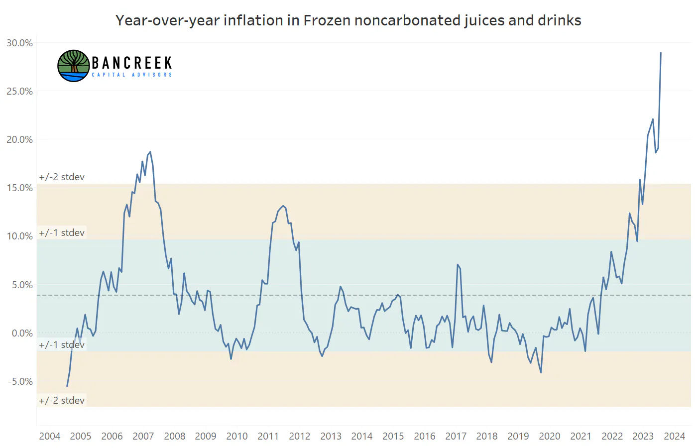
Source: Bancreek Capital Advisors, LLC analysis of bls.gov data
What’s your take on the data?
Thanks for reading our January 2024 inflation recap! Please don’t hesitate to contact us with any questions on the data, our visualizations, or our analysis. Also, now that you’ve made it this far in the article, why not keep scrolling down to the bottom of the page to sign up for our mailing list. Subscribing to our mailing list will ensure that you will be the first to know whenever we publish new content, media, and visualizations to Bancreek.com.
Enjoying this post?
Tell others about it.

Bancreek's Actively Managed ETFs
If you are interested in learning more about Bancreek Capital Advisors' actively managed ETFs click the link below
Learn MoreMore articles like this
Fetching Related Posts
There are no other articles tagged with Research