Key takeaways from the July 2024 Consumer Price Index release

Eric Pachman
Published
August 14th 2024
Eric Pachman
Published
August 14th 2024
July 2024 year-over-year inflation comes in eight basis points lower than prior month
This morning the Bureau of Labor Statistics released the July 2024 Consumer Price Index for All Urban Consumers (CPI-U). Overall CPI-U was reported at 2.89% year-over-year (YoY) for July, down eight basis points from 2.97% year-over-year last month.
As a reminder, Bancreek publishes two visualizations that can help you explore CPI-U in granular detail. Both of these visualizations have now been updated through July and are embedded below:
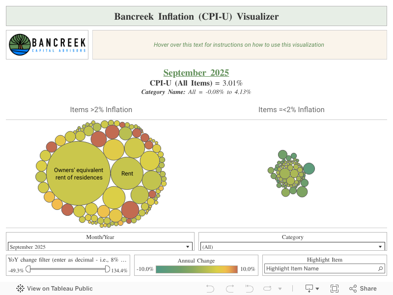
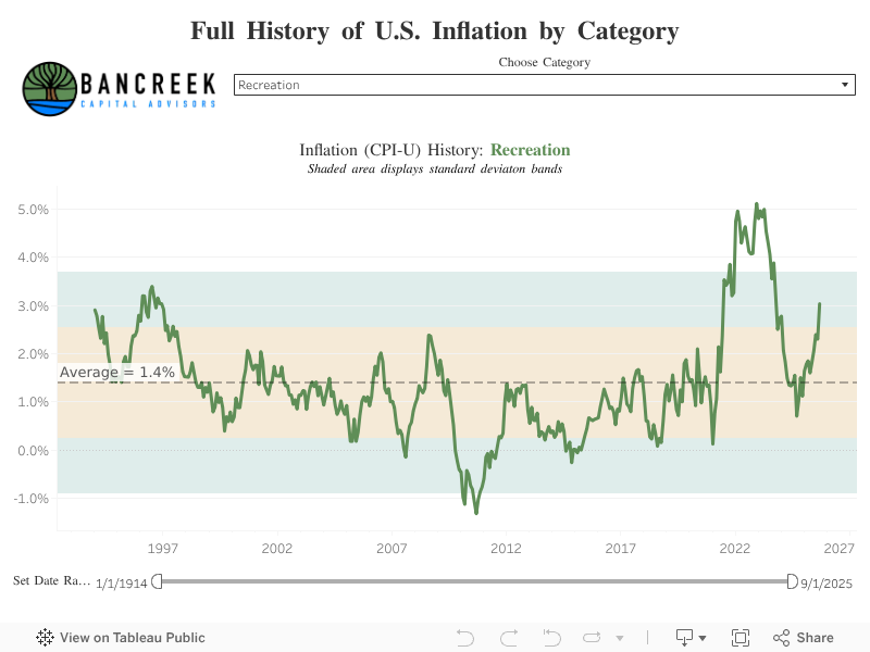
This post hopefully will further assist in your analysis of the moving parts underlying this month’s CPI-U print. Its goal is not to provide a comprehensive analysis of the nearly 180 items we track (that’s what the visualizations are for), but rather just to point to the most meaningful changes from one month to the next.
To perform this analysis, we track a measure we call “inflation impact,” which we calculate by multiplying each item’s YoY inflation by its weight in the prior year period. You can think of this as “weighted inflation” as opposed to the “unweighted inflation” that is more commonly reported by the media. Each month we take the weighted inflation of each item we track in CPI-U and then sum them up to overall CPI-U. Then we compare these weighted inflation numbers from one month to the next to see what drove the sequential increase or decrease. In this way, we can precisely identify the most significant drivers in the change in YoY CPI-U from one month to the next.
Leased cars and trucks, OER, and Used cars and trucks highlight favorable items in July
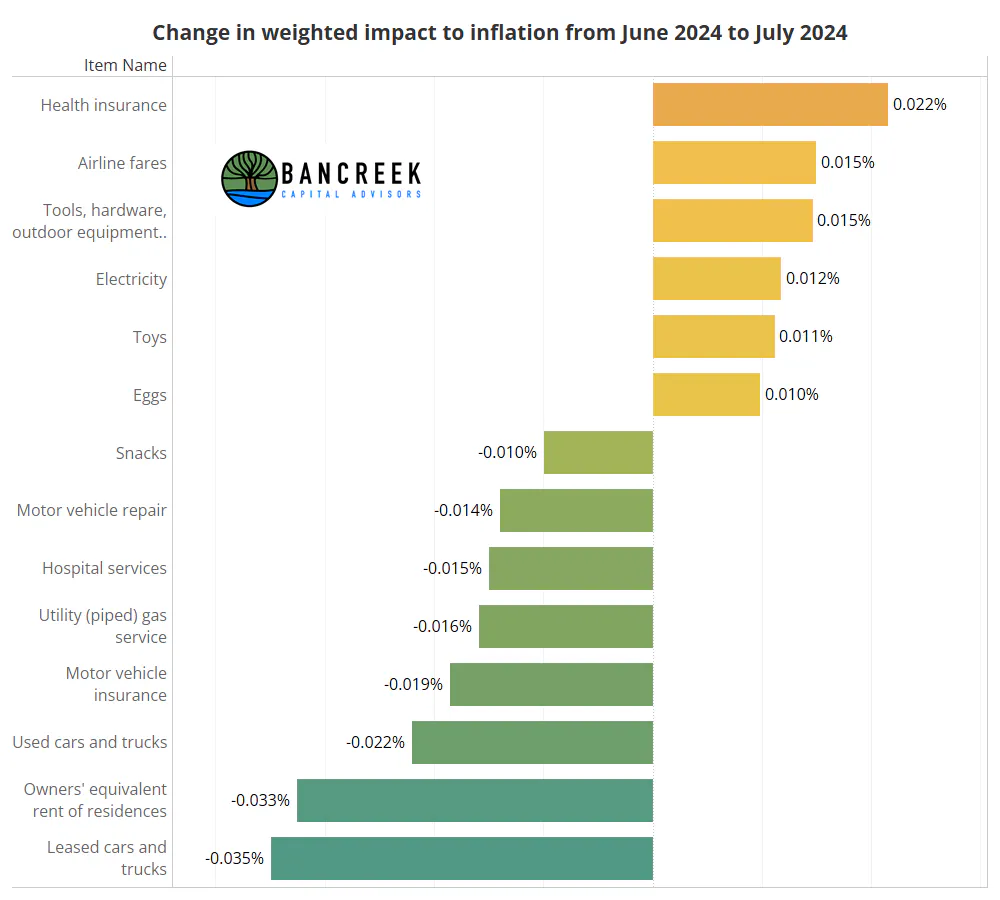
As a reminder, last month's favorability was largely driven by gasoline deflation. Fast forward to this month, and we're pleased to report that gasoline had an immaterial impact on July 2024 CPI when compared to June 2024. Instead, as shown in the below chart, the decline in headline CPI was driven by items like Leased cars and trucks (3.5 bps favorable), Owners' equivalent rent of residences (3.3 bps favorable), and Used cars and trucks (2.2 bps favorable). On the opposite side of the ledger, Health insurance (2.2 bps unfavorable) was the only item we track that added more than two basis points of inflation to July 2024. Note that while we only called out the items had an absolute impact of two basis points or more in this paragraph, we show all items with an absolute impact of more than one basis point below.
Source: Bancreek Capital Advisors, LLC
Key housing inflation measures rise modestly
As we wrote last month, inflation analysis has become quite straightforward as of late given how skewed headline CPI is to just two housing items: Owners' equivalent rent of residences ("OER") and Rent of primary residences ("Rent"). As a reminder, these two items together carry a weight of 33% of CPI-U. Combine this with the fact that these two items are still notching year-over-year inflation north of 5% and the math gets quite simple. In short, these two items have to deflate sequentially for CPI to have any chance to close in on the Fed's target.
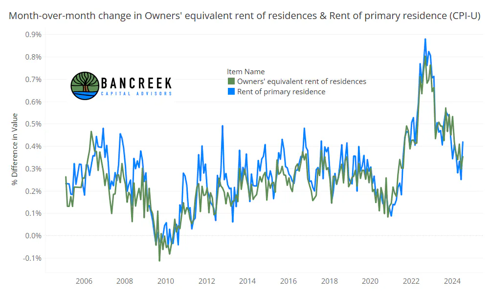
To that end, that fact that these two items inflated faster this month was unfortunate. As shown in the chart below, OER inched up from 30 bps of MoM inflation in June to 35 bps of MoM inflation in July. Meanwhile, rents rose more meaningfully from 25 bps MoM inflation in June to 42 bps MoM inflation in July.
Source: Bancreek Capital Advisors, LLC
We'll go ahead and update the scenario analysis we did in last month's post with this new data, primarily to help illustrate how small, seemingly insignificant differences in the month-over-month inflation of these key housing items add up to meaningful forecasting differences over time.
That said, here are two scenarios we'll model for you:
- OER and Rent month-over-month inflation is 30 bps a month for rest of 2024
- OER and Rent month-over-month inflation is 40 bps a month for rest of 2024
Scenario 1: By year-end 2024, OER year-over-year inflation drops to 4.3% while year-over-year Rent inflation drops to 4.0%. After applying the weights of these two items, we estimate their combined YE24 inflation impact to be 1.41 points, down from 1.75 points today. In short, CPI-U would shed 34 bps of inflation in this scenario.
Scenario 2: By year-end 2024, OER year-over-year inflation drops to 4.9% while year-over-year Rent inflation drops to 4.5%. After applying the weights of these two items, we estimate their combined YE24 inflation impact to be 1.58 points, down from 1.75 points today. In short, CPI-U would shed only 17 bps of inflation in this scenario.
In summary, Scenario 1 gives us twice the tailwind to CPI (i.e., an additional 17 bps of deflation). Maybe you are thinking that 17 bps doesn't seem like a big deal... but when rounded, that's the difference between 2.8% and 2.6%, or 2.6% and 2.4%. At this stage of the game, these are very meaningful differences that we should expect will impact policy decisions.
Simply put, given how subdued CPI inflation is right now across the vast majority of its items, there is just no where else to look to find this sort of favorability by year end... with one notable exception, which we'll talk about next.
Motor vehicle insurance inflation refuses to cooperate
While some folks may applaud the decline in year-over-year inflation from 19.5% in June to 18.6% in July, we instead chose to focus on another eye-popping increase in sequential month-over-month inflation (+88 basis points MoM). Take a look at the next chart, which shows how this compares to the historical average sequential inflation. You know that saying about "gifts that keep giving?" Besides one tantalizing deflationary data point in May 2024, Motor vehicle insurance is proving to be the exact opposite. It's the penalty that keeps penalizing CPI. To put numbers to this, this one item added 50 basis points to July CPI. In other words, in some alternate universe where this measure didn't inflate uncontrollably, today's headline CPI print would have been around 2.4%.
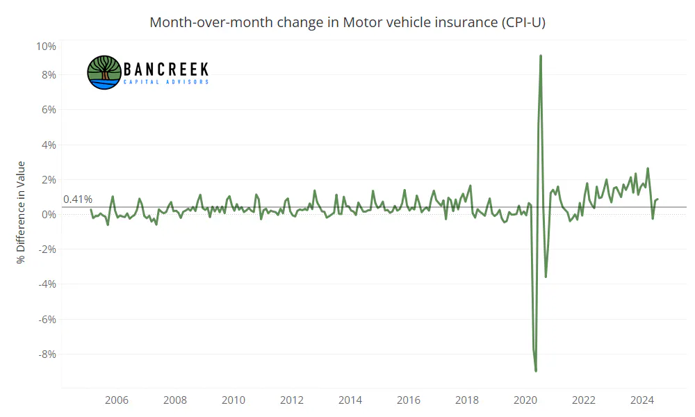
Source: Bancreek Capital Advisors, LLC
The above chart doesn't do justice to how truly egregious the inflation in this item has been since COVID. Actually, it may even fool you into thinking that the recent run of sequential increases in the item may just be making up for the COVID-driven decline. As shown below, that was true until February 2022, when this index took out its pre-COVID peak. Since then it is up a staggering 46%.
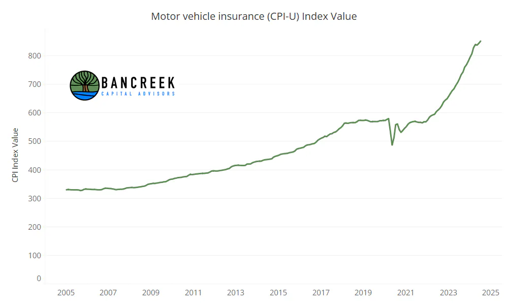
Source: Bancreek Capital Advisors, LLC
We've seen some folks blame the rise in prices in new and used vehicles for this increase. There is also logic that repair costs have increased meaningfully since COVID. As shown below, it's true that these items have seen considerable upward pressure since COVID, which logically would explain the direction in auto insurance prices.
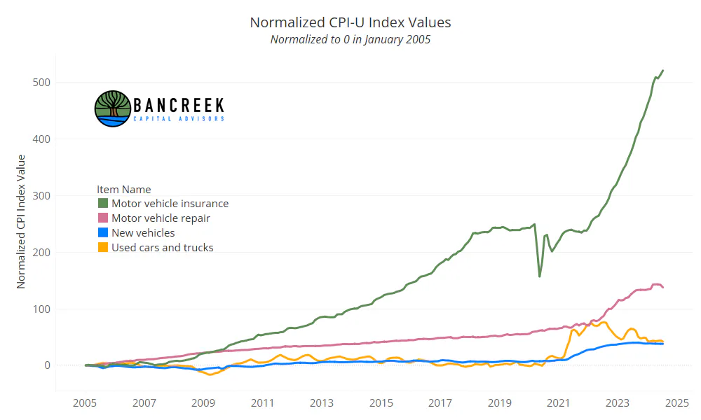
Source: Bancreek Capital Advisors, LLC
But the above chart also emphasizes that this "problem" is not a new dynamic at all. In fact, you can look all the way back to 2008 for the origin of the disconnect between the BLS' measurement of Motor vehicle insurance versus three of its primary "ingredients." We won't rattle off all the stats around this chart, but consider the following...
Between January 2010 and January 2020:
- The Used cars and truck index was down 2%
- The New vehicle index was up 6%
- The Motor vehicle repair index was up 20%
- The Motor vehicle insurance index was up 56%
What we take away from this is that Motor vehicle insurance is very capable of posting strong pricing inflation through a decade characterized by very modest inflation in its' ingredient costs. With this as context, maybe we shouldn't be surprised by Motor vehicle insurance's current behavior now that its ingredient costs are rising in a more meaningful way.
Is (more) "controllable" inflation really just 1.0% right now?
Let's bring this back to the question on everyone's minds: What will the Fed's next move be? We will answer that question with another question. Given what we have learned over the past few years about OER, Rents, and Motor vehicle insurance, how much control do you think the Fed has over these items? Will the Fed's decision to hold rates steady in September rather than cut finally cause housing prices to crack? Or will that just further stall activity in the resale market, keeping much needed supply off the market? On auto insurance, does this decision in any way impact what has clearly (based on the data) been a measure that creates its own inflation no matter its input costs? You can probably tell where we stand on the answers to these questions. We have little faith that the next rate decision, or for that matter, the next four decisions, will have any discernable impact on these items. That's not to say that they won't ease soon. It's certainly appearing that way for shelter, despite a small step backwards this month. Our point is simply that these items are marching to the beat of their own drummer.
So, for argument sake, let's assume the Fed reads this post and agrees their near-term rate decisions will have little to no direct impact on the near-term inflation in there three items. The logical question then becomes, what is CPI absent the Big 3? In other words, what is a more controllable measure of inflation?
The good news is that you can use the Bancreek Inflation (CPI-U) Visualizer to answer this question! Simply open the visualization tool and find the Big 3 items, which unsurprisingly, are the three giant bubbles to the left of the viz. We've highlighted these items below.
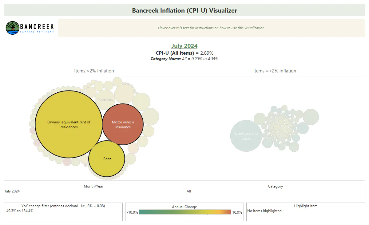
Source: Bancreek Capital Advisors, LLC
Next get out a pen and paper and get ready to write down some numbers. Start by hovering over OER and find two pieces of information for this item: Prior year relative importance (a.k.a., weight) and Inflation impact. In July these numbers were 25.62% and 1.359%, respectively. Write these numbers down for each of the Big 3 items. What you should see is 7.59% / 0.386% for Rent and 2.70% / 0.501% for Motor vehicle insurance.
OK, we have the data we need and can move on to the math. First, add together the Inflation impacts for the Big 3. You should get 2.246%. Then subtract this from the 2.89% headline inflation, which will get you to 0.644%. That's the collective inflation impact of the 170+ other items we track. The last bit of math we have to do is gross these other items up to 100%. To do that, add together the weights of the Big 3 (35.91%) and subtract from 100%, arriving at 64.09% weight of everything else. To gross up these other items, divide their total inflation impact (0.644%) by their weight (64.09%). The answer is a nice, simple, and memorable 1.0%, which we'll point out, is substantially below the Fed's 2% inflation target.
Labor data adds urgency to situation
Last week we published a pretty comprehensive analysis of July's nonfarm payroll data report. While we won't rehash all the details (but would encourage you to read it if you have interest) we'll just summarize our main finding that outside of the health care industry, job growth is looking pretty anemic.
However, since last week we have added another piece to the jobs data puzzle, which to us, provides even more reason for concern. Before we explain what we've done, first off, shout out to @corpcred for gently nudging us to start exploring the BLS' unemployment database (which for data nerds out there is here). While we are still in the early innings of figuring out how to create a helpful viz from this monstrosity of a database, one of our early findings was so interesting to us that we chose to share it now.
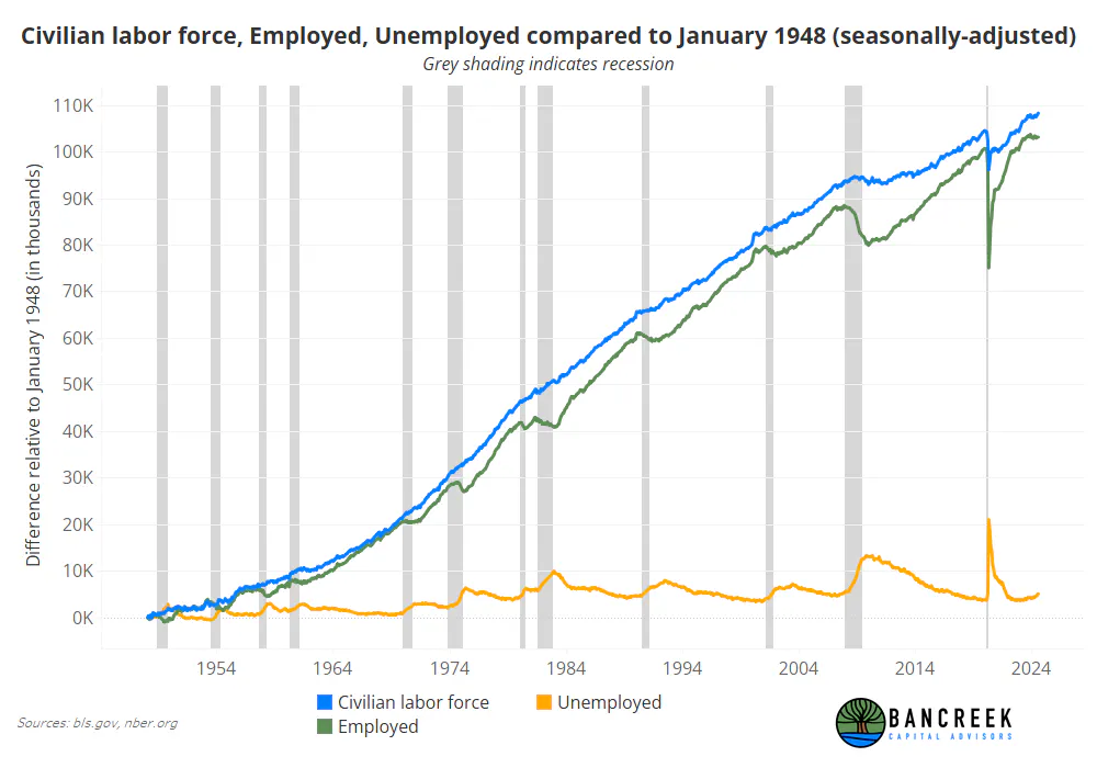
Below you will see the components that underlie the Unemployment rate: the size of the Civilian labor force alongside the number of Employed and Unemployed people. We've displayed this seasonally adjusted data back to the start of the BLS' series, which was in January 1948. Please note that we have also normalized this data to zero on January 1948 to make it easier to see smaller movements in each series. Lastly, we added grey shading to the chart to call out each recession during this period, as per nber.org. Here is the finished product:
Source: Bancreek Capital Advisors, LLC
You'll probably want to spend a minute inspecting this chart to get the most value from it. But here's what we noticed. Right now we have a situation where since late 2023, the number of Employed people has stalled. That itself didn't seem concerning to us, until we added the recession shading to the chart and realized that outside a brief moment in 1995, there has not been a time in recorded history when a stagnant Employed series wasn't accompanied by a recession. Turning our attention to the yellow Unemployed series just makes matters worse. That shows a notable upward trend (while you can't tell from the chart, the number of Unemployed people is up 21% from its recent low point in late 2022). We cannot find any other examples of such a trend in the Unemployed series without a recession in its vicinity.
This is not to say that we are spiraling towards a recession. There are far more factors to consider if you want to make that call. Plus, we are data people here at Bancreek, not economic forecasters. All we can tell you is that there is no historical precedent to dodge a recession based on the state of the current labor data.
The data has spoken.
We assume the debate will continue to rage on what the Fed should do given the body of evidence that is forming. In our minds, it's getting increasingly hard to spin the jobs data in a positive light, especially after our latest foray into the depths of the BLS' unemployment database. But inflation is trickier. The aggregated data measure (whether it be headline or core) is telling a story that leaves doubt on what the Fed's next step should be. Headline CPI and PCE are still too high, and after the slight disappointment in today's shelter numbers, there may be less conviction that core CPI will fall as meaningfully in the coming months, which could lower the perceived odds of the Fed taking aggressive action.
But, as we have explained in this report, there are issues with this aggregated measure we call CPI. Namely, much of it may not be within the near-term control of the Fed to begin with. So what is "controllable" inflation then, which arguably, would be a better KPI for the Fed to use? We offered one way to think about this within this post that suggests it could be well below where the Fed wants it.
This wouldn't be a problem if we could wait for all this to sort itself out over time without any negative consequences. But the labor data is lurking, sending more flashing red signals that we don't have much more time to figure out if the Fed's rate lever will end up having any impact on the Big 3.
So while the Fed's next action is still anyone's guess, one thing is very clear to us: the data no longer is leaving any room for debate. Rather, if anything, with "controllable" inflation well below the Fed's target and the labor data behaving as if we were recession-bound, the only question the data asks is: Are they too late?
Enjoying this post?
Tell others about it.

Bancreek's Actively Managed ETFs
If you are interested in learning more about Bancreek Capital Advisors' actively managed ETFs click the link below
Learn MoreMore articles like this
Fetching Related Posts
There are no other articles tagged with Research