
The Demise of the Dynamic Duo

Eric Pachman
Published
September 4th 2025
Eric Pachman
Published
September 4th 2025
Structural vs. Cyclical
A couple of Fridays ago, the market was bracing itself for Jerome Powell's Jackson Hole speech. All eyes were looking for clues within Powell's speech on when the rate easing cycle would start, and how much easing we should expect. Of course, Powell deftly avoided answering any of these questions, arguing that there were very concerning upside risks to inflation and downside risks to the labor market. Nonetheless, the powers that be (i.e., "bots?") decided that Powell's comments, were on the margin, dovish.
Later that morning, we received a call from a media outlet asking for our thoughts on how the market would react to what they saw as an almost guaranteed rate cut at the Fed's September meeting. We politely declined to answer this question, as in our view, this reporter, and the market in general, are focused on the wrong part of Powell's speech. The market appears to be stuck in the trees, and is oblivious to the forest. In this case, the "forest" was bluntly and worryingly mapped out for us by Powell in this statement:
Changes in trade and immigration policies are affecting both demand and supply. In this environment, distinguishing cyclical developments from trend, or structural, developments is difficult. This distinction is critical because monetary policy can work to stabilize cyclical fluctuations but can do little to alter structural changes.
This statement stopped us in our tracks. It was the most direct acknowledgement we have heard from Powell that the Fed is largely powerless to combat significant structural changes in the economy. This statement was the final puzzle piece for the warning bells we have been sounding for months now, leading to this comprehensive post.
You see, the market has reversed the order of operations in its' assessment of the data right now. It takes for granted that a rate cutting cycle will, as it has done for at least half a century, spur economic growth and job creation. It is also apparently comfortable ignoring the warning signs Powell provided on inflation risks in favor of just assuming they are transitory. But, as we have asked in the past, what if the Fed's monetary policy tool is insufficient to "fix" a weakening labor market this time? As Powell just told us, this would likely be the case if the labor market's challenges are structural, rather than cyclical. We can ignore this question all we want, but doing so is like picking up nickels in front of a steamroller. If the U.S.'s economic challenges are structural, best we know now, and not be surprised when monetary policy doesn't wipe away all our problems.
It's incumbent upon all smart investors to have an opinion on the structural vs. cyclical debate right now. Speculators can bet on which direction the market will go on the next monetary policy change, but investors should look past this to form a view if the Fed can dig us out of the unprecedented challenges the U.S. economy now faces.
Based on the title of this post, you probably can guess where we stand on the structural vs. cyclical debate. We are firmly on "Team Structural," and therefore, quite concerned about where we are headed. You may not be, and that's OK. But we'd still strongly recommend reading this post, just to understand the other side of the debate. In other words, we may see different "forests" and that's just fine. But we should all make sure we are looking at the "forest" rather than the "trees." Maintaining a birds-eye view ensures that we won't be trapped in the forest if the entire thing gets bulldozed to the ground.
That said, today’s post zeroes in on what we see as the two most significant structural risks to the U.S. economy: healthcare and immigration—the “Dynamic Duo.” This report will lay out the current landscape for both and argue that, absent meaningful policy shifts, each is on a trajectory toward long-term deterioration.
U.S. healthcare caught a cold
The first member of the Dynamic Duo is U.S. healthcare. On the list of structural growth drivers for this country, healthcare is right at the top of the list. We've spent over a year writing about how healthcare has been propping up U.S.'s nonfarm payroll growth, so we'll do our best to summarize what we have learned here.
First off, according the BLS' "establishment survey" data, as of July 2025 there were 135,970,000 total employees working in the "Private" sector. Of these, 23,409,000 employees worked in Health care and social assistance. Divide these two numbers and you'll find out that 17.2% of all Private workers in the U.S. are currently employed in Health care and social assistance.
Now, if healthcare was not structurally advantaged compared to other industries in some way, you would expect this industry to be responsible for around 17% of all Private job growth, especially over a long period of time. But that's not what the data show. Rather, here's the percent of Total private jobs added that came from healthcare and social assistance, over several time periods:
Health care and social assistance job additions as a percent of Total private job additions
- 20-years: 36.2%
- 10-years: 30.1%
- 5-years: 21.3%
- 3-years: 53.6%
- 2-years: 65.9%
- 1-year: 61.8%
As shown above, no matter the time horizon, Health care and social assistance jobs have delivered disproportionate payroll growth. The only period that is even close to proportionate growth is the prior five years. But note that this period is cycling July 2020, which was still impacted by the COVID shutdowns that caused a historic (-48%) decline in Leisure and hospitality jobs. Of course, these jobs quickly came back once shutdowns were lifted, causing an equally historic spike in these service jobs (the next chart shows this dynamic quite well). Meanwhile, healthcare jobs were less impacted by COVID. All told, the five-year period is heavily distorted by COVID, making the other periods a better indicator of how valuable healthcare jobs have been to the U.S. economy.
So, five-year period aside, the data makes it clear that healthcare jobs have been one of the primary drivers of U.S. job growth over the past two decades. It also makes it clear that over the last three years, the job market has become almost completely reliant on this single industry, with it adding 53.6%, 65.9%, and 61.8% of all Total private jobs over the past three, two, and one year periods, respectively.
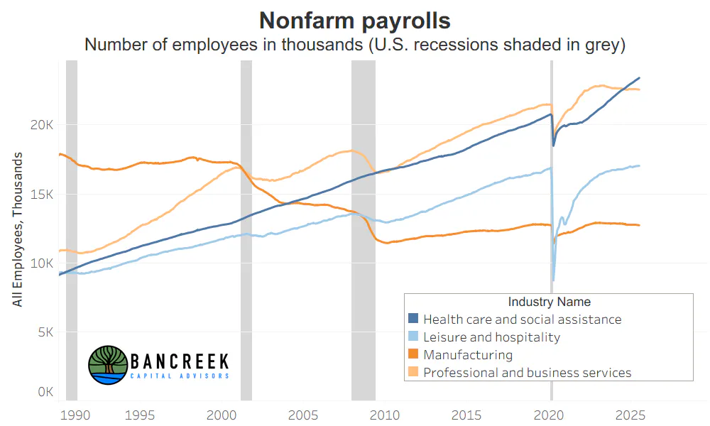
The below chart provides a different view of the data to help understand what makes healthcare so different from other industries. As shown below, healthcare job growth is not cyclical. It is structural. Besides the anomalous COVID period (even healthcare was not immune to mandatory shutdowns), notice how healthcare jobs have never declined during recessions (grey shaded areas). Compare this to the other three industries: Leisure and hospitality, Manufacturing, and Professional and business services. Each of these industries were clearly impacted by recessions. Our second observation is that the growth rate of healthcare jobs has accelerated post-COVID, helping to offset the plateauing of net hiring in other large industries. This visual helps explain how we have come to rely on healthcare for more than 60% of job growth in recent years. It's because outside of healthcare, nearly all other major industries payroll charts are behaving like we are in a recession. Meanwhile, at least according to the BLS, healthcare jobs are in the midst of their most significant growth phase in recorded history.
Source: Bancreek Capital Advisors, LLC
All our eggs are in the healthcare basket
Regardless on your view on disproportionate healthcare job growth, and how long it can persist, it's hard to ignore that the U.S. labor market has a lot of concentration risk. To provide an analogy, would you be more comfortable holding a portfolio of a few dozen equal weighted stocks, or the same collection of stocks, with 60% of your money in just one equity? You probably would choose the equal-weighted portfolio to best mitigate risk. Sadly, that's not an option for the U.S. job market now, especially with AI nipping at the heels of many of the jobs in the Professional and business services category. So, it follows that the fate of U.S. job market likely will follow the fate of U.S. healthcare jobs.
There are a couple reasons to be worried about the fate of U.S healthcare jobs at the moment. We'll highlight three for you to consider:
- ADP labor data is signaling weakness
- Structural arbitrage is under pressure
- Medicaid cuts loom on the horizon
Are healthcare jobs rising or falling? YES.
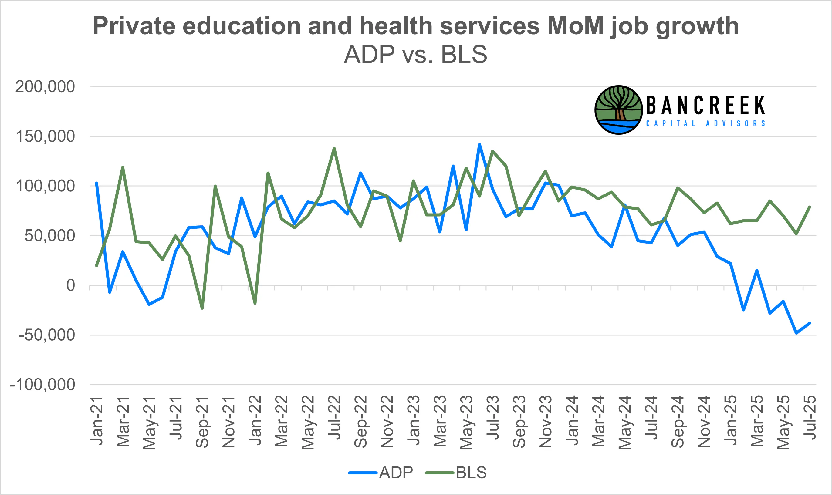
The first warning sign on healthcare jobs comes from the ADP employment situation report. While ADP's data doesn't provide enough detail to see the healthcare and social assistance level, it does report out job growth for Private education and health services, which we estimate is roughly ~85% private health services. In other words, this is a good enough proxy for healthcare for our analysis. We can then compare this industry in ADP's data to the same industry in the BLS's data to see how they track each other. As shown below, the two series have recently diverged. BLS's data is telling us healthcare job growth is booming. ADP's data is telling us it's shrinking. These two data sets aren't just slightly off... rather, they are showing us two completely different realities (or "multiverses," for Marvel fans) for healthcare jobs in 2025.
Source: Bancreek Capital Advisors, LLC of data from bls.gov and adpemploymentreport.com
The natural question you likely have is which one is right and which one is wrong. Sadly, there is no clear answer to that. They are both technically "right" in that they rely on different methodologies to give us a snapshot of the "health" of healthcare jobs at any point in time.
While we are not methodology experts on either data collection process, a cursory glance at ADP's and BLS's methodology documents makes clear that the main difference is that ADP's data is a direct data feed from over 500,000 of its clients (all clients, not just healthcare), while the BLS sends out a voluntary survey to 651,000 establishments (again, ALL establishments, not just healthcare) and as of March 2025 (latest month reported) had a response rate of 42.6%. So, on the surface, ADP "feels" like the better data set. It appears to win on both quality (data feed rather than voluntary survey) and quantity (>500k vs. ~277k businesses).
However, concluding we should only pay attention to ADP based on this way oversimplified comparison of the two methodologies would be wrong. Rather we think its beneficial to use both data sets as tools to assess the labor market. If both are in agreement, we can have a bit more comfort that what they are telling us is really happening. If they contradict each other, that just means we may have a bit less confidence that any given industry is as strong (or weak) as one of the databases tells us. That's why our key takeaway from the current conflict between the two datasets is healthy skepticism of the strength in healthcare job growth reported by the BLS right now.
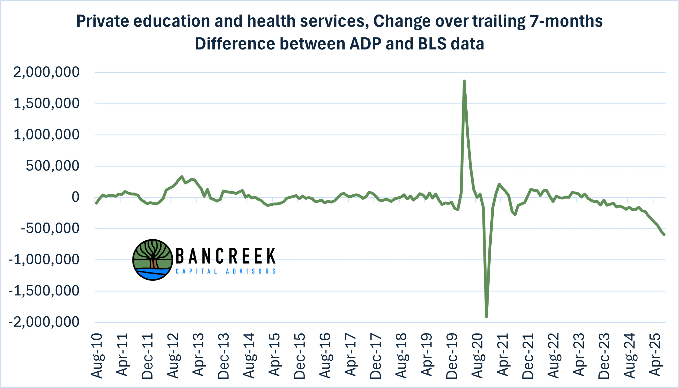
Before we leave this discussion topic, we took a look back in time to see if the magnitude of the disconnect we are currently seeing in healthcare job growth between these two databases was normal or not. To do so, we calculated the seven-month trailing change in jobs going back to 2010 for the Private education and health services industry in both databases. Why seven-months? Because we have seven-months of data this year (through July), so this is the year-to-date (YTD) period for 2025. According to ADP, Private education and health services has shed -118,000 jobs through July this year. Meanwhile, according to BLS, the same industry has gained 478,000 jobs YTD. If we subtract the BLS change in jobs from the ADP change, we get a gap of -596,000 jobs, as shown in the chart below. This chart clearly shows that outside anomalous spikes around COVID (which reversed themselves quickly) we have never before seen a gap this large. More concerningly, it appears to be getting larger throughout 2025, adding more uncertainty to the true state of the healthcare labor market.
Source: Bancreek Capital Advisors, LLC of data from bls.gov and adpemploymentreport.com
One thing is clear here. Something (which has never happened before) has changed that is pulling these two data sets apart. We do not know what it is. But the unprecedented gap between these two healthcare job market realities should at least make us question whether the healthcare job market is as strong as the BLS is making it seem. And if the healthcare job market is not as strong as it seems, the health of the entire job market may currently be overstated.
Is the U.S. healthcare jig finally up?
For anyone paying attention to the malaise that is U.S. healthcare equities (e.g., see UNH), it's hard to dismiss the possibility that the business of U.S. healthcare is facing somewhat of an existential crisis. For decades, U.S. healthcare's unique business model has largely been driven by price discrimination.
Price discrimination has fueled structural U.S. healthcare growth
Price discrimination may sound like a nasty thing, but applied to a transparent marketplace, it's simply an economic concept that can provide benefits for both business and consumers. Take Costco, which will happily offer you a more expensive Executive membership, which (we can attest!) pays off and then some in annual cash back if you shop enough at Costco. Discount airlines do this as well, by offering you bargain prices on a ticket, and then up charging for just about everything else (e.g., checked bags, carry-ons, assigned seats, early boarding, etc.). These innocuous forms of price discrimination are used by nearly every retailer nowadays in the form of loyalty programs that offer discounts for permission to bombard you with texts and e-mails and monitor your shopping habits in hopes of generating more sales from you in the future. But there's nothing wrong with these form of price discrimination because, 1) we know its happening and can choose to participate or not, and 2) prices are transparent to us, giving us enough information to decide if the cost/benefit makes sense.
Healthcare is a different form of price discrimination altogether. Generally speaking, U.S. healthcare employs a system of price discrimination where service providers and/or drugmakers inflate the list price of a service or drug and then offer negotiated rebates or discounts to payers (i.e., insurance companies or self-insured employers) based on how much negotiating leverage they have.
Let's pause here and provide some context on how much list prices are really inflated. Let's use generic (i.e., off-patent) drugs as a case study. Medicaid.gov publishes a handy summary of the gap between the list price (i.e., "AWP") and the drugs' actual acquisition cost as reported by retail pharmacies (i.e., "NADAC"). According to this public document, in December 2024, the median generic drug's cost was 91.5% cheaper than its list price. In other words, the median generic drug's list price was 11.8 times higher than its cost. And for the business owners out there reading this who provide health insurance to your employees, pause here and go read your Pharmacy Benefit Manager (PBM) contract. Your PBM is almost certainly "guaranteeing" a discount off the list price (AWP), rather than benchmarking the price you pay to a real price (like NADAC). In other words, the drugmakers mark up generic drug prices by nearly 12x and then your insurance company gives you a discount off these fake inflated prices. Hocus pocus ... profit for everyone (except you and your employees)!
But this is not a joking matter, especially if you don't have insurance or are in the deductible phase of your coverage. If you fall into either of these unfortunate groups, these fake inflated prices become very real, as they are the "cash prices" which you must pay. Think back to all the stories you have heard of people rationing insulin or unable to afford generic cancer treatments. This is why. It's not because these drugs are actually expensive (most are actually dirt cheap). It's because cash payers (or deductible-phase patients) are not getting the discounts provided to everyone else.
Over the years we have studied the U.S. healthcare system we have come to realize that all healthcare pricing is some iteration of the above example. The healthcare status quo is setting sky high prices and then offering contractually hidden rebates and discounts off the inflated prices. If we study this with our Wall Street hat on, we see this as the most powerful, long-standing, pricing arbitrage in existence. It's been around for decades now, and gets worse each year as the healthcare complex tries to wring out more profits from the arbitrage. This is especially true as the healthcare supply chain has almost completely vertically integrated (e.g., health insurers now own and control their own PBMs and pharmacies... and even drugmakers!) further obfuscating these pricing distortions.
A Wake Up call for healthcare
On December 4, 2024, United Healthcare executive Brian Thompson was assassinated in Manhattan heading to the company's investor conference. The shooter's alleged motive was reported to be medical coverage issues. Years from now we may look back and mark this event as the beginning of the end of healthcare's long-term pricing arbitrage. It wasn't the shot itself that leads us to this view, but the outpouring of support, not for the victim, but the perpetrator of this heinous crime. This was quite literally a "Wake Up" call for healthcare that it is now public enemy number one. While the public may not understand the details we just shared with you on why our healthcare system is so distorted, many are apparently willing to condone murder as retribution for the system's design.
This is a problem for the status quo. It lends more support to President Trump's call for Most Favored Nation drug pricing, administered by a direct-to-consumer model (of which his son owns part of one, we should add), which if it could be implemented (highly unlikely, in our view) would be a massive disruption to the status quo. The public's ire towards U.S. healthcare also acts as a tailwind to a much more likely disruptor, Mark Cuban, whose Cost Plus Drugs company has exposed the true dirt cheap pricing of many "expensive" generic drugs, and made these real prices available to the public. Such disruptive threats and ill will are forcing the incumbents into more transparent pricing models, which while still mostly smoke and mirrors, are still likely to erode arbitrage opportunities over time.
Most concerningly for the business of U.S. healthcare is that hatred for the system's design is one of the few things on which both sides of the aisle agree. This means that status quo incumbents across the healthcare supply chain are likely to be targeted by lawmakers for the foreseeable future, regardless the party that controls the political merry-go-round on which we are all stuck.
If you walk away from this section remembering anything, remember this - hidden pricing games are a large driver of profit within the U.S. healthcare system. If these games come to an end, it is reasonable to expect profits to decline across the healthcare complex, which would put structural downward pressure on healthcare employment. Unfortunately, it's impossible to know how to handicap this risk. All that is certain is that its probability is a step change higher today than it was just a year ago.
What happens to healthcare jobs when Medicaid gets cut?
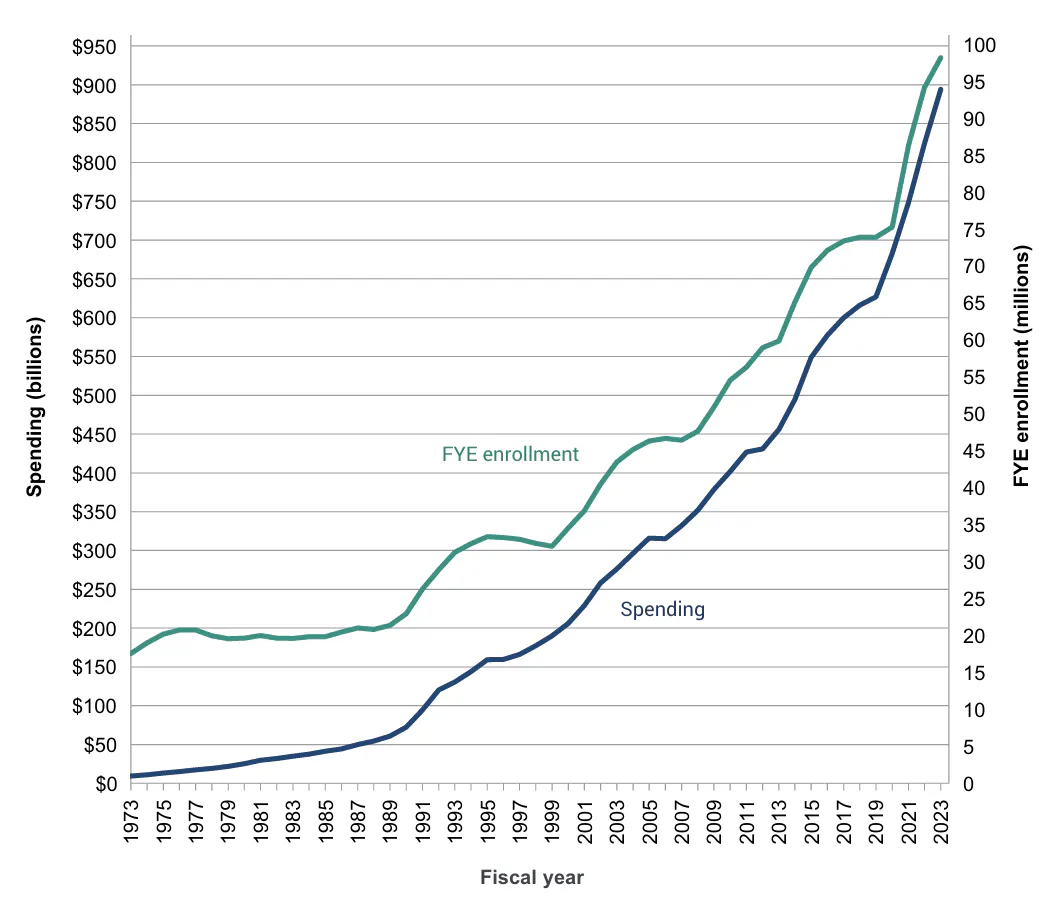
On July 4, 2025, President Trump signed the "One Big Beautiful Bill" into law. One of the more contentious pieces of legislation in the bill was cutting over $1 trillion in Medicaid and CHIP expenses over the next 10-years (we verified this number based on CBO's analysis of the bill) by eliminating coverage for 10.5 million people by 2034. Just for context, the below chart shows historical annual Medicaid expenses and full year enrollment (FYE) going back to 1973. In 2023 Medicaid spent $894 billion to cover 98.2 million individuals. This means that in 2023, Medicaid provided health coverage to a whopping 29% of all people living in this country. So, the cuts, which are not-so-coincidentally scheduled to start in 2027 (after the midterms) are roughly aimed at chopping ~10% of the people and cost out of Medicaid.
Source: Macpac Macstats
Cutting Medicaid poses all sorts of challenges for the healthcare labor market. One that we have explored in depth is the impact to daycare services for the elderly and disabled, which you may be shocked to learn has been the largest source of job growth across the country among all industries at the more granular levels of the BLS' hierarchy. Below is a post we put up on socials a little while back on this risk.
Please wait...
We also spoke with Megan Leonhardt at Barron's about this back in May before the bill was passed. Back then we warned people of the risk of monetary policy not being able to fix job market weakness that could stem from the proposed (at the time) Medicaid cuts:
“If you start attacking this from a regulatory side of things, you can’t fix it with monetary policy,” Pachman said. “I really don’t think that people are aware of how much damage the U.S. could be creating for itself.”
Clearly our warning was not heeded, as the Medicaid cuts ended up increasing from $700 billion over 10-years in the initially proposed bill to $1 trillion in the signed bill over 10-years. 🤷♂️😔
But honestly, digging down into the many ways that axing 10% of the Medicaid population could hurt people and jobs is probably not worth any more effort. As such, we will not go into the projected closures to rural hospitals or the surge in expenses that are likely to result from uninsured patients seeking routine treatments in the ER departments of the remaining hospitals.
Rather we'll just keep this simple. If a company is forced to cut it's budget by 10%, would you expect it to go on a hiring spree? Probably not. You'd probably expect a round of layoffs instead. So why is the market so complacent right now that the healthcare complex will continue to hire people at a record clip when its second largest payer has to meaningfully cut expenses starting in 2027?
We tend to live by three quotes:
- Charlie Munger's, "Show me the incentive and I'll show you the outcome."
- Jerry Maguire's, "Show me the money!"
- Mugatu's (from Zoolander), "I feel like I'm taking crazy pills!"
Mr. Munger's quote sums up how we got ourselves in this healthcare mess. Mr. Maguire's quote provides sound advice on what could happen if we try to chop our way out of it. Mr. Mugatu's quote captures how we feel the more time we spend comparing our detailed analysis of U.S. macroeconomic data with what the market is currently willing to pay for U.S. equities.
The Statue of Liberty is having an identity crisis
According to neh.gov:
"The Statue of Liberty stands in Upper New York Bay, a universal symbol of freedom. Originally conceived as an emblem of the friendship between the people of France and the U.S. and a sign of their mutual desire for liberty, it was also meant to celebrate the abolition of slavery following the U.S. Civil War. Over the years the Statue has become much more. It is the Mother of Exiles, greeting millions of immigrants and embodying hope and opportunity for those seeking a better life in America. It stirs the desire for freedom in people all over the world. It represents the United States itself."
Our purpose here is not just to point out the obvious contradiction in many people's views towards immigrants today when the meaning of "United States itself" lies in "embodying hope and opportunity" for "millions of immigrants." Rather the main reason we dragged Lady Liberty into our report is because the data we've recently analyzed suggest her welcoming of immigrants over the past two decades has been critical to ensure healthy growth of U.S.'s labor supply as the "boomer" generation heads out to pasture.
Land of the free and home of the... old
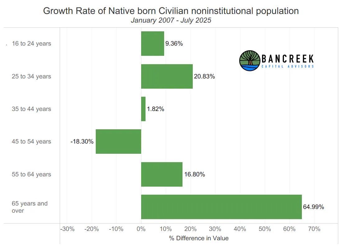
Let's outline the problem we currently have that has been hiding in plain sight for at least the last 18-years (we only have data back to 2007, so it could be longer). The U.S.'s Native born population is rapidly ageing. Take a look at chart below, which shows the growth rate of the "Native born" (i.e., Born in the U.S.A.) population (i.e., Civilian noninstitutional population) by age group. Also, note that "noninstitutional" simply means not institutionalized in nursing homes, assisted living facilities, jails, etc.
Source: Bancreek Capital Advisors, LLC of data from bls.gov
As shown above, since January 2007, the Native born 65+ age group has grown at a much faster clip than any other age group. Let's now convert these percentages to absolute numbers in the below waterfall chart.
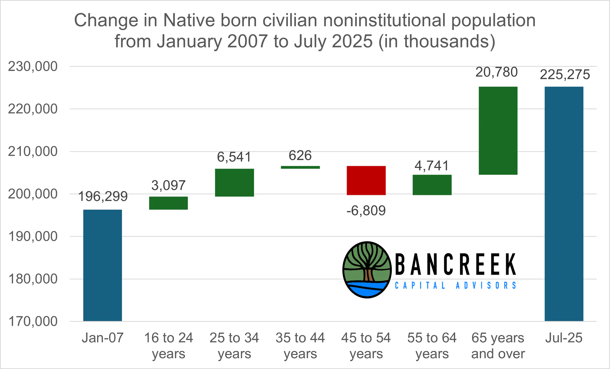
Source: Bancreek Capital Advisors, LLC of data from bls.gov
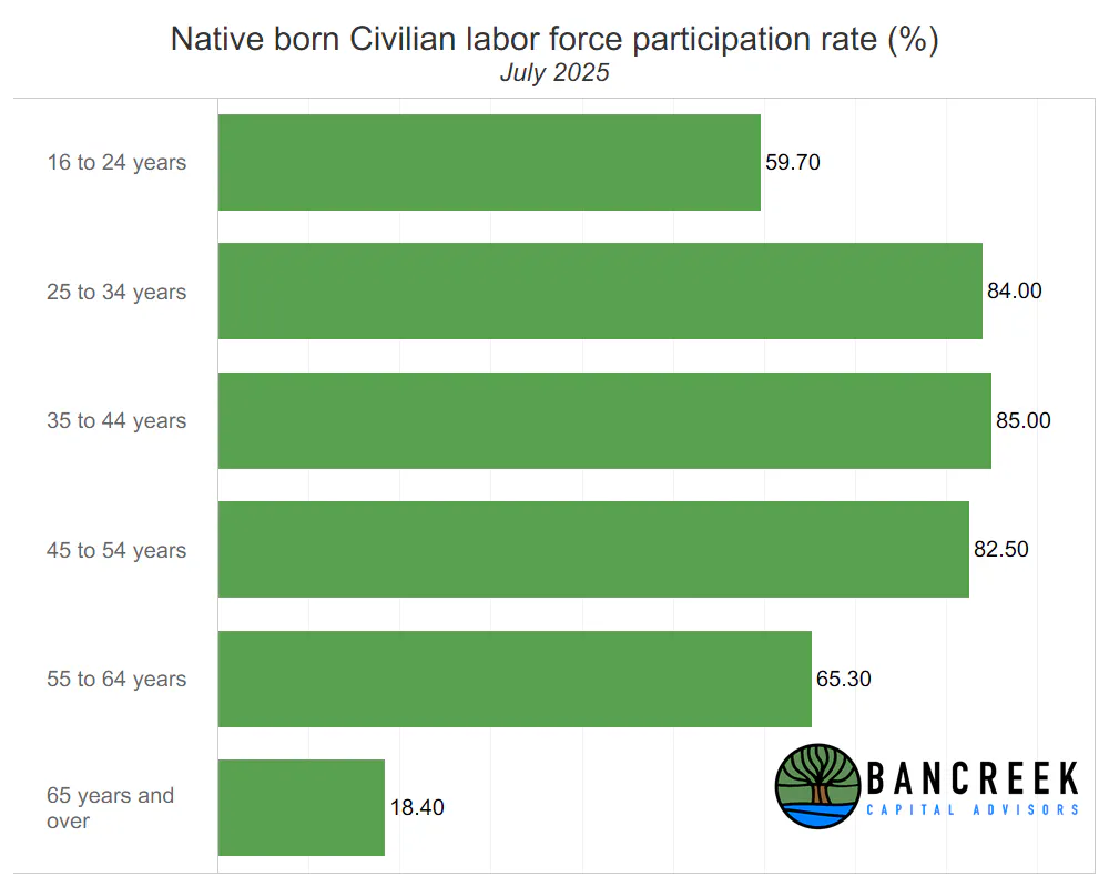
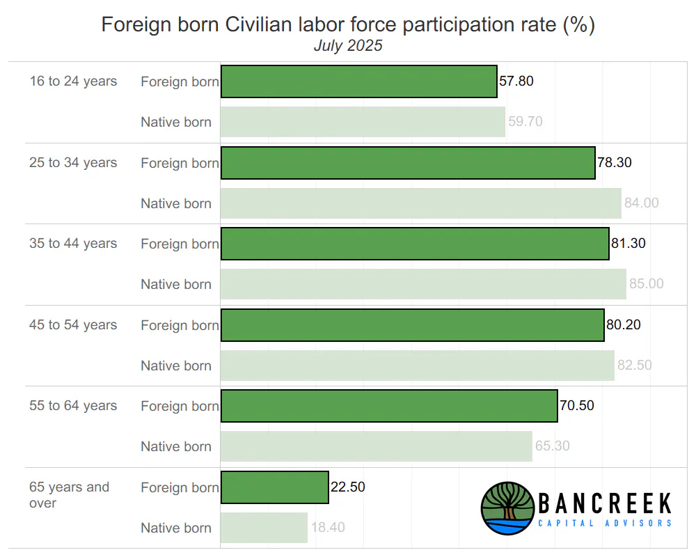
Why is this a problem for labor supply? The answer should be obvious. Americans in the 65+ age group don't work much. Instead, you know, they are retired and collecting social security. While this is obvious, it can't hurt to put numbers to this as well, so let's take a look at the labor force participation rate by age group for Native born Americans as of July 2025.
Source: Bancreek Capital Advisors, LLC of data from bls.gov
This last chart completes the picture. Over the past 18+ years, our fastest growing age group was the one with by far the lowest labor participation, which has put substantial downward pressure on the Native born labor force participation rate. From January 2007 to July 2025 it declined from 65.4% to 62.0%. But if we exclude the 65+ age group from the Native born labor force participation rate, it actually went from 75.2% to 75.3% over the same period. This means that the ageing of the Native born population has been responsible for the entire decline in its labor participation rate over this period. Put it all together, and the Native born labor force increased by an anemic 0.5% CAGR over the past 18.5 years.
Why is a stagnant (or shrinking) labor supply a problem? We turn to the UK parliament for an explanation:
"Falls in labour supply can impact inflation, economic growth, and public finances. They can add to inflationary pressures—as employers compete for scarce employees by raising wages, adding to the cost of producing goods and services. By constraining the level of output that can be produced, or by leading to increases in the costs of producing it, labour shortages can limit economic growth. Falls in labour supply will worsen the public finances, through lower tax receipts and, depending on who is withdrawing from the labour force and why, could result in increases in benefits payments."
Yikes, that sounds undesirable. So, why hasn't this happened over the past 18.5 years? One word - immigration.
Foreign born to the rescue!
Let's now take a look at those same three charts for what the BLS calls "Foreign born," but we will interchangeably use the term, "immigrants." First, here's the growth percentages by age group between January 2007 and July 2025.
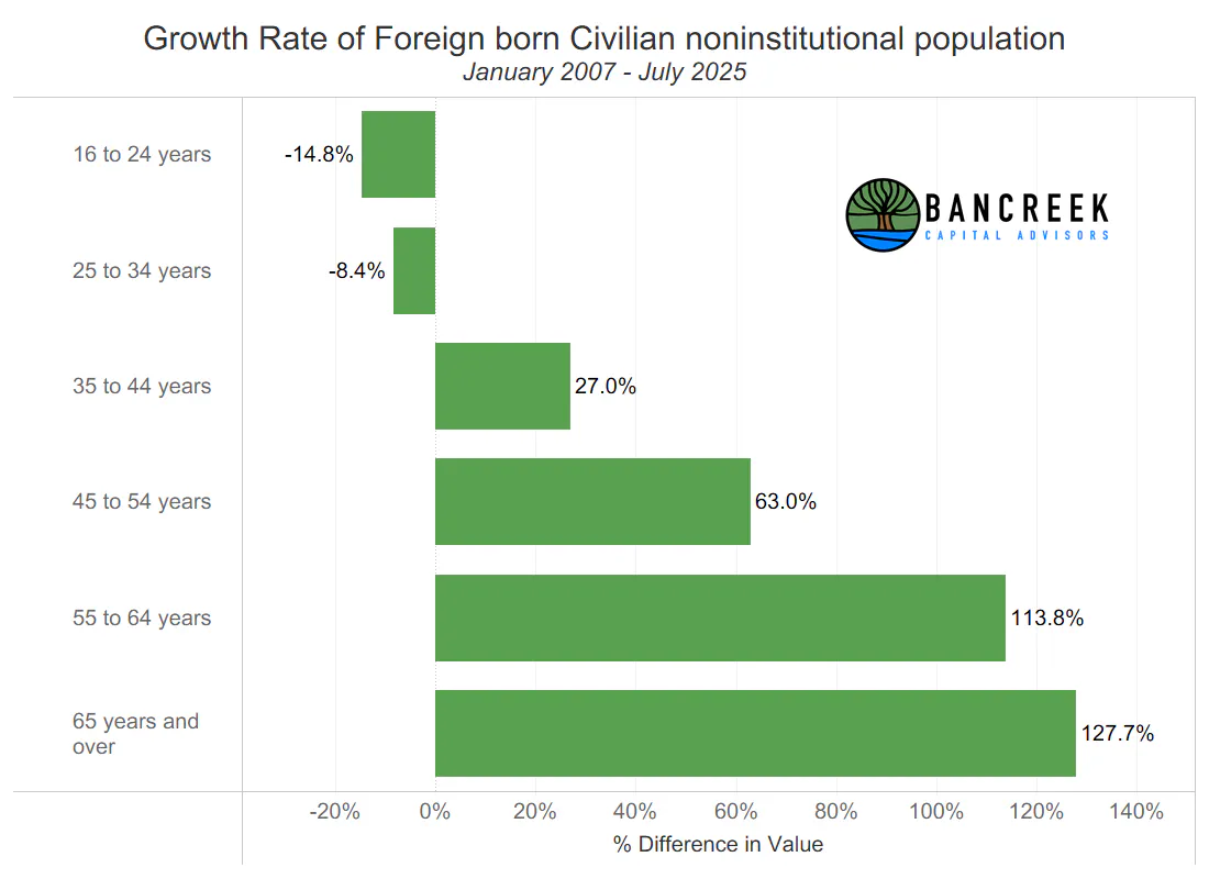
Source: Bancreek Capital Advisors, LLC of data from bls.gov
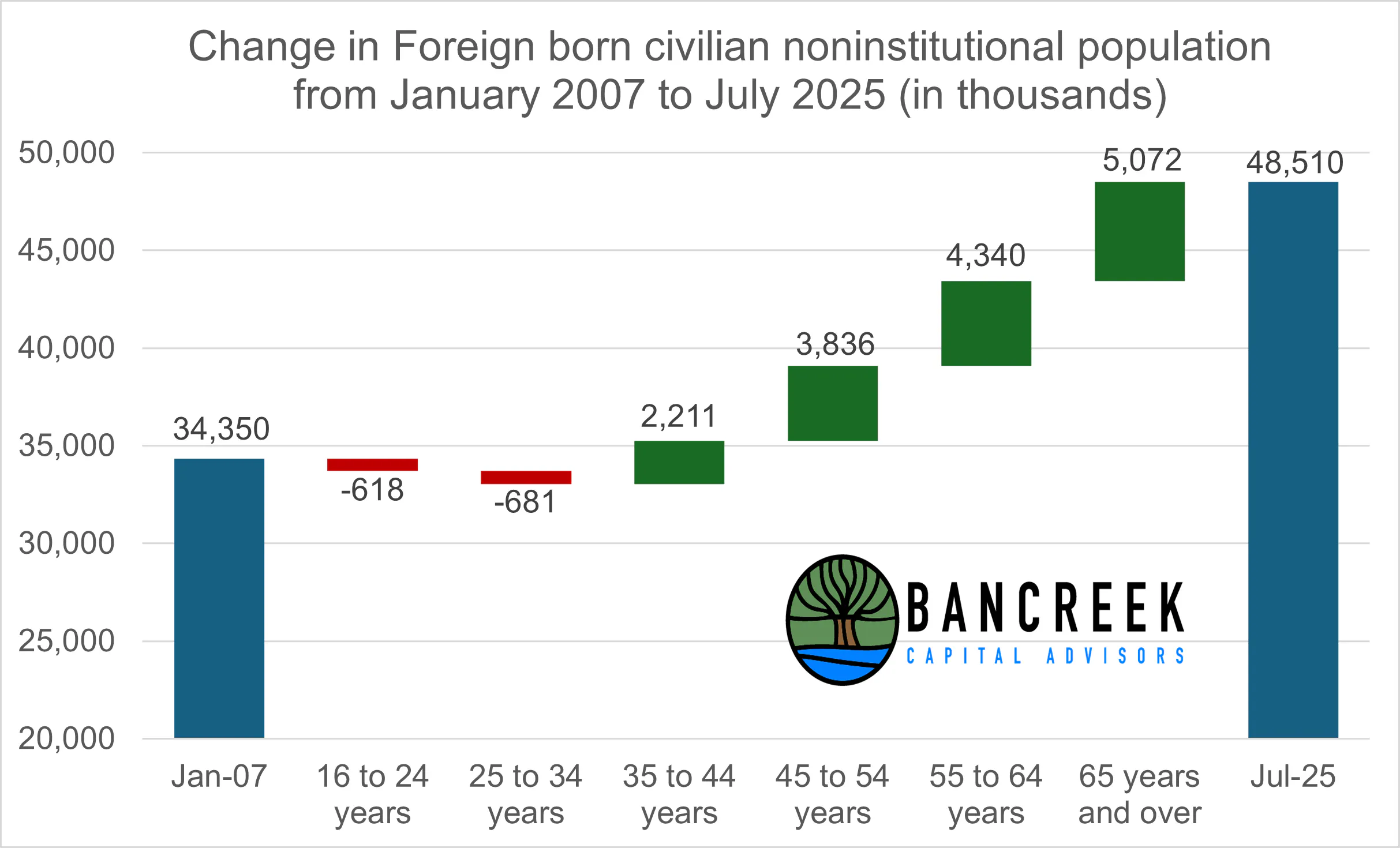
Here are the absolute numbers (i.e., waterfall chart) over the same period for Foreign born. Note that while there has still been disproportionate growth in the 65+ Foreign born population, we have also seen very significant growth in the higher labor participation 35-64 year old age groups.
Source: Bancreek Capital Advisors, LLC of data from bls.gov
Lastly, below we show the labor force participation rates for Foreign born Americans, by age group, side-by-side with the labor participation rates for Native born Americans by age group.
Source: Bancreek Capital Advisors, LLC of data from bls.gov
If we run through the math, it turns out that the Foreign born workforce has grown by 36.5% over 18.5 years (a CAGR of 1.7%). That's compared to a cumulative growth rate for the Native born workforce of just 8.7% (once again, a CAGR of 0.5%) over the same period. All told, we have added 8.6 million Foreign born workers to the U.S. workforce since January 2007, off a base of just 23.5 million. Meanwhile, over the same period the U.S. has added 11.2 million workers to the labor force, off a base of 128.4 million. So, our immigration policies up until now have been responsible for adding nearly as many workers to the U.S. labor supply as we have added from the entire U.S. born population, despite the significantly smaller base population of Foreign born Americans.
No immigrants, no growth
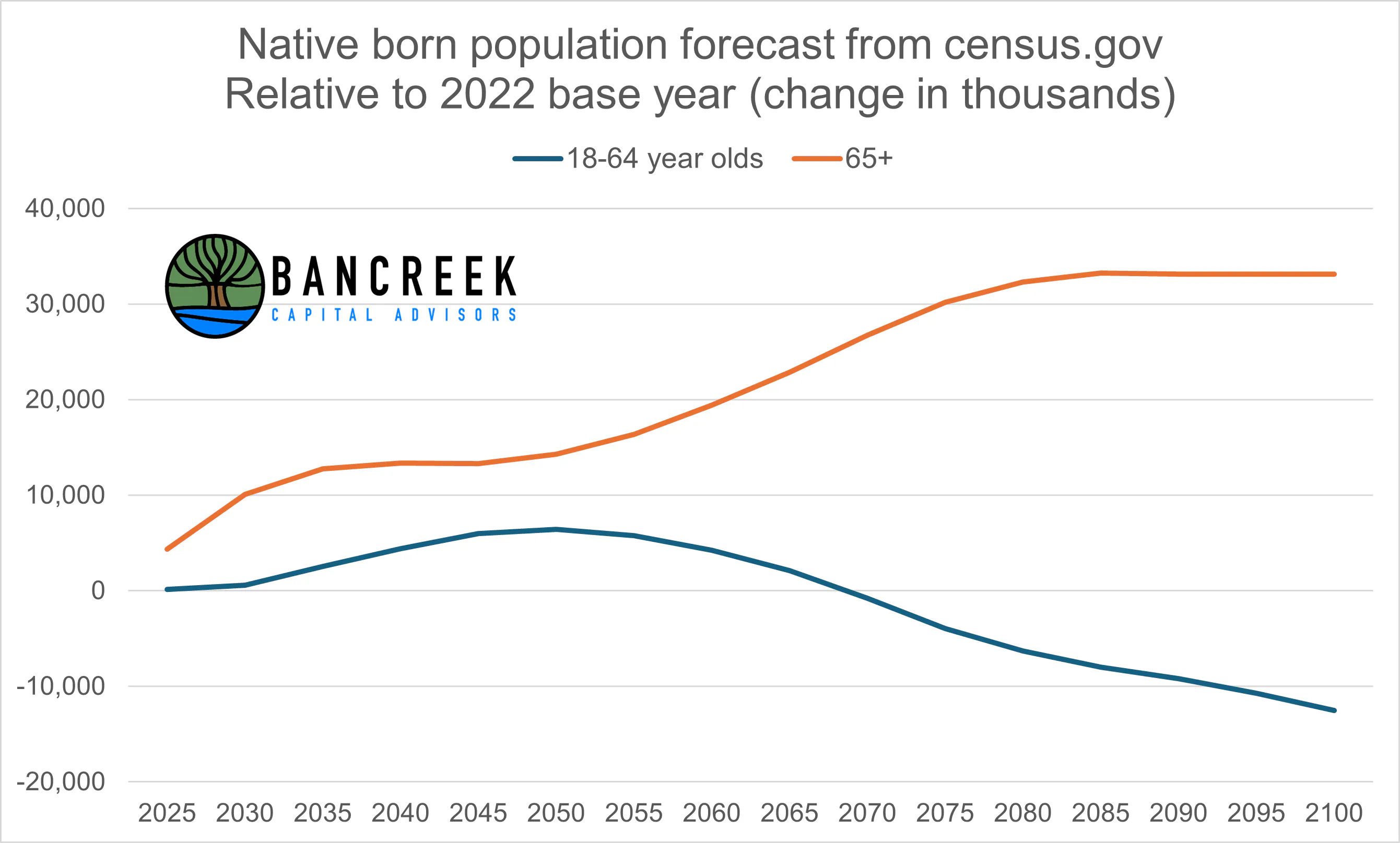
Unfortunately, the ageing of the American population is just getting started. Census.gov makes this very easy to see. Simply click on this link, and download "Table 9: Projected Native born Population for Selected Age Groups." We've collected this data in the following chart for you. The chart below shows the change in the projected Native born population for two age groups: 18-64 and 65 and older versus the actual 2022 population for these groups. This chart clearly shows that our own government (the same government that is now enacting anti-immigration policies) is telling us to expect very little growth in 18-64 (i.e., working age) Native born Americans over the next 25 years, after which they expect this demographic to contract. Meanwhile, they also expect the U.S. to add over 30 million Native born 65+ year-olds over the next 50-years.
Source: Bancreek Capital Advisors, LLC of data from census.gov
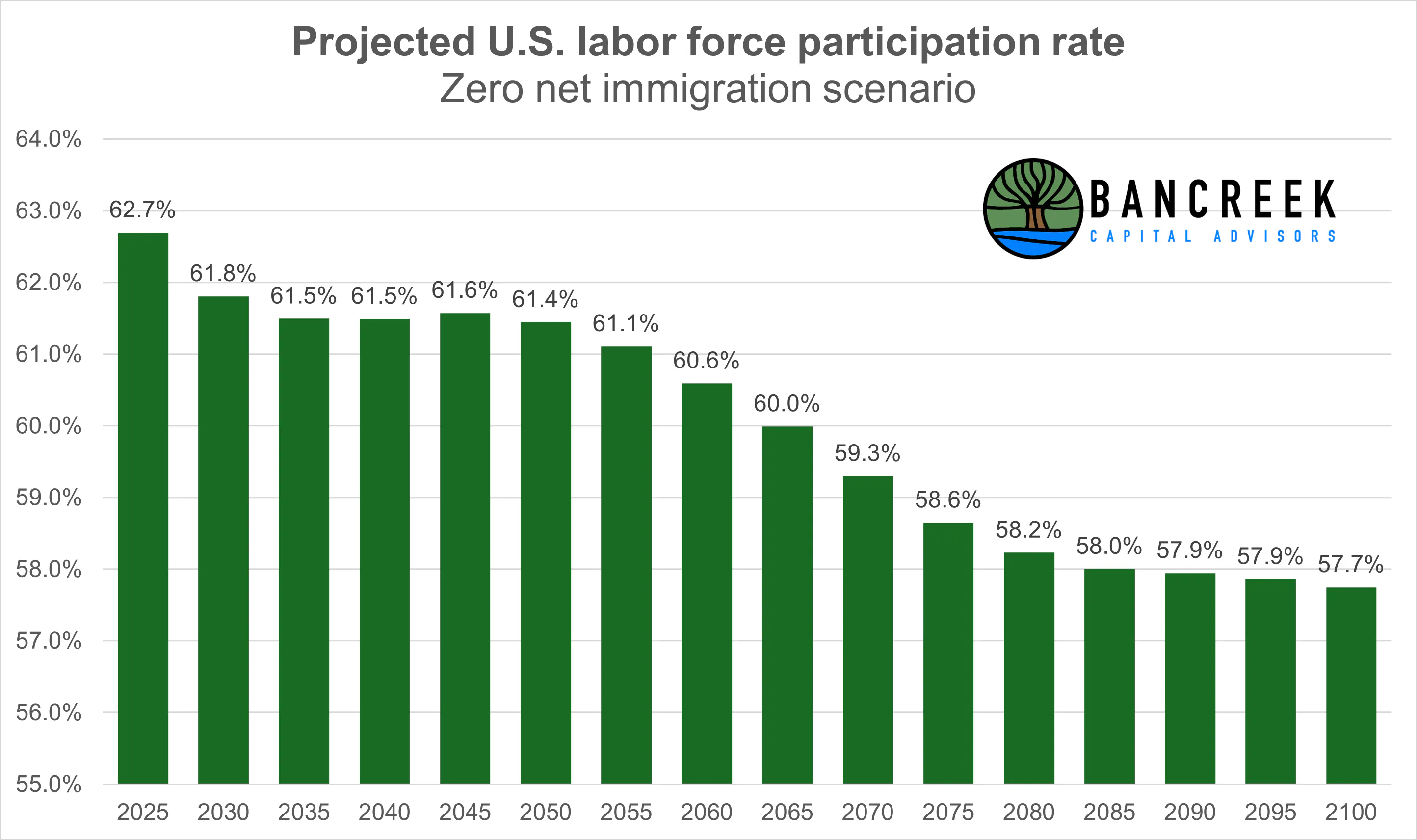
With this information, we can now perform a hypothetical thought experiment. If we completely shut off the immigration spicket for the next 75 years, what would happen to labor force participation rate, assuming no change in the labor force participation rates of any individual age group going forward? The below chart shows the result of this back-of-the-envelope math exercise. We simply have a "weighted average" problem. The more growth that comes from the 65+ group, the lower our overall participation rate will go, and the tighter the labor supply will get. Note that we are assuming no change to the Foreign born population and workforce post-2025 in this exercise. If we deport working immigrants, the numbers could end up being even worse than modeled below.
Source: Bancreek Capital Advisors, LLC
We'll close this section by stressing that this entire dynamic is as structural as it gets. We appear to have avoided structural upward pressure on inflation that comes from a stagnant labor supply thanks to the influx of immigrants over the past two decades. But as the Statue of Liberty reminds us, the U.S. has always been a nation of immigrants. One could argue, this may be one of the core elements of the U.S. business model that has enabled our global economic dominance over the past century.
But times are changing. The data shows that we have two options. We either need to do a complete 180 and embrace immigrants with open arms (even more so than we have in the past) or start rethinking the concept of retirement, and dramatically boost the labor force participation rate of the 65+ year-old U.S. born demographic. If both of those options sound unlikely, we sadly see no way to avoid long-term structural inflation pressures due to the tightening of the U.S. labor supply.
Are we setting the stage for structurally lower jobs AND structurally higher inflation?
Yes.
As much as making healthcare more fair and equitable is the right thing to do, as we covered in depth in this report, any broad policy shocks to the system are likely to put downward risk on healthcare jobs. Given how reliant we have become on healthcare jobs, this has the potential to put structural downward pressure on the entire job market.
Meanwhile, the potential fallout of the current war on immigration reminds us of the quote by Warren Buffet, "It's only when the tide goes out that you discover who's been swimming naked." Immigration has for at least the last 20-years created a "high tide" economic environment for the U.S., providing healthy tailwinds for labor supply growth and coinciding with a period of unprecedented wealth generation. But the tide now appears to be going out, not just due to normal fluctuations in the economic cycle, but because politicians are yanking the "stopper" out of the "drain." We'll see if the U.S. remembered to bring its bathing suit or not pretty quickly as census.gov projects our country to add 5.7 million Native born 65+ year-olds between 2025 and 2030 - the largest increase to this demographic expected over any five-year time period through 2100.
Focus on the data
We’ll close by addressing the core takeaway: this report is about data. Everything presented here is drawn directly from the U.S. government’s own numbers - still among the most reliable and comprehensive sources available to analysts. The data on immigration’s impact on the U.S. labor supply over the past two decades is powerful, and it tells a story that investors cannot afford to ignore.
At Bancreek, our business is investing, specifically the long-term compounding of capital. To succeed at this game, we must study topics that shape economic reality, even when they may be politically charged. Immigration is one of those topics, and the data is sending a clear warning signal for investors.
Our approach is simple: strip away the narratives, focus on the numbers, and understand what those numbers mean for markets and portfolios. The data doesn’t care about ideology, and neither should our investment decisions.
Best we all pay attention.
Enjoying this post?
Tell others about it.

Bancreek's Actively Managed ETFs
If you are interested in learning more about Bancreek Capital Advisors' actively managed ETFs click the link below
Learn MoreMore articles like this
Fetching Related Posts
There are no other articles tagged with Research