
The U.S. Job Market's Star Player Finally Had an Off Game

Eric Pachman
Published
March 6th 2026
Eric Pachman
Published
March 6th 2026
This morning, the Bureau of Labor Statistics released its Employment Situation report for February 2026. In it, we learned that total nonfarm payroll employment "edged down" by -92,000 jobs in February.
Healthcare's off month
We've been talking about the U.S. job market's over-reliance on healthcare for almost two years now. And it's only gotten worse, reaching a level we could have never envisioned when we started exploring this concerning concentration risk. It was just a matter of time before Healthcare and social assistance took a month off. This month, Team USA's superstar had an off game, shedding -18.6k jobs. It was not the only "player" that didn't show up this month. If you use our data visualization to flip back over time and look at the non-healthcare industries, they have all let us down for many months now. The only difference in February was they didn't have Healthcare and social assistance pounding the offensive glass, rebounding their bricks, and dunking with authority.
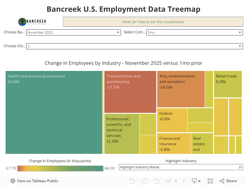
Here's what's most interesting in this report.
If you strip out Healthcare and social assistance, all other industries shed -73k jobs.
This may sound like a lot, but it's not much different from the number of jobs these industries lost over the past year.
Let's check the tape.
Through January 2026, Healthcare and social assistance added 744k jobs over the past year. You can see this easily using the visualization when you change the base period to "January 2026" and the comparison period to "1yr."
Now change the Display Level to "0." What number do you see? 290k jobs. That's all the total nonfarm payrolls we added over the same period.
So, divide 744k by 290k and you'll find that Healthcare and social assistance was responsible for creating 256% of all new jobs over the past year. Two years ago, we were concerned when we saw this ratio approach 60%!
Now, subtract 744k from 290k and you'll find that all other industries lost -454k jobs over the past year. Divide that by 12 and that's -38k jobs per month.
Read the fine print
It's true that this month's -73k non-healthcare job loss is higher than -38k non-healthcare jobs lost on average over the prior 12-months through January. But we need to drill deeper to understand if these numbers are statistically different. And when we read the fine print of the BLS's monthly releases, we walk away with the answer that they are not.
Here's a paragraph buried in the fine print of the BLS' Employment situation report:
"...the confidence interval for the monthly change in total nonfarm employment from the establishment survey is on the order of plus or minus 122,000. Suppose the estimate of nonfarm employment increases by 50,000 from one month to the next. The 90-percent confidence interval on the monthly change would range from -72,000 to +172,000 (50,000 +/- 122,000). These figures do not mean that the sample results are off by these magnitudes, but rather that there is about a 90-percent chance that the true over-the-month change lies within this interval."
To translate, this means that if the BLS repeated the survey they just conducted to arrive at the -92,000 job loss for February 2026, nine times out of 10 the month-to-month change would be between -214,000 and 30,000.
At this level of detail, the headline figure becomes more of a distraction than a definitive metric. It highlights a clear gap between the precision of the data and the market's broader reaction to a single absolute number.
But, understanding the statistical error also tells you how "bad" today's MoM change was. Note that the upper end of the confidence interval (+30,000) still missed consensus (+55,000). In other words, they could have repeated this survey ten times, and on nine of them still missed consensus.
On the flip side, they could have repeated this survey and very easily found that we didn't lose -92,000 jobs, but instead we lost -192,000 jobs. We just don't know, and we won't know until they rebase and retune their model early next year to the QCEW (i.e., unemployment insurance) data.
Response rate blues
Why is the confidence interval so wide? If we had to choose one main culprit it would be the small and declining size of the BLS's sample.
In the technical note in today's Employment Situation Report, the BLS stated:
"The active sample includes approximately 26 percent of all nonfarm payroll jobs."
Not bad... but of course, not everyone responds to voluntary surveys. It turns out that the survey response rate as of March 2025 was 42.6%, down from 61% in May 2015.
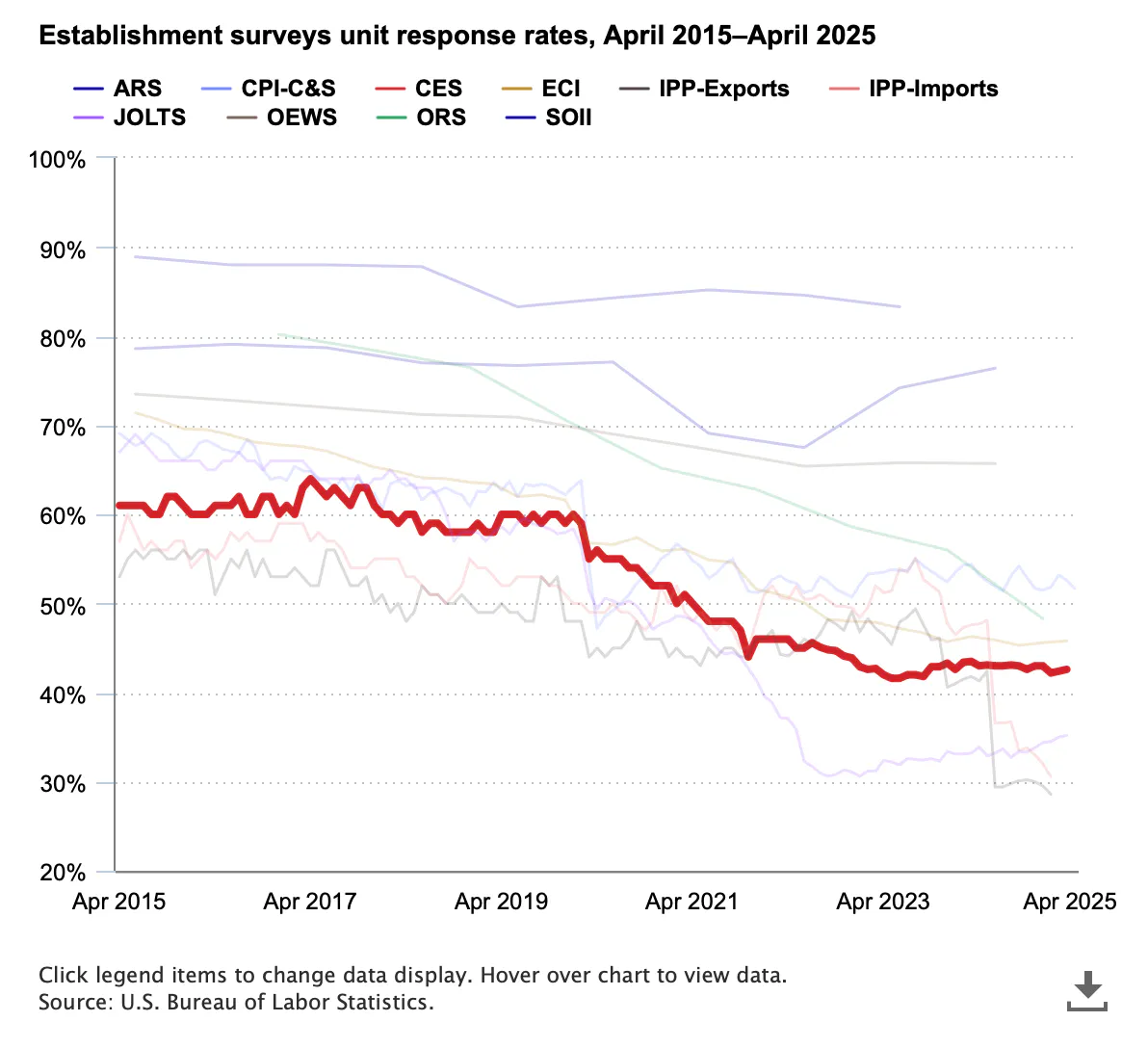
Source: bls.gov
So, if their survey covers 26% of employees, and they get a 42.6% response rate, their survey really only covers 11% of employees. Thus, we have a very wide confidence interval.
We are not the first to point out the limitation of this survey. But for some reason, the +/- 122,000 "confidence interval" remains largely unknown to market participants. And this large error is what manifests from extrapolating a small sample size. Maybe people don't talk about this because the far more precise revisions don't seem to impact the market as much as the latest single point estimate.
How much gasoline inflation could we see in March?
Before we let you go, we figured we would give you a rule of thumb to file in the back of your mind to know how much gasoline inflation to expect when March 2026 CPI is released. As a reminder, the correlation between the YoY change in average AAA retail prices and the YoY change in the CPI gasoline item is nearly perfect (R2 = 0.9979). We wrote about this back in August 2024, and started to use this knowledge to forecast CPI one month out once AAA gasoline retail prices were locked for the month.
That said, here is the math to keep in mind.
In January 2025, our data visualization shows that the gasoline CPI item declined by -7.5% YoY and had a relative importance (i.e., "weight") of 2.94%. To get the weighted inflation impact, we multiply these two numbers and arrive at -22 basis points. This means that YoY gasoline deflation lowered January CPI by -22 basis points. So, without any gasoline deflation, overall CPI-U would have been 2.61% instead of 2.39%.
Let's now turn to March.
First off, March 2025 gasoline prices averaged $3.11 per gallon. As of March 5, 2026 they are $3.32 per gallon. If they somehow just stayed at $3.32 per gallon for the rest of the month, March 2026 would average out to be $3.30 per gallon, which would be 6.0% inflation YoY. Apply the same relative importance to this unweighted inflation and you get a weighted inflation impact of +18 basis points.
So, in this scenario, not only do we have to unwind the deflation benefit from January, but we have to add an inflation "penalty" to March of 18 bps. That would lift March CPI to 2.79%.
Of course this assumes that gasoline prices don't surge further, which seems like a silly assumption given that they have popped over $0.30 per gallon in just a few days. So, what if March 2026 average gasoline prices are higher than $3.30? The highlighted box below shows what CPI-U would be (all else equal) at different average gasoline prices for March 2026.
- $3.40 per gallon = 2.88% CPI-U
- $3.50 per gallon = 2.97% CPI-U
- $3.60 per gallon = 3.07% CPI-U
- $4.00 per gallon = 3.45% CPI-U
So, for each 10 cents on gasoline prices, expect an additional 10 basis points of inflation.
Note that we included the last $4 scenario because we are in uncharted territory now - right in the middle of a tail risk playing out in front of our eyes. It's wise to be prepared for any scenario, even if they may seem extreme.
Good luck out there! As always, don't hesitate to reach out with any questions.
Enjoying this post?
Tell others about it.

Bancreek's Actively Managed ETFs
If you are interested in learning more about Bancreek Capital Advisors' actively managed ETFs click the link below
Learn MoreMore articles like this
Fetching Related Posts
There are no other articles tagged with Research