
A new way to analyze and understand inflation in the United States

Eric Pachman
Published
February 13th 2024
Updated
June 12th 2024
Key Takeaways
- Inflation expectations have dominated the macro debate since prices started to surge post-COVID.
- The attention looks very well deserved when we study the latest surge in inflation within the context of multiple historical periods.
- Despite all the attention inflation has received, we believe there is a dearth of informational tools to help investors and the general public understand the true drivers of inflation over time.
- To address this unmet need, Bancreek released its inaugural visualization, the Bancreek Inflation Visualizer, a Tableau-based data visualization that allows the user to quickly identify the key components that are impacting inflation each month.
- We used this new tool to discover that just three items (out of 179) – Owners equivalents of rent, rentals of primary residences, and motor vehicle insurance – were responsible for more than 75% of all December 2023 inflation.
- We calculated that if these three items had been at their historical average in December 2023, headline inflation would have been just 1.9%. If we include adjustments to health insurance in this analysis (which was an outlier on the deflationary side of the ledger in December 2023) headline inflation would have been 2.1%.
Unless you have been living underneath a rock these last few years, you've probably noticed that inflation is having a moment right now. If you're an equity investor, inflation expectations, and speculation on the resulting actions the Fed may or may not take to get inflation back under control, has completely dominated the macro picture since prices started to surge coming out of COVID. But this is not just an investor problem. It's become an everyone problem, so much so that perceptions of inflation, and its impact on economic prospects could influence the outcome of our next presidential election.
Historical perspective
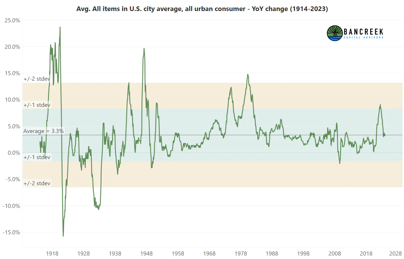
In our view, inflation is quite deserving of all the notoriety it's gained in recent years. Just look at the following chart, which shows inflation from 1914 through 2023.
Source: Bancreek Capital Advisors, LLC analysis of bls.gov data
We have two takeaways from this chart. First, this chart gives us a whole lot more respect for our grandparents, and all other Americans that lived through the growing pains that were the first part of the 20th century. That was a seriously wild ride characterized by significant price instability. Our second takeaway, which is much more relevant for this post, is the tail end of this chart, which shows the spike in prices through which we just lived. This provides some context to show you that this recent bout of inflation was no joke. First off, as the chart shows, the recent cyclical peak of 9.1% in June 2022 was a more than one standard deviation event. That may not get your attention, but again, this dataset includes the insane volatility of the first half of the 20th century. So, this tells us that even with that craziness as context, June 2022 was still deserving of attention.
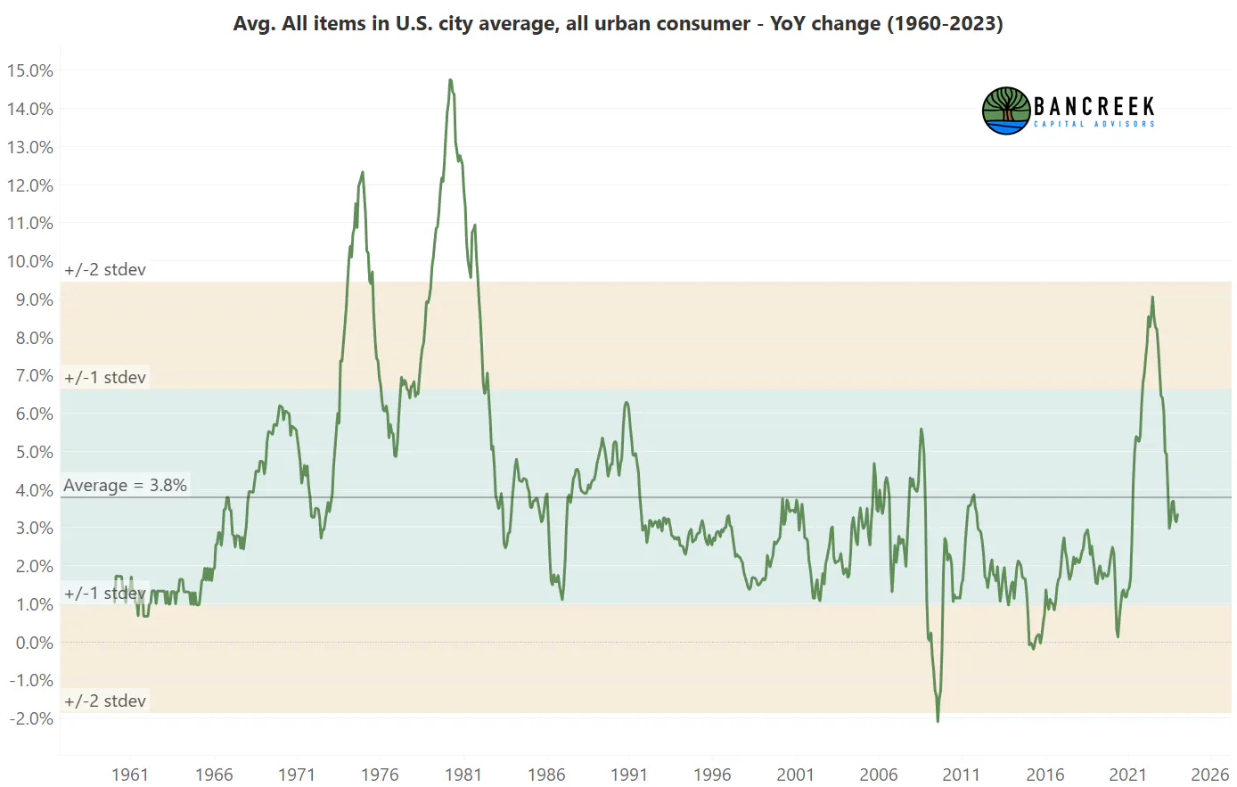
Let's say you believe the first half of the twentieth century is no longer representative of your price stability expectations today. If we drop this data out and start the series when inflation became more subdued in the early 1960s, here is the chart you get instead:
Source: Bancreek Capital Advisors, LLC analysis of bls.gov data
Over this period, June 2022 was nearly a two standard deviation event.
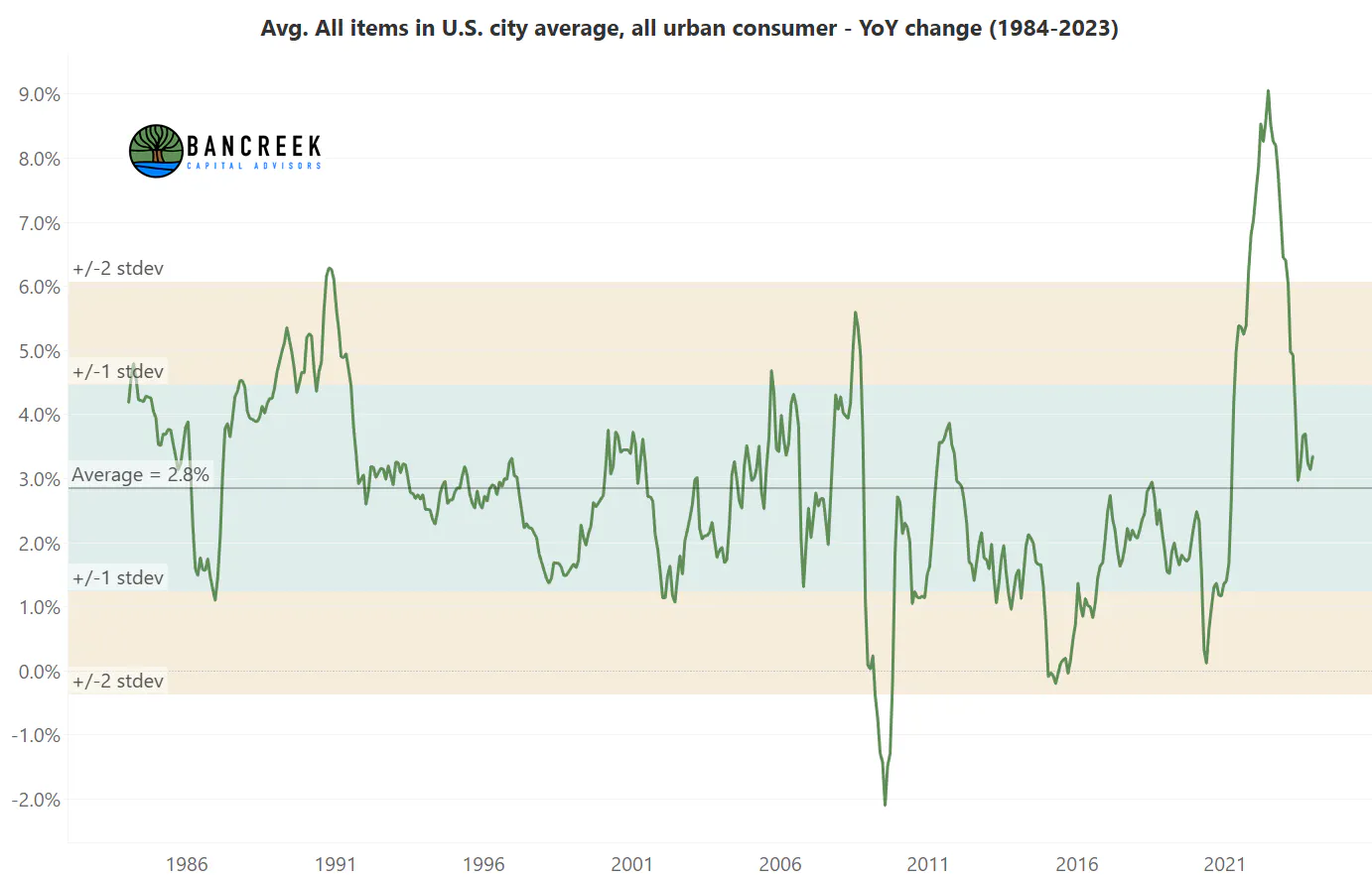
We can take this thought exercise even further. What if you just care about our lived experience? It's sobering to step back and realize that unless you are 50 or older, you probably don't even have memory of time when there was serious inflation in this country. Census data tells us that 64% of Americans were 49 or younger in 2022, and thus never experienced (at an age old enough to remember it) a true inflationary environment. This means that most of us don't recall what it felt like to experience inflation of the 1980s. So, let's now begin the chart where most of our collective memory starts:
Source: Bancreek Capital Advisors, LLC analysis of bls.gov data
This is the modern era time horizon that, in our view, represents most of the country's lived experience. And within context of just this more recent period, June 2022 was nearly a four standard deviation event, meaning it should occur roughly twice in a lifetime! So, it makes sense that inflation has captured the world's attention.
The devil is in the details
With so much attention on this one number, we found it a bit surprising that there aren't better tools to help us understand what's going on underneath the hood. Each month there will be a plethora of news releases telling us what went up and down, calling attention to select items to highlight both some of the drivers of the move and to create a connection with the reader. But this is a tricky proposition because any article you read ultimately must end (as unlike our blog posts, they usually have word limits) and you may be left with unanswered questions.
Airline fares and auto insurance
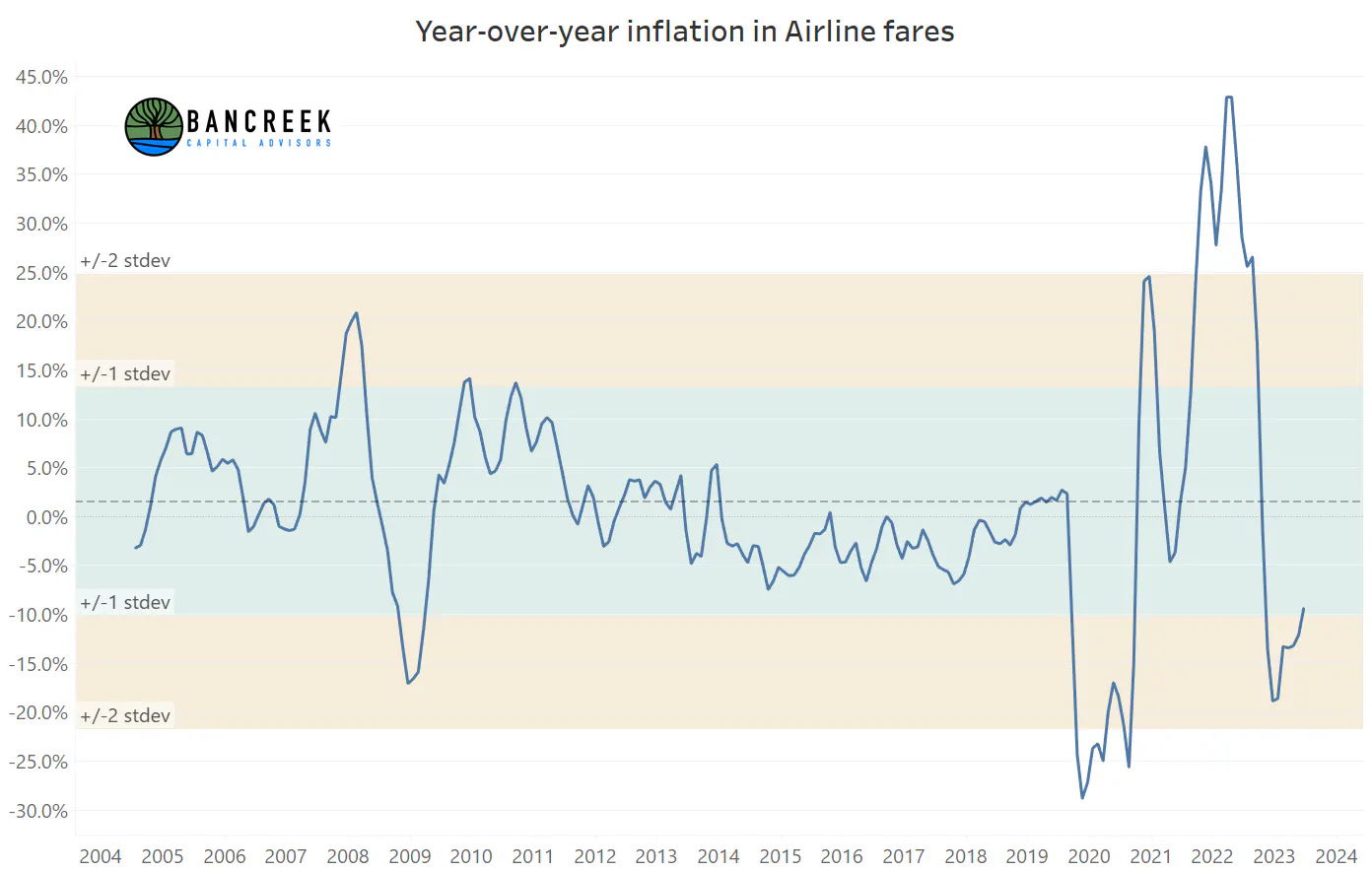
For example, we've noticed that air fare tends to get a lot of attention, which makes sense because air fare prices are highly visible to consumers. So, it makes sense that a headline that air fare prices are up or down 15-20% may get some eyeballs, as it should if you are a frequent traveler that has disproportionate exposure to this one category. But if you are just concerned about overall inflation, and how meaningful air fare is, this coverage is not as helpful for two reasons. First, air fare currently comprises just 0.59% of overall inflation – there are 27 other items that are larger than this to worry about. Second, the standard deviation of air fare inflation dating back to 2005 is a staggering 11.6%. Meanwhile, the mean inflation over this period is a very tame 1.5%. If this historical relationship holds, this means that we should just expect two-thirds of all airfare inflation prints going forward to come in somewhere between -10.1% and 13.1%. Wild swings appear to be fairly normal for this category, and therefore for those seeking the true drivers of inflation on a month-to-month basis, not super helpful.
Source: Bancreek Capital Advisors, LLC analysis of bls.gov data
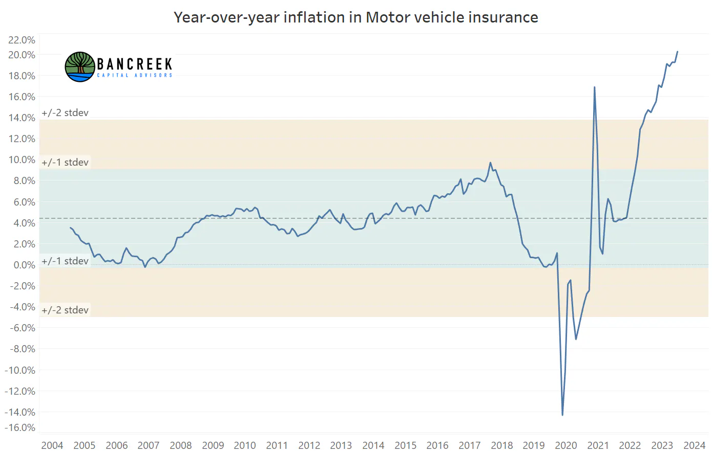
Now consider motor vehicle insurance. The unprecedented inflation in this category has been getting more press in recent months. But let's put what's going on here into content with the same metrics we reported for air fares. Historical average motor vehicle insurance has been 4.4% going back to 2005, with a standard deviation of 4.7%. That means we should expect two-thirds of the data to come in between -0.3% and 9.1%. With that as context, December 2023 motor vehicle insurance inflation was 20.3% - a greater than three standard deviation event! To make matters worse, motor vehicle insurance comprises 2.51% of all inflation, making it nearly five times more important to inflation watchers than air fare. Overall, we estimate that this single item contributed 0.51 points to inflation in December 2023. In other words, if there was no inflation in this single item last month's inflation would have been 2.9% rather than 3.4%.
Source: Bancreek Capital Advisors, LLC analysis of bls.gov data
The point here is that the BLS makes all this data readily available to perform this analysis through text files they publish monthly on their site. To be fair, it's not quite in a plug and play format to make it come to life and readily ooze insights. It takes a lot of data work to do that. But with how critical this one metric is nowadays, and our general love for creating challenging data visualizations, we felt we should at least give it the old college try.
Introducing the Bancreek Inflation Visualizer
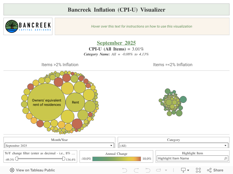
That said, we're thrilled to release our first data visualization – the Bancreek Inflation Visualizer. This tool is designed to visualize the individual items that comprise overall inflation each month, and more importantly, quickly assess how impactful each item was on overall inflation in the selected month. We'll give you a brief tour of how to use the visualization here but would urge those readers that are looking for more information on how we created this tool to read our detailed methodology post.
Visualizing item-level drivers of inflation
First things first, overall inflation is comprised of what the BLS calls "items codes" (which we'll refer to as "items" going forward). Items are categories such as "gardening and lawncare services" and "nonelectric cookware and tableware." Overall, there are 400 of these items, but over half are groupings of other items. So, our first task was to comb through all the items and select only the most granular items that summed to 100%. This process left us with 179 different unique items that together comprise inflation. We then displayed each one of these items as a bubble on the visualization and grouped them by those items that experience over 2% inflation in the chosen month versus those that inflated at 2% or below in the month. Why 2%? That's the Fed's stated inflation target, so we figured that was as good of a dividing line as any.
That brings us to the size of the bubble, which we think is arguably the most helpful part of the visualization. The size corresponds to our estimate of how much inflation each item added in one month. You can also think of this as a weighted inflation estimate, which differs from the unweighted inflation numbers that are reported widely each month. We'd argue that for inflation watchers, weighted inflation is far more important than unweighted, as it really gets to the heart of what is driving overall inflation. In other words, if we're looking at weighted inflation only, we don't get distracted by air fares but immediately are laser focused on motor vehicle insurance, as again, it is five times more important than air fare inflation. Of course, it's still good to know unweighted inflation, which is what the traffic light color scheme we used to shade the bubbles signals for you.
But that's not all! Remember, we also need historical context to understand how rare a given pricing move may or may not be. To get this information, just hover over any item bubble and a "tooltip" will appear that gives you some stats for the month, along with historical stats so you can put the current month's move in context.
Using the Bancreek Inflation Visualizer – a study of June 2022 and December 2023
With the functionality discussion out of the way, let's start using the tool to see what we can glean from the data.
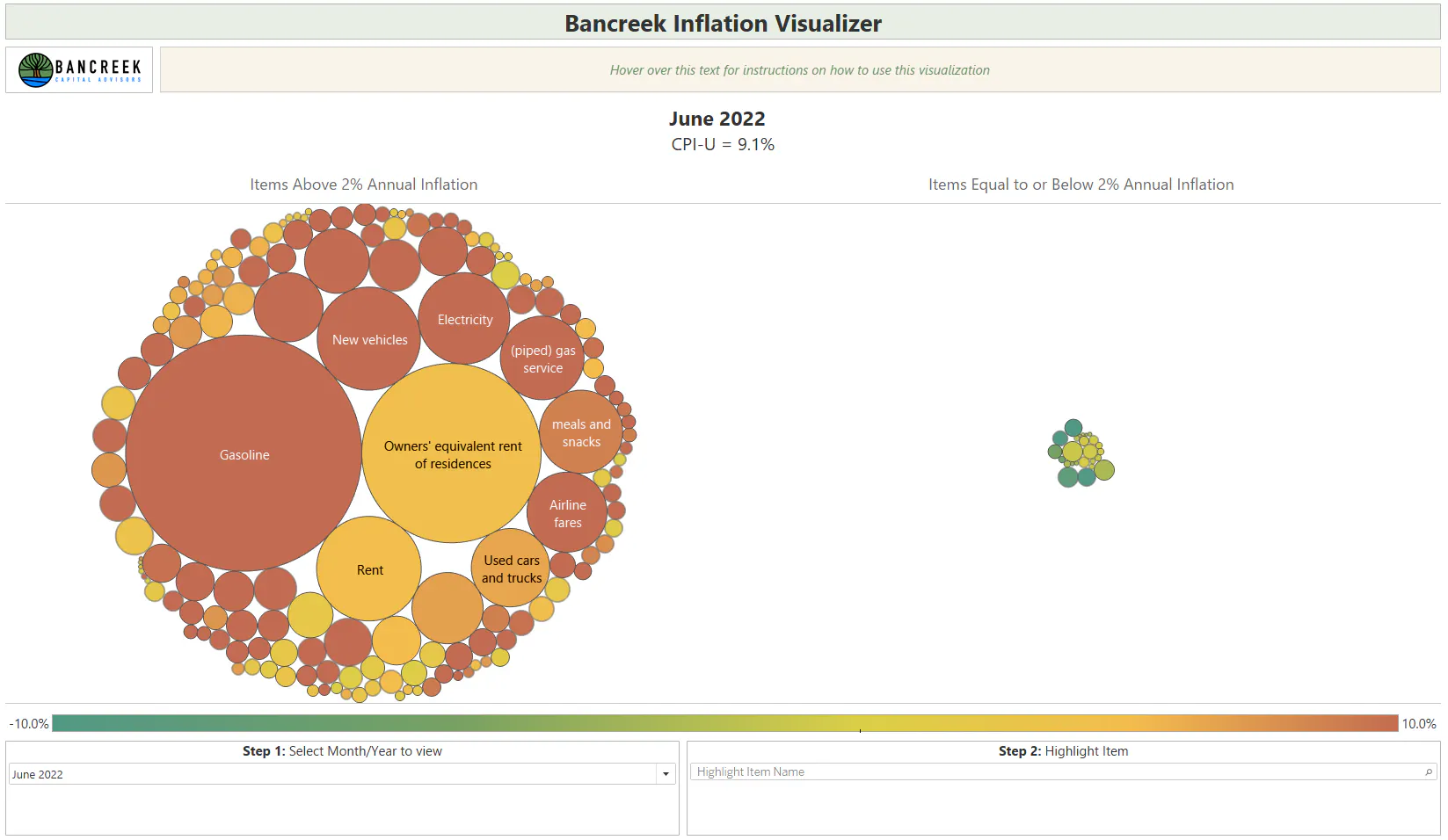
First off, let's go back in time a few years to the height of inflation panic – June 2022, when headline inflation peaked at 9.1%. When we select this month within the tool, we see this image:
Source: Bancreek Capital Advisors, LLC
Two things immediately jump out at us from the above image. First, nearly all the bubbles are on the left side. To be precise, 85% of all items inflated at 2% or more this month. Second, a whole lot of those bubbles look dark red, don't they? As you'll see in the legend, dark red signifies ~10% inflation or more. It turns out that 34% of all items inflated at 10% or more in June 2022. This suggests that inflation was quite widespread back in summer 2022. We can quantify this as well by looking at the amount of inflation contributed to the total by the top 10 largest items. In June 2022, the top 10 largest items were responsible for 5.5 points of total 9.1% headline inflation. That's 61% of inflation driven by the top 10 items.
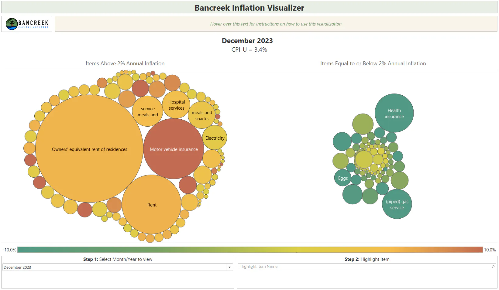
This may seem like a lot until you fast forward the dashboard to December 2023 (image shown below). When we do this same calculation for December 2023, we find that the top 10 items were responsible for 87% of all inflation (3.0 points out of 3.4% headline inflation). While you can't glean this number directly from the dashboard, it should intuitively make sense that its higher given that we are now left with only three large bubbles on the left side of the ledger and have many more bubbles back on the right side of the ledger. In fact, we calculate that only 51% of items inflated at more than 2% in December 2023, while just 5% inflated at more than 10%.
Source: Bancreek Capital Advisors, LLC
The contrast gets even more stark when we normalize each item for its normal volatility when using its mean and standard deviation. In other words, how many items in each month were way beyond where they "should" be given just typical month-to-month volatility. We found that in June 2022, 65% of items were more than one standard deviation above the mean while 34% of all items were two standard deviations above their mean. Fast forward to December 2023 and these numbers dropped to just 20% and 6%, respectively.
While these stats may be new to folks, the takeaway message shouldn't come as a surprise to inflation watchers – inflation has gotten considerably better over the past 18-months and, for most items, is back to where we should expect it to be based on the last two decades of data. But there are still a few sticky wickets in the data, which should be readily apparent in the visualization (hint – they are the huge bubbles on the left side). The three main drivers of inflation in December were:
- Owners' equivalent rent of residences ("OER") – a proxy for how much a homeowner would receive in rent for their property.
- Rent of residences ("Rents")
- Motor vehicle insurance
Taken together, these three items were responsible for a staggering 2.6 points of the 3.4% headline inflation print.
Congratulations we've returned to ~ 2% inflation… if it weren't for three stubborn items
One of the neat (at least we think it's neat) things we can do with the data from our tool is some scenario analysis. We should note that all three of these items are abnormally high relative to where they have been over the past two decades. OER and rents are right around two standard deviations above their two-decade mean, while motor vehicle insurance is 3.4 standard deviations above its mean. So, we were curious, what would inflation be now, if we could get these three categories to more normal levels of inflation? It turns out that if all three had been at their two-decade average last month that would have reduced headline inflation to 1.9%, right in line with the Fed's 2% target. To be fair, if you looked at the right size of the visualization, you may have noticed that the BLS' YoY measurement of health insurance inflation is wildly deflationary now (we calculate health insurance deflation in December 2023 was a three standard deviation event), which has an offsetting effect on OER, rent, and auto insurance. If we also adjust health insurance to its historical mean, that brings our 1.9% up to 2.2%. Regardless, we imagine a print of 2.1% in December 2023 would have elicited a very different response than did the actual 3.4%.
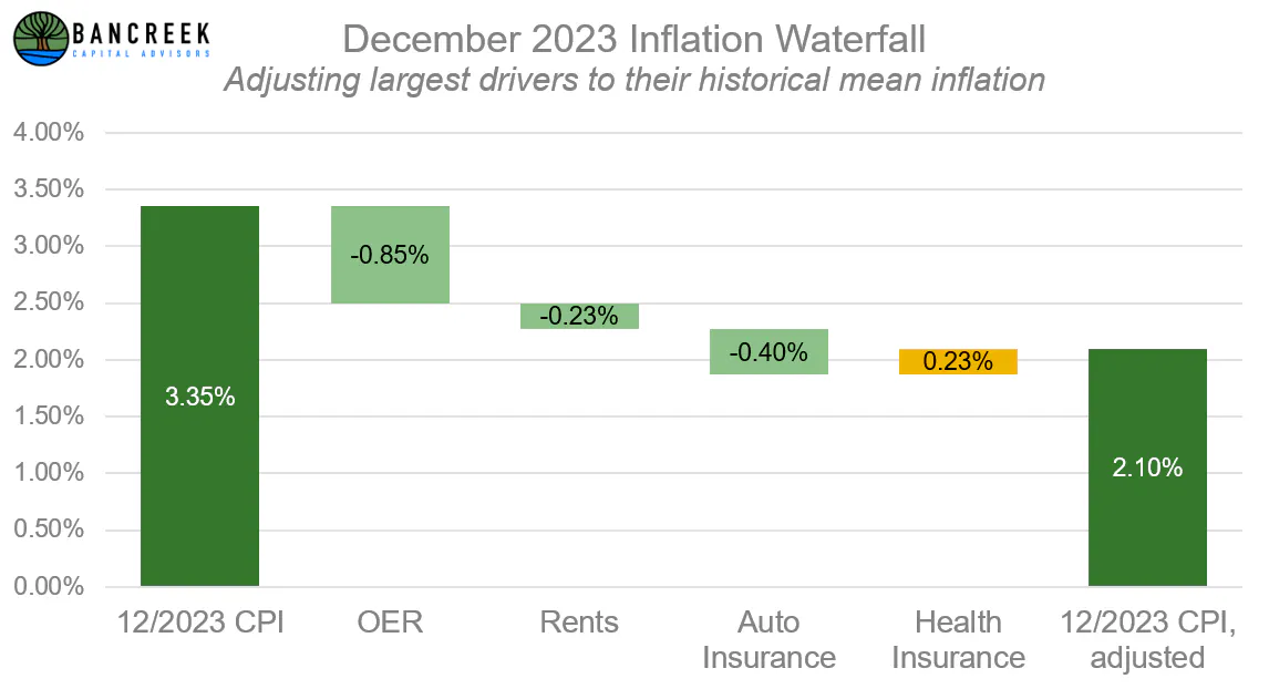
Source: Bancreek Capital Advisors, LLC
Another point to consider on our journey back to the Fed's targeted 2% inflation goal is how likely it is to achieve and maintain a 2% inflation level. To get a sense of this, we once again consulted the data and found (as shown in the figured below) that the U.S. has only been able to achieve 2% or lower inflation (importantly, in a non-recessionary period) 30% of the time dating back to 1984. In other words, if our wrestling match with inflation over the next 40 years looks anything like the prior 40 years, prospectively nailing a 2% average is going to be a heavy lift.
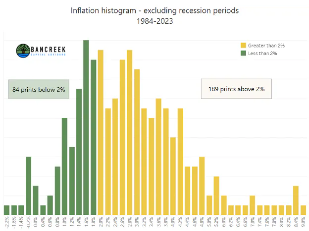
Source: Bancreek Capital Advisors, LLC analysis of bls.gov and fred.stlouisfed.org data
If your only tool is a hammer, every problem looks like a nail
We will close with a question that is on our minds, that may be on yours now too if you have stayed with us to this point in the report. Does the Fed's decision to hold rates, increase them, or decrease them, have any direct bearing on the three items that are currently driving the preponderance of inflation? Each of these three items has their own unique dynamics influencing pricing movements, and the Fed's positioning on rates is, in our minds, just not even close to the top of the list in influencing near-term movements in any of them. To us, the Fed's rate lever is akin to a giant hammer. When two-thirds of all items are inflating at rates beyond what we would expect, of course, bring out the hammer and swing it with force! But the data now clearly shows the hammer has done its job, and now we are down to the point of fine tune precision work in just a couple markets, which sadly, the Fed just doesn't have a tool to influence. But as the saying goes, "if your only tool is a hammer then every problem looks like a nail." And so, we all tune in each month with bated breath to see what the Fed is going to do with rates to ease inflation down to 2% (or more likely, based on the data, some number in the mid-2s) forever more, knowing that the decision may not actually have much impact on targeting and fixing the very few remaining bad apples.
Investing in structurally advantaged businesses
If anything, this work has just strengthened our resolve in our investment thesis – structurally advantaged businesses are likely to be the best places to be in an inflationary world. This isn't a new idea by any means, but it's one we think has become even more pressing with the bifurcation in market valuations that we have seen over the past few years.
We hope you've enjoyed this deep dive into inflation analysis. As always, if you have any questions or comments on any of the material presented, don't hesitate to reach out to us directly. We're always happy to discuss our work with readers.
DISCLOSURES
Any discussion of specific securities in this report is for illustrative purposes only and should not be used or construed as an offer to sell, a solicitation of an offer to buy, or a recommendation for any security or investment.
Enjoying this post?
Tell others about it.

Bancreek's Actively Managed ETFs
If you are interested in learning more about Bancreek Capital Advisors' actively managed ETFs click the link below
Learn MoreMore articles like this
Fetching Related Posts
There are no other articles tagged with Research