
Key takeaways from the January 2025 Personal Consumption Expenditures release

Eric Pachman
Published
February 28th 2025
Eric Pachman
Published
February 28th 2025
January 2025 year-over-year PCE eases by nine basis points from last month
This morning the Bureau of Economic Analysis released January 2025 Personal Consumption Expenditures (PCE) data. Overall PCE was reported at 2.51% year-over-year (YoY) for January, down 9 basis points from 2.60% year-over-year last month. Meanwhile, core PCE declined to 2.65% in January 2025 from 2.86% in December 2024.
As a reminder, Bancreek publishes two visualizations that can help you explore PCE in granular detail. Both of these visualizations have now been updated through January 2025 and are embedded below:


This post hopefully will further assist in your analysis of the moving parts underlying this month’s PCE print. Its goal is not to provide a comprehensive analysis of the more than 180 items we track (that’s what the visualizations are for), but rather just to point to the most meaningful changes from one month to the next.
To perform this analysis, we track a measure we call “inflation impact,” which we calculate by multiplying each item’s YoY inflation by its weight in the prior year period. You can think of this as “weighted inflation” as opposed to the “unweighted inflation” that is more commonly reported by the media. Each month we take the weighted inflation of each item we track in PCE and then sum them up to overall PCE. Then we compare these weighted inflation numbers from one month to the next to see what drove the sequential increase or decrease. In this way, we can precisely identify the most significant drivers in the change in YoY PCE from one month to the next.
Broad-based core disinflation
As usual, we'll start this month's analysis with our "walk-across" chart (of sorts), whose goal is to explain how we got from last month's headline inflation print to this month's print. As mentioned in our rounding section, we have 9 fewer basis points of additional inflation to explain this month. Normally the following chart, which shows only those items whose weighted inflation impact changed by more than 1 basis point from last month to this month, sums up to right around the change in the headline number. Interestingly, this month it doesn't tie out, summing to 4 basis points of additional inflation versus the 9 basis points of lower inflation we actually saw in the data.
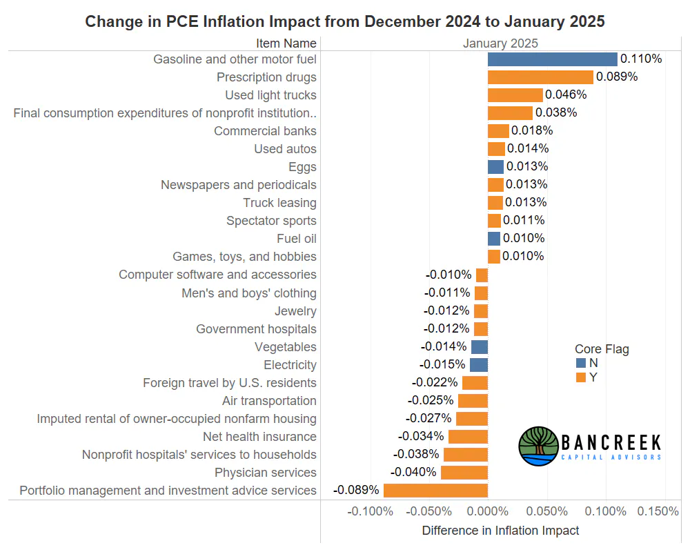
Source: Bancreek Capital Advisors, LLC
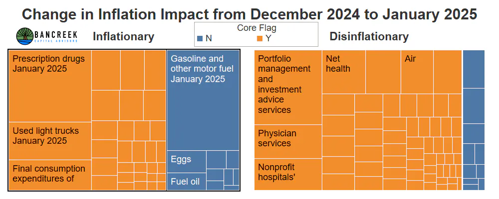
This month, the story lies in all of the very small changes to items that we normally are able to skim over as, up until now, they have largely cancelled each other out. This month, that wasn't the case, as we attempt to display in the next chart. This chart shows the same month-over-month change in inflation impact data, except for all mutually exclusive items we track in our visualization rather than only the largest movers. The items on the left are "inflationary," meaning their inflation impact rose from December to January, while the items on the right are "disinflationary," meaning their inflation impact declined from December to January. Lastly, core items are colored orange while food and energy items are colored blue.
Source: Bancreek Capital Advisors, LLC
Our main takeaway from the chart is that there are far more core items in the disinflationary section than there are in the inflationary section. To put some numbers to the chart, we count a total of 32 core "inflationary" items that together put 33 basis points of upward pressure on PCE, against 59 core "disinflationary" items that together shaved 51 basis points from PCE. Putting the two together does a much better job of explaining the pretty meaningful decline in core PCE from December 2024 to January 2025. In short, today's data release is a clear example of the devil truly being in the details.
Charting the big movers in January
That said, we still see value in exploring the big movers in a bit more detail, as more often than not in our experience, they will largely explain the change in headline and core PCE. As such, we think it's good for us to familiarize ourselves with these items. To that end, the following two chart galleries show the YoY inflation of the key PCE inflation impact movers. Note that the first chart gallery covers the key inflationary items, while the second gallery covers the disinflationary items. Also note that we lifted the below charts directly from our Bancreek Detailed PCE Item Analyzer. If you want to explore the entire BEA hierarchy, head over to this tool and that data is all there for your viewing pleasure. Lastly, note that the green series on the chart is the YoY inflation of the item, while the blue series shows the item's weight in PCE over time. When both are combined (like Voltron) you get "weighted inflation," or what we call "inflation impact."
Key inflationary items
Key disinflationary items
Threat of global trade war has destroyed any visibility on inflation
We used to close our monthly inflation updates with a scenario analysis, not necessarily to forecast where could be headed in the coming months, but to help educate our readers on the sensitivities of the coming inflation numbers to some of the key items. This exercise was quite helpful last year as most items were largely stabilizing, allowing us to tighten our focus on a few of the key drivers of inflation (e.g., shelter, autos, etc.).
But with the new year has come a new administration, which has very quickly blown up any hope of stability across the items. Tariffs (or at least the threat of tariffs) are now given out like Oprah gives out cars (although, if these auto tariffs are enacted, Oprah may not be able to be as generous going forward).
All kidding aside, the threat of applying tariffs to just about everything makes modeling inflation impossible as global trade impacts jut about every one of the items we track. We just can't even attempt to disaggregate the knock on effects of isolationism on each item, given that such polices have never existed in the data before (and note that our data goes back to 1990). We are truly entering unknown territory now, so all we can do is watch how it plays out. To that end, our tools may now be more valuable than ever, as they will allow you to quickly sift through all the data to see which items have been impacted and which ones have been spared by this grand policy experiment.
Enjoying this post?
Tell others about it.

Bancreek's Actively Managed ETFs
If you are interested in learning more about Bancreek Capital Advisors' actively managed ETFs click the link below
Learn MoreMore articles like this
Fetching Related Posts
There are no other articles tagged with Research