
July 2025 CPI: Step aside tariffs. Heath services inflation has arrived.

Eric Pachman
Published
August 12th 2025
Eric Pachman
Published
August 12th 2025
July 2025 year-over-year inflation (CPI) creeps up to 2.70%. Core CPI rises to 3.06%.
This morning the Bureau of Labor Statistics released the July 2025 US CPI report for All Urban Consumers (CPI-U). Overall CPI-U was reported at 2.70% year-over-year (YoY) for July, up three basis points from 2.67% YoY last month. Meanwhile, Core CPI-U (excluding food and energy) was reported at 3.06% YoY, up 12 basis points from 2.93% YoY last month.
As a reminder, Bancreek publishes two visualizations that can help you explore CPI-U in granular detail. Both of these visualizations have now been updated through July and are embedded below:
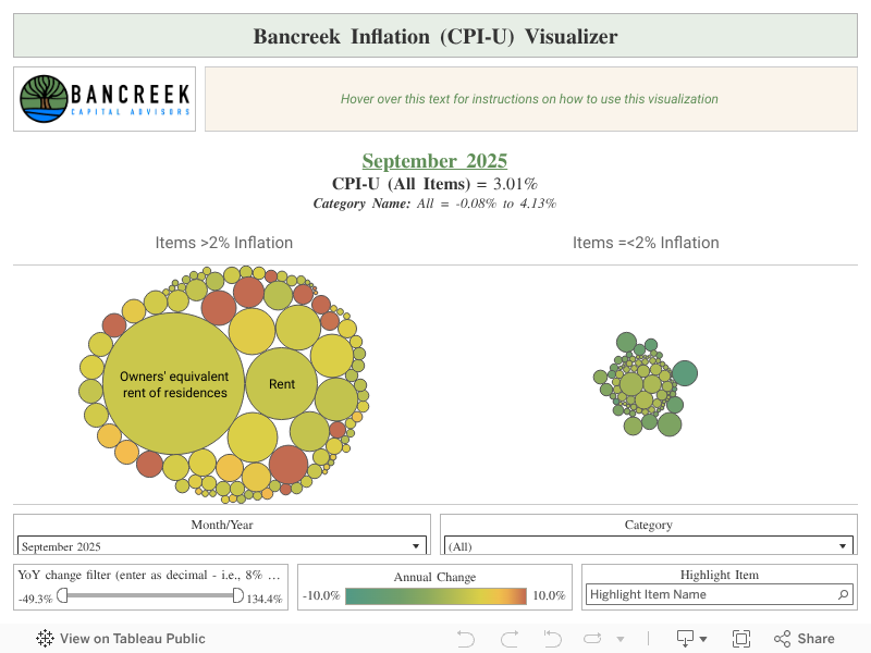
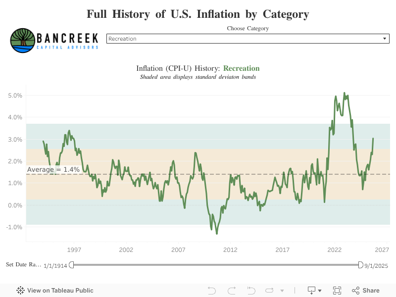
This post hopefully will further assist in your analysis of the moving parts underlying this month’s CPI report. Its goal is not to provide a comprehensive analysis of the nearly 180 items we track (that’s what the visualizations are for), but rather just to point to the most meaningful changes from one month to the next.
To perform this analysis, we track a measure we call “inflation impact,” which we calculate by multiplying each item’s YoY inflation by its weight in the prior year period. You can think of this as “weighted inflation” as opposed to the “unweighted inflation” that is more commonly reported by the media. Each month we take the weighted inflation of each item we track in CPI-U and then sum them up to overall CPI-U. Then we compare these weighted inflation numbers from one month to the next to see what drove the sequential increase or decrease. In this way, we can precisely identify the most significant drivers in the change in YoY CPI-U from one CPI report to the next.
Step aside tariffs. Health services inflation has arrived.
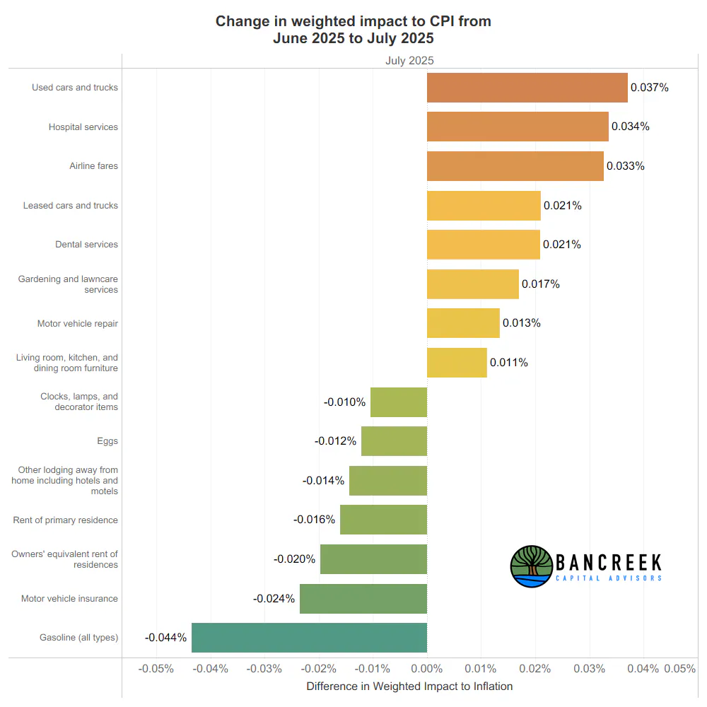
The following chart shows our "walk across" in weighted inflation from last month's 2.67% YoY headline CPI to this month's 2.70% YoY headline print. Note in this chart, we only show items that experienced a change in YoY weighted inflation +/- 1 basis points. If you diligently add up the impact of the items in the chart you'll see they sum to an increase of five basis points. That's pretty darn close to the three basis point increase in headline CPI, meaning this chart largely sums up the main drivers, on the margin, of inflation from June to July.
Source: Bancreek Capital Advisors, LLC analysis of data from bls.gov
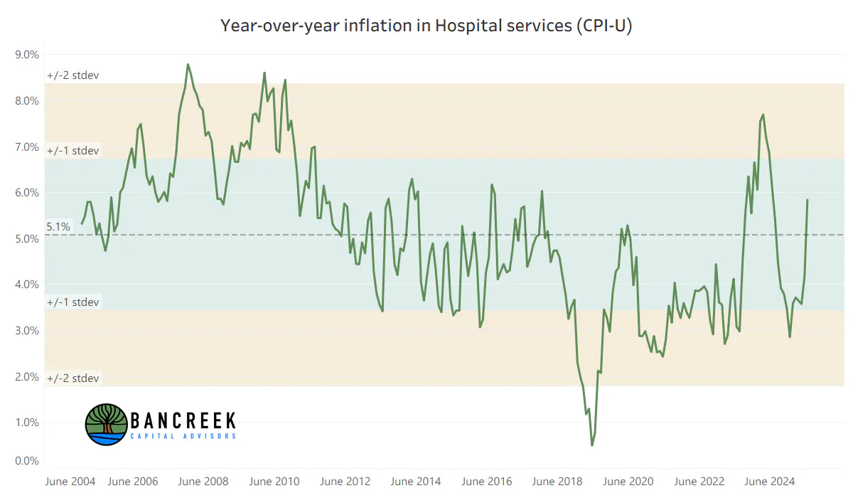
Right off the bat, the two inflationary items that, to us, seemed to come out of left field were Hospital services and Dental services. The reason these two items were not on our radar was because until this month, their inflation had been stable for several months. Then, as shown in the two charts below, July happened.
Source: Bancreek Capital Advisors, LLC analysis of data from bls.gov
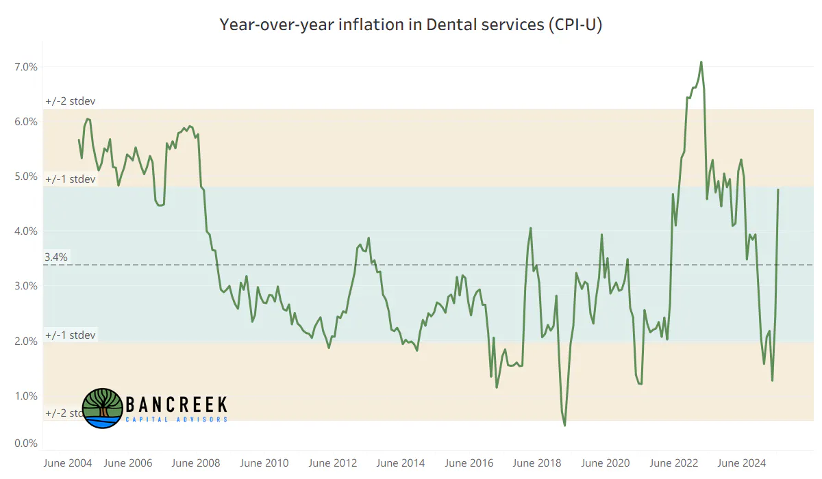
Source: Bancreek Capital Advisors, LLC analysis of data from bls.gov
Our initial reaction to these two charts was to immediately go check last year's July data to see if there was odd behavior that we are now cycling. In other words, maybe this spike in inflation is just an odd artifact of the data that will sort itself out next month? To do this, we created (and have used often over the past year) a view that compares the monthly index values for each item to immediately visualize cycling issues that could be leading to funky YoY inflation numbers. As shown in the two charts below, we found no oddities in last year's data. This was real inflation in July for these two items, no matter if you look at it on a YoY or a sequential basis.
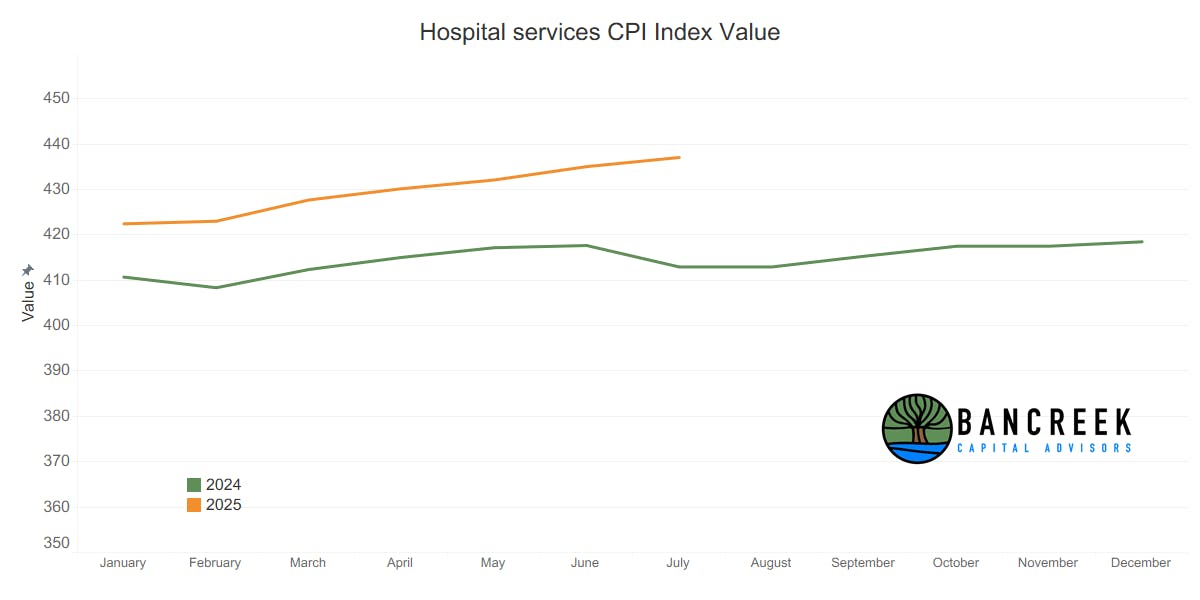
Source: Bancreek Capital Advisors, LLC analysis of data from bls.gov
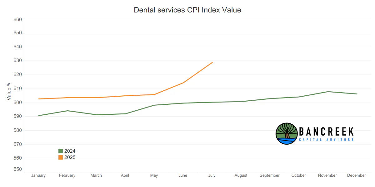
Source: Bancreek Capital Advisors, LLC analysis of data from bls.gov
The longer we work with inflation data, the more we are realizing the key to understanding where YoY inflation is headed is in these charts. So many of the "surprises" we see in inflation each month are really not surprises, but just fall out of largely predictable cycling. Take airline fares for example. As a reminder, last month here is what we wrote about Airline fares.
"Moving on to Airline fares, which is a similar story to gasoline in that it's facing tougher comps as we move forward. As shown below, 2024 comps for Airline fares get quite tough the next three months. As such, unless we get a large sequential decline from June's index value, we are likely looking at upward pressure to YoY inflation from this line item as well."
Fast forward one month and this is exactly what happened. Airline fares ended up posting the third largest inflation impact in July, adding three basis points alone to YoY CPI over June's value. But clearly, we don't have a crystal ball. All we have is the below chart (maybe we should call it the "Crystal Ball" chart), which clearly showed us that if Airline fares didn't decline meaningfully, we were going to lose all the deflation in this item that was helping CPI so much in prior months.
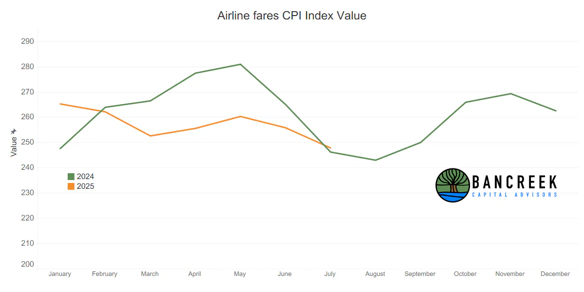
Source: Bancreek Capital Advisors, LLC analysis of data from bls.gov
This digression on Airline fares kills two birds with one stone. We not only showed you why Airline fares is no longer a CPI "good guy," but also presented a case study for why this surprising surge in Hospital and Dental service inflation is very concerning. Scroll back up and look at those two "Crystal Ball" charts and you will see that 2024's second half inflation is very modest for both of these health services items. In other words, cycling can't save us. If July's data point holds, or worse off, increases in the second half of 2025, Health services inflation looks like it will stick, or even get worse over the rest of 2025. Again, this was nowhere near our radar heading into today, but now looks like it could be an inflationary force to contend with for months.
Pricey used vehicles
Next, we'll briefly turn our attention to the #1 inflation impact item of the month - Used cars and trucks. Here is what the YoY trend chart looks like for this item. In short, this month's increase doesn't appear to be an errant data point, but rather the further establishment of another concerning inflationary trend.
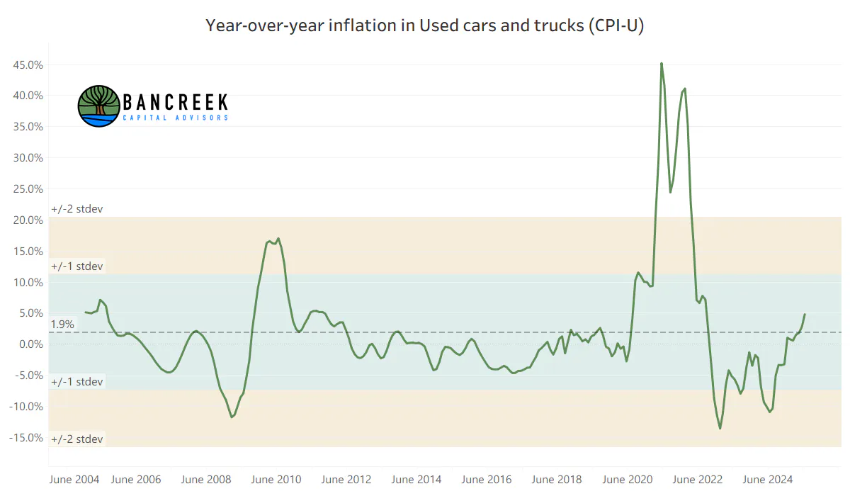
Source: Bancreek Capital Advisors, LLC analysis of data from bls.gov
Maybe the "Crystal Ball" chart tells a better story this time? Strike two! Again, the story only gets worse. As shown in the chart below, comps get more difficult for Used cars and trucks in the coming months, suggesting that unless we get a major sequential step down in Used car and truck prices, we should expect a higher inflation impact from this item in the fall.
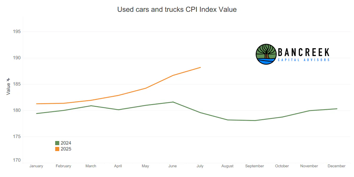
Source: Bancreek Capital Advisors, LLC analysis of data from bls.gov
We'd be remiss if we didn't remind you that is was just one year ago when Used car and truck deflation was shaving an entire 30 basis points off headline inflation!
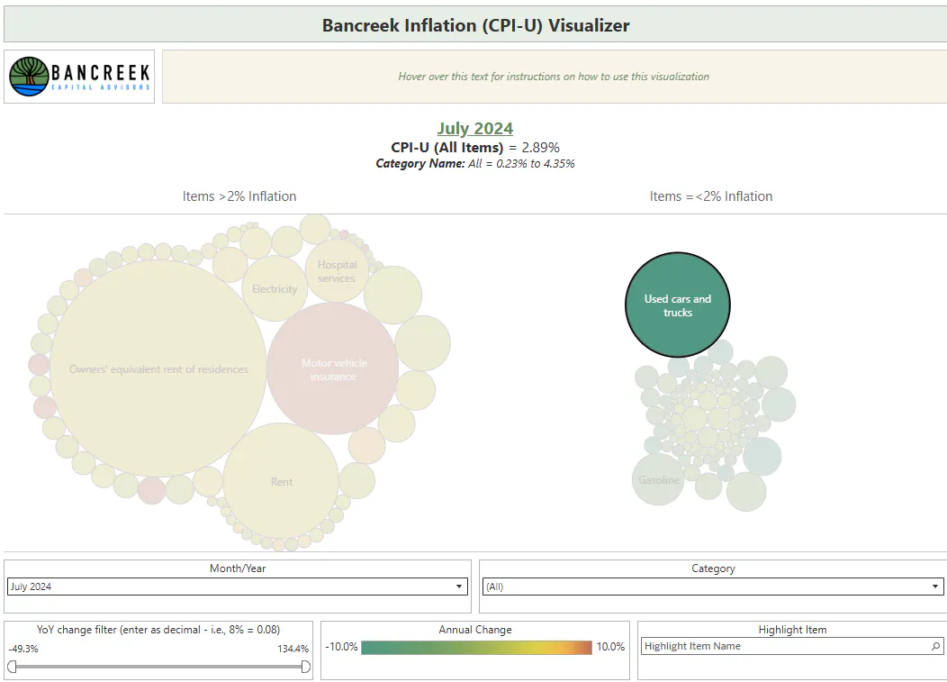
Source: Bancreek Capital Advisors, LLC analysis of data from bls.gov
A year later, Used cars and trucks now has a positive inflation impact of nine basis points. In other words, this single item has had a 39 basis point swing in inflation impact in one year. And this makes sense because it's a large component (1.9% weight within CPI) that is highly volatile (Standard deviation = 9.2%). We have to watch out for these sort of items as they can single-handedly drive surprises in headline CPI.
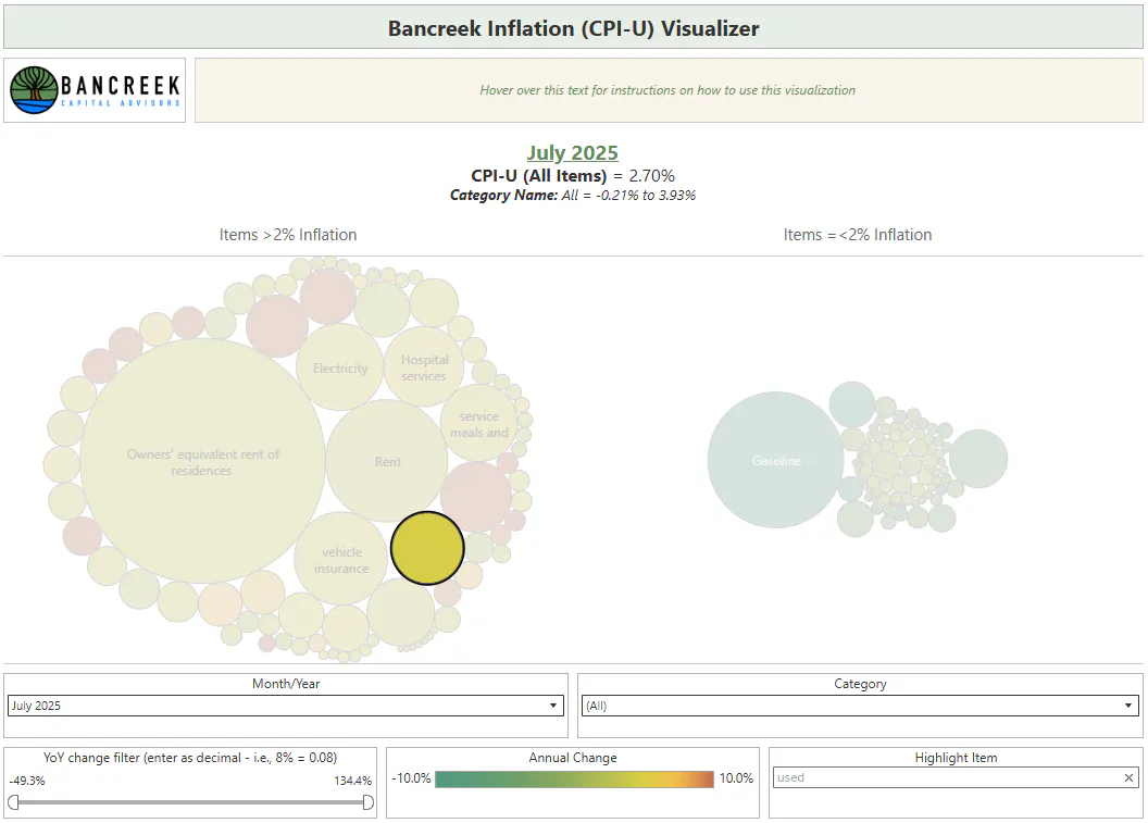
Source: Bancreek Capital Advisors, LLC analysis of data from bls.gov
Lightning round
There's so much to cover today, but limited time for us to write and you to read, so we are going to breeze through the rest of our key takeaways in what we'll call our "Lightning round."
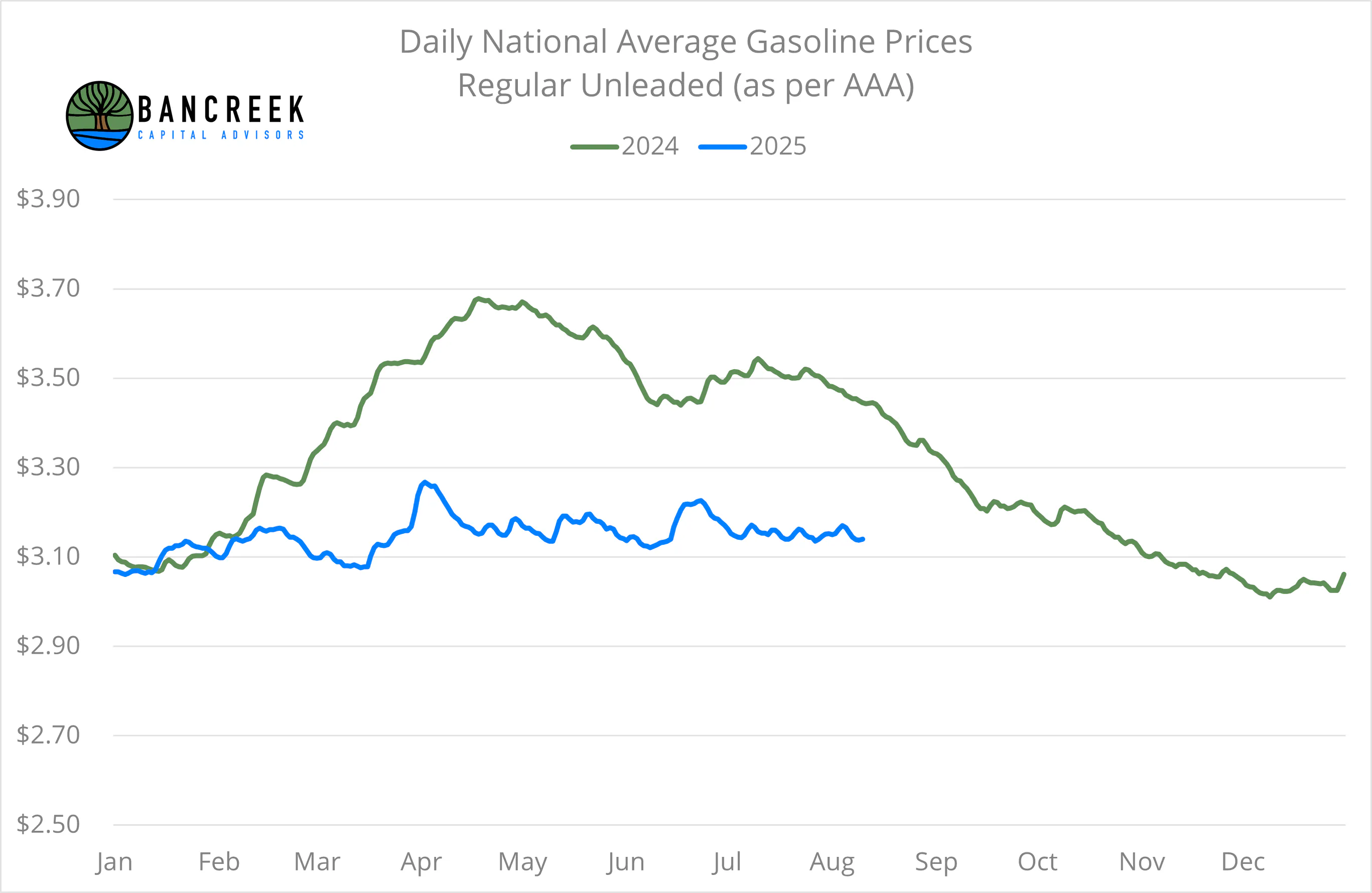
Gasoline helps this month, but is facing seriously tough comps starting in September.
In other words, don't get used to this headline CPI number. As shown below, if gasoline doesn't drop meaningfully in the next couple months, gasoline prices could turn inflationary, wiping out what right now is a 33 basis point CPI good guy. So, brace yourself for a 3-handle on headline CPI if average retail gasoline prices keep stable at ~$3.15 per gallon, which shockingly is a level they have hugged for months now (very odd behavior during summer driving season by the way).
Source: Bloomberg
Time to start mowing your own lawn?
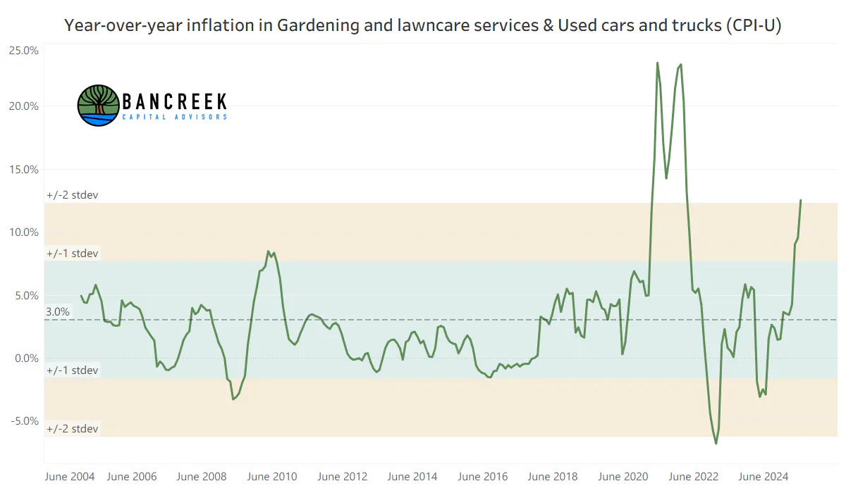
Gardening and lawncare services surged to 12.5% YoY inflation this month, which as shown below is more than two standard deviations above this item's mean historical inflation (3.0%). We doubt many people had this one on their bingo card. Although, maybe it should have been given that studies have shown that one in three workers in landscaping are immigrants?
Source: Bancreek Capital Advisors, LLC analysis of data from bls.gov
Time to start repairing your own car?
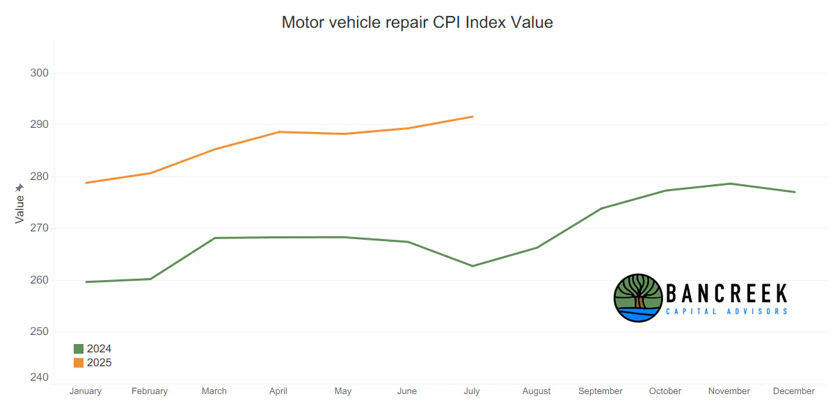
Motor vehicle repair inflation jumped this month to 11.0% YoY, up from 8.2% YoY in June. While this is yet another concerning data point, this time, the Crystal Ball chart offers some hope, as the index for this item surged in the second half of 2024. This doesn't mean we are in the clear, as we are seeing some substantial sequential inflation in this item. But it does suggest that if it can moderate a bit, YoY inflation could ease into year end for Motor vehicle repair.
Source: Bancreek Capital Advisors, LLC analysis of data from bls.gov
Shelter inflation remains in check, while median home prices hit all-time highs.
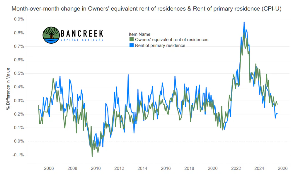
For years now we have harped on how important it is to pay attention to the key shelter items (OER and Rents) as together they comprise over a third of headline CPI, and more than 40% of core CPI. The good news is that these items continue to experience subdued sequential inflation, which is greatly helping to keep inflation down at debatably acceptable levels. The bad news is that median home values continue to hit all time highs, which could eventually put upward pressure on these measures. If we ever get ever get a meaningful resurgence in sequential shelter inflation, and it sticks, the market can pretty much give up on any hope of a sustained rate cutting cycle. So, here's hoping that whatever is going on with housing prices doesn't make its way through to the BLS's surveys anytime soon!
Source: Bancreek Capital Advisors, LLC analysis of data from bls.gov
The elephant(s) in the room
All this analysis is well and good, but we imagine the two elephant-size questions on people's minds are:
- When will the Fed cut rates, and
- How do we know we can trust this data?
Let's take question #1 first. If you have made it this far in the report, what do you think is the most likely direction inflation is headed? It's quite clear to us, and likely anyone really digging in the weeds, that absent highly anomalous disinflationary prints on several high weight items, the path of least resistance is up for CPI. If you really spend time in the data, this doesn't even seem to be a controversial view anymore. There is just too much on the "bad" side and not nearly enough "good" factors to offset the bad going forward.
But predicting CPI's direction is not the same as answering the question of when the Fed will cut rates. We have been highlighting hidden weaknesses in the labor market for months now, and even we were shocked by how poor July's nonfarm payroll data was. Labor could be the driving force of the Fed's decision to cut, especially if the Fed leans more dovish and starts accepting inflation in the mid-3% range. In other words, the Fed's reaction to upward pressure on inflation is much harder to forecast than the trajectory of inflation.
Now on question #2. We don't have to rehash what just happened at the BLS. This abrupt change in leadership, which was sold under a highly politicized pretense, should be concerning to anyone who works with data. But we are not as concerned about this for a few reasons.
First, the BLS's measures are constructed from the ground up as a collection of hundreds of highly complex surveys and/or measurement techniques, which we would argue almost no one understands completely except the folks that work there. The BLS then reports out each one of these line items, and makes this data available going back over decades, allowing research firms like Bancreek to study these items and understand their innate behavior. We know which items are highly volatile and which ones are not. So, if for example, we saw a large uncharacteristic drop in say, one of the main shelter components (which have always exhibited very low volatility) we would know something is up.
And the good news is that if you are on our distribution list, when we know something is up, you will too. Now more than ever, it is critical to be living in the data to truly understand what is fact and what is fiction. If you are not doing it yourself, consider following our work on our socials LinkedIn and X to best prepare yourself to see clearly through fog.
Enjoying this post?
Tell others about it.

Bancreek's Actively Managed ETFs
If you are interested in learning more about Bancreek Capital Advisors' actively managed ETFs click the link below
Learn MoreMore articles like this
Fetching Related Posts
There are no other articles tagged with Research