
July 2025 payroll data: A lump of coal

Eric Pachman
Published
August 1st 2025
Eric Pachman
Published
August 1st 2025
Nonfarm payrolls (NFP) increase by 73,000 in July. Private payrolls up 83,000.
In July, total nonfarm payrolls rose by 73,000 (short of consensus' 104,000 expectation), inclusive of an 83,000 increase in Total private jobs. But the bigger news in today's release was the large prior two-month downward revision, which dragged May and June job gains down to just 19,000 and 14,000, respectively.
As always, you can explore all the data yourself using our the Bancreek U.S. Employment data treemap, which can be accessed here and also is embedded below. For an in-depth tutorial on how we built this visualization, and how to best use it, please read our Visualizing Changes in Nonfarm Payroll Data post.
The bow has been removed.
Last month we entitled our nonfarm payroll post, "A lump of coal wrapped in a pretty bow." Well, this month that bow was violently ripped off, exposing not just very ugly data, but in our view, adding more doubt to the credibility of U.S. economic data. We'll table the second point for now, and just review the wreckage that unfolded in this month's data release.
More public education jobs to the rescue! Oh wait... never mind.
Just under 30-days ago we were scratching our heads at the 63,500 increase in state and local education jobs reported in the June nonfarm payroll data. At the time we wrote:
"While we are not experts in the outlook for public education, our skepticism only gets stronger when we do even the most cursory research on the space. Messaging from the current federal administration points to cuts to public education funding rather than increases in funding (not to mention the impact of NIH funding cuts on public research institutions). Also, if states have to shoulder a higher proportion of medical expenses for Medicaid, but don't want to kick people off Medicaid, other cuts will have to be made, which could hit education. At best, we'd characterize our 30,000-foot view on public education as not banking on this month's job growth to continue at a similar pace. At worst, you could make a convincing argument for job decline here."
While we were on the right track in being skeptical that these gains were sustainable, it never occurred to us that they actually never happened. Even more, we could have never envisioned that it would take less than 30-days for these gains to almost completely reverse out. After today's revision, the BLS now reports that just 7,500 jobs were added in state and local education in June. That's 56,000 jobs that just disappeared due to measurement error. What makes matters worse, in our view, is that these are government jobs. It's true that they are not federal government jobs, but they are still government jobs. The implication that the government can be so wrong measuring government jobs is, at least optically, quite damning.
Don't worry. Healthcare job growth is still strong. Or is it?
As bad as today's revisions were, the one bright spot was that the BLS continues to report that Health care and social assistance job growth is still on a tear. Recall that we have been saying that around 60% of all Total private job growth over the past two years had come from Health care and social assistance, and industry that happens to contain just 17% of Total private employees. Well, sorting through the wreckage of today's revisions, this is how that ratio looks for the past three months:
- May 2025: Health care and social assistance +72,000; Total private +69,000. Health care and social assistance as a % of Total private jobs growth = 104%
- June 2025: Health care and social assistance +59,000; Total private +3,000. Health care and social assistance as a % of Total private jobs growth = 1,967%
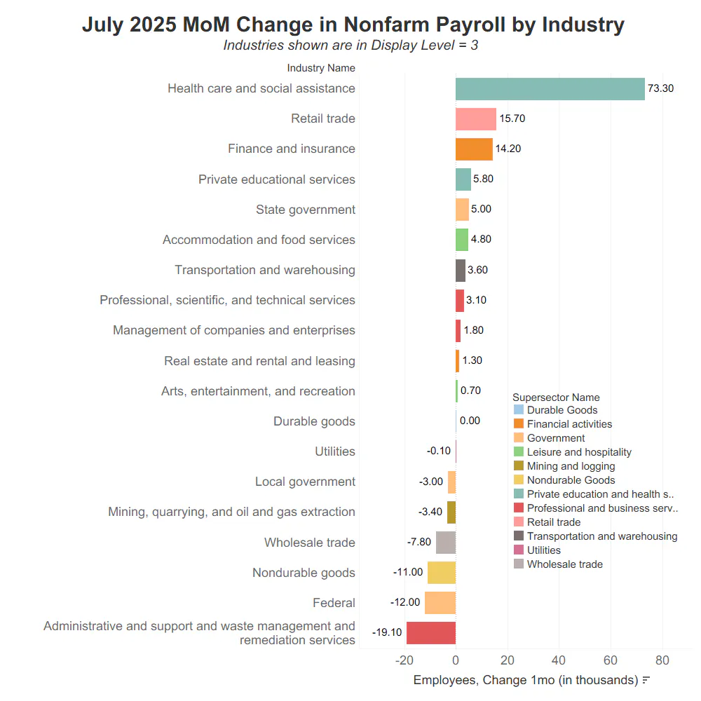
- July 2025: Health care and social assistance +73,300; Total private +83,000. Health care and social assistance as a % of Total private jobs growth = 88%
There are two possible ways to interpret the data presented above, depending on whether you are glass half full or glass half empty type of person. The glass half full take on this data is to be very thankful for the growth in health care jobs, as long as you are willing to forget about the coming Medicaid cuts in 2027, thanks to the One Big Beautiful Bill, which are almost certain to provide real headwinds to this growth. The glass half empty way of looking at this is that an economy whose only job growth is in health care is not a healthy economy, but rather a sick economy.
But there is a third way of interpreting this data. Like state and local education, could it just be wrong? While we aren't willing to call it wrong at this time, we are very skeptical of these gains, in large part thanks to the chart below.
You may recall that we started to highlight the gap between the ADP Employment Situation data and the BLS' Current Employment Statistics data last month for the Private education and health services industry (which we estimate to be ~85% health services). Here is the updated chart.
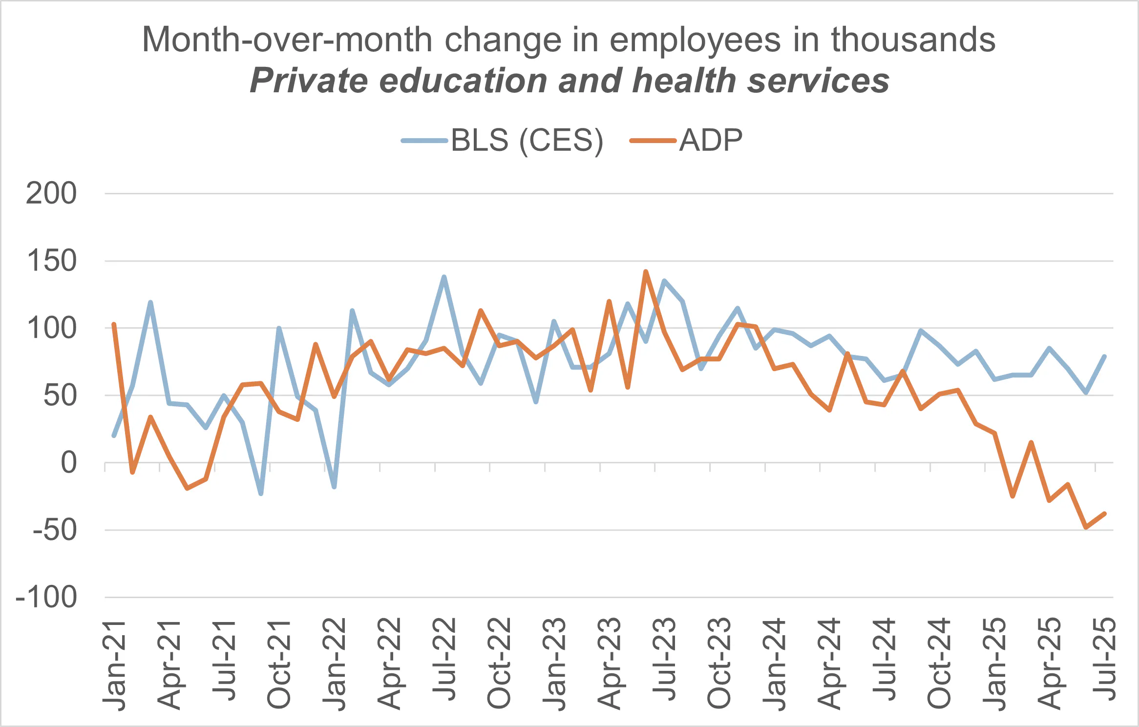
Source: Bancreek Capital Advisors, LLC analysis of data from bls.gov and adpemploymentreport.com
We fully understand and appreciate that ADP and BLS use completely different approaches to measure job gains each month. Disconnects in the data should be expected, especially in any given month, due to such methodological differences. But if we take a step back, we need to ask the question if this apparently structural gap forming between these two measurements attempting to measure the same thing is acceptable?
To provide an analogy, let's assume we are at our local high school track meet and are tasked with timing an 800-meter race (in our view, the most challenging of races). You have the luxury of strapping chips on to the runners' shoes to get a very precise time. On the other hand, we must sit in the bleachers and time runners with a stop watch. Clearly we are going to report different times given our different "methodologies." But no matter how archaic our timing technology is, we will still likely both agree who won the race and who lost.
We have a similar situation here, but the two methodologies are instead giving us conflicting big picture data. They don't even agree on who is winning the race right now. In fact, consider ADP's own words from a few days ago:
Hiring gains were led by a resurgence in services, with the exception of education and health, which has posted a net loss of jobs so far this year.
So has there been a net loss of jobs this year? Or has there been a gain of 478,000 jobs, as the BLS has reported for 2025? The fact that these two different measures are painting such different pictures on health care jobs is quite concerning, in our view. And whether we like it or not, after today's BLS about face on the data, we know which one we trust more.
Sifting through the wreckage
The following charts attempt to provide you with, what hopefully, is now a more accurate post-revision picture of job growth over the past three months. These charts show the change in jobs by industry at Display Level = 3 (for more on what Display Level is read our tutorial report on our NFP visualization). These charts provide helpful context for how important the questionable health care job growth has been over the past three months.
We'll start with May 2025.
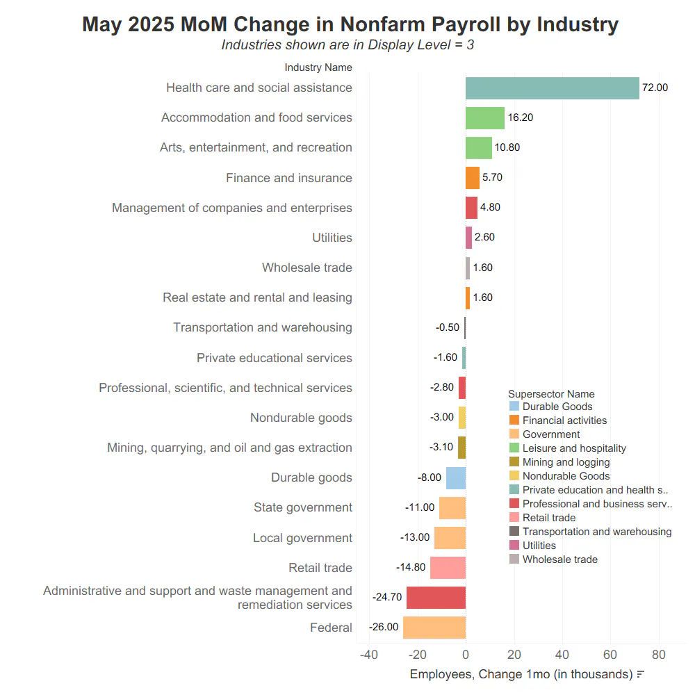
Source: Bancreek Capital Advisors, LLC analysis of data from bls.gov
Here's June 2025.
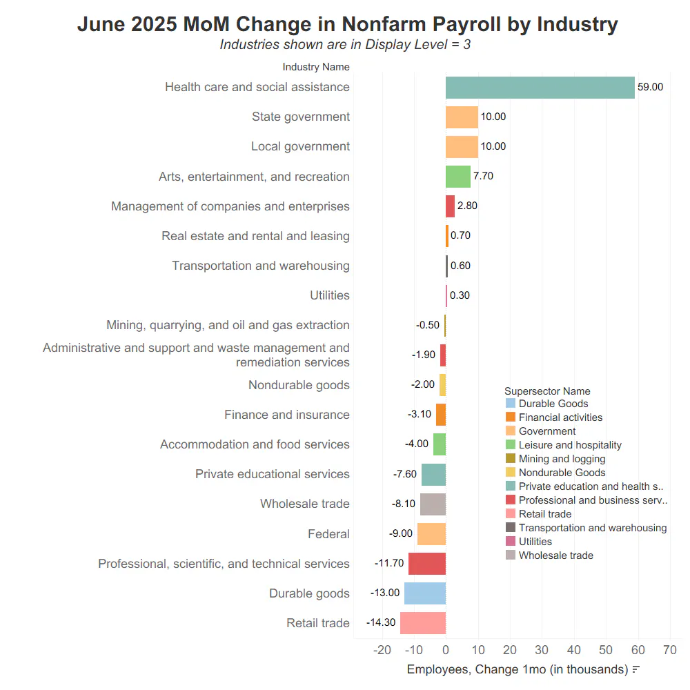
Source: Bancreek Capital Advisors, LLC analysis of data from bls.gov
And last but not least, here is July's initial print. Although take this one with a grain of salt as it hasn't been revised yet.
Source: Bancreek Capital Advisors, LLC analysis of data from bls.gov
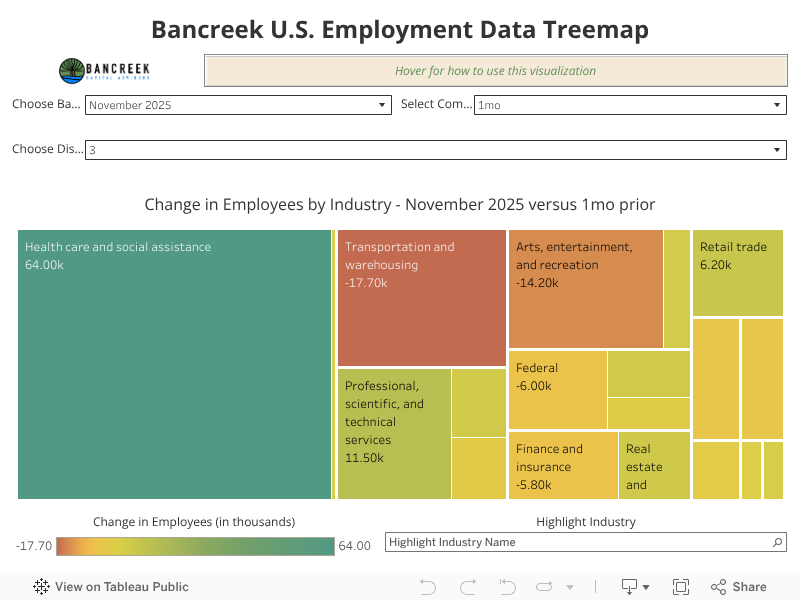
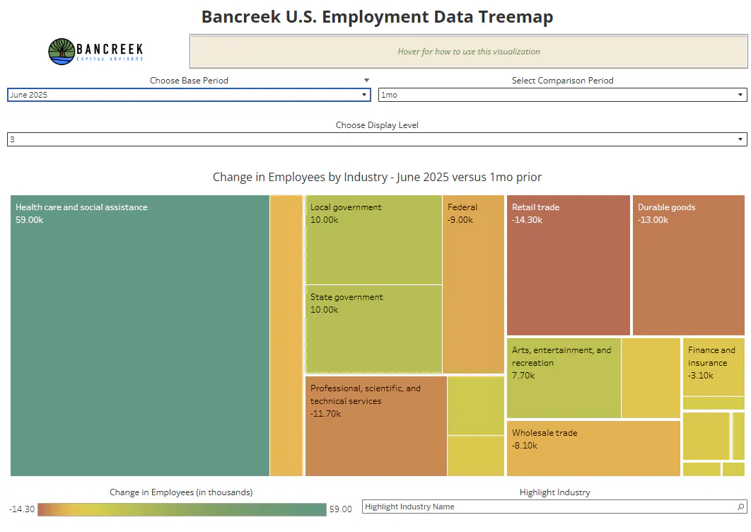
If you are looking for a different view of the same data, we'd really encourage you to use our interactive visualization as it provides a much more visceral view of the data thanks to its heat map color scheme. The following image is a screen shot of June's data, in which we only added 3,000 private jobs at the same Display Level = 3. There is just so much red and orange on this chart now, which indicates industries with poor or negative job growth.
Source: Bancreek Capital Advisors, LLC analysis of data from bls.gov
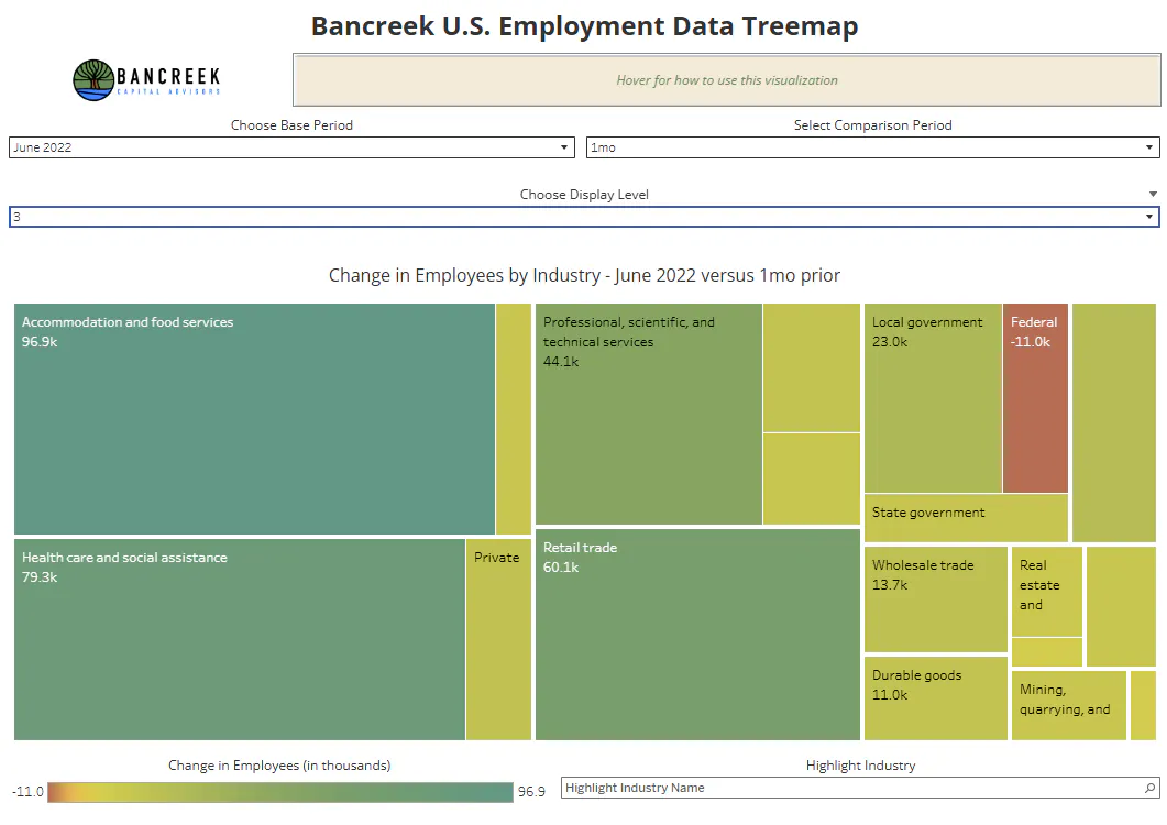
Contrast this with the same visualization from June 2022. Look at all the different shades of green, which points to a strong job market that is broadly growing.
Source: Bancreek Capital Advisors, LLC analysis of data from bls.gov
Our interactive visualization provides you with this data for all Display Levels going all the way back to 2015. And all it cost to use it is your time, energy, and curiosity.
Time to embrace "not knowing"
In Zen Buddhism there is a concept called "not knowing." Despite our innate wiring to eliminate all uncertainty in our lives (which is clearly the fuel for AI), thousands of years of introspection from monks and laypeople practicing Buddhism has arrived at the notion that freedom actually lies in "not knowing," rather than in "knowing." If we can find comfort in not knowing, we can be open to responding in the moment without withering under the weight of expectations. We can make better decisions in the moment dealing with inevitable uncertainty.
As we learned today, no matter how much we want to trust in knowing, we really can never know everything. Sometimes, uncertainty just punches us in the face and leaves us to pick ourselves off the ground. This won't change no matter how many trillions of dollars we throw at AI. We will still be left with uncertainty. And we'll have to deal with it, either kicking and screaming or with grace and resilience.
So it's due time for us to consider the benefits of embracing not knowing. This doesn't mean to give up on putting our detective hats on and digging through the data. We must continue to do this. But we also should maintain little attachment to this data and analysis, and change our views when the data changes. The data doesn't care about our feelings and egos and it doesn't care if it's right or wrong. It's just inanimate data, not matter how much we gripe in this post about how unfair it is to have to deal with such uncertainty from once trusted government data sets.
So, Bancreek Capital Advisors will continue to analyze and report on what we see, when we see it. But we will also understand that given the limitations of the data we analyze, it is not really possible to know anything for sure. And that's OK, because that is true for just about anything when we really pay attention to our lives.
Good luck out there not knowing.
Enjoying this post?
Tell others about it.

Bancreek's Actively Managed ETFs
If you are interested in learning more about Bancreek Capital Advisors' actively managed ETFs click the link below
Learn MoreMore articles like this
Fetching Related Posts
There are no other articles tagged with Research