
Key takeaways from July 2024 Nonfarm payrolls

Eric Pachman
Published
August 2nd 2024
Eric Pachman
Published
August 2nd 2024
Nonfarm payrolls rise by just +114k in July, down from +179k last month
This morning the Bureau of Labor Statistics (BLS) released July 2024 Nonfarm payroll data. Total nonfarm payrolls rose by 114k, inclusive of a 97k increase in Total private jobs. Today's release also included a downward revision of June's Nonfarm payroll job additions from 206k to 179k. This downward revision to June's numbers was 100% driven by Government, which was revised down from 70k adds to 43k adds last month.
Before we dive into our take on all the moving parts in today's Nonfarm payroll data release, we'll first share that we've updated the Bancreek U.S. Employment Data Treemap with today's data (embedded below). So, if you are the type that just wants the visualization and less words, here you go. Also, as a heads up, it usually only takes us 10-15 minutes to update and repost this visualization on bancreek.com, versus a few hours to gather, write, and publish our thoughts. So, if you want to play with this viz as soon as its ready on Nonfarm payroll data release day, make sure to bookmark this page.
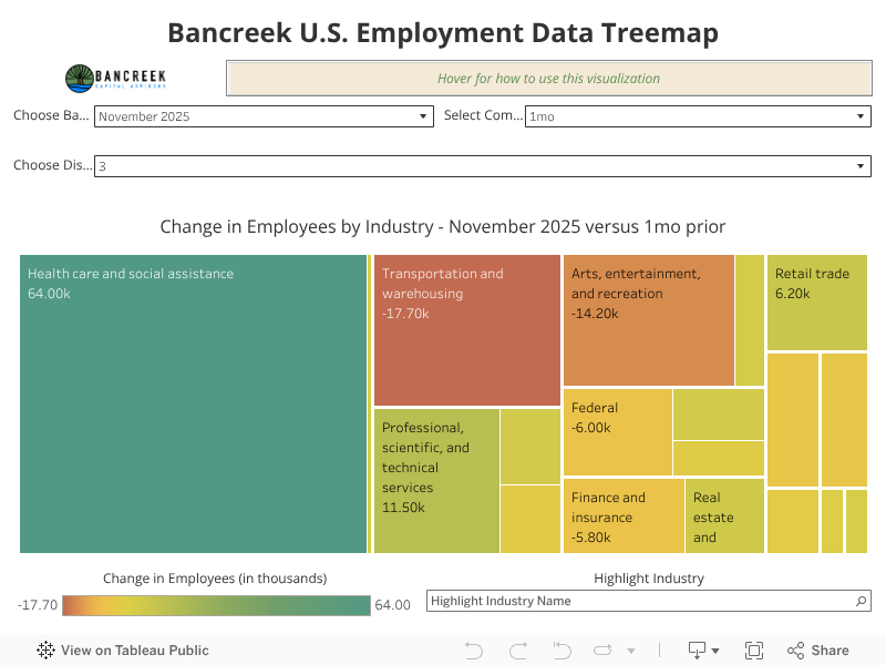
On the other hand, if you are interested in our thoughts on the data, keep reading for our key takeaways.
Health care and social assistance adds 64k jobs in July
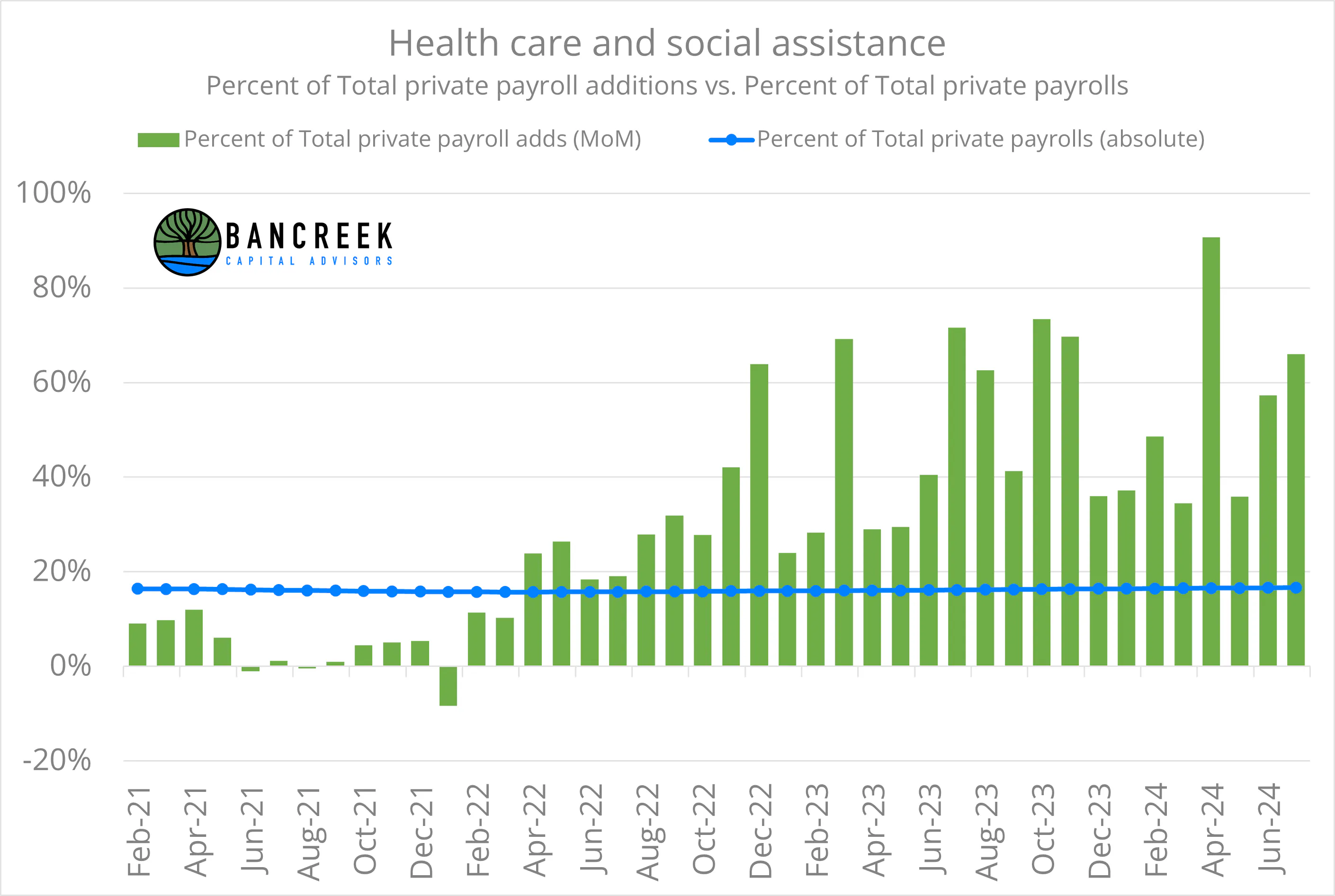
Tej Parikh, economics leader writer for the Financial Times, offered an interesting question for us to contemplate a couple months ago in an article, appropriately titled, "America: a healthy or healthcare economy?" Today's release offered yet another data point tilting the answer to this question to the latter. The BLS today reported that the Health care and social assistance industry added 64k jobs in July. That's down from last month's +78.1k adds in the industry, but still an impressive number considering that Total private job adds in July clocked in at just 97k. In other words, Health care and social assistance was responsible for 66% of the Private jobs adds this month. For context, as of this month, the BLS reported 22.5 million jobs in Health care and social assistance and 135.4 million Total private jobs. In other words, Health care and social assistance represents 17% of Total private jobs, but just generated 66% of the growth in the entire non-government economy.
What's more interesting is that this month is not even close to an anomaly, but rather is a continuation of a trend that has been forming since the middle of 2022. Consider the below chart, which shows two series for the Health care and social assistance industry: percent of Total private total job growth each month (green bars) and percent of absolute Total private jobs (blue line). This chart clearly shows that since mid-2022 this single industry has been disproportionately adding jobs to our economy relative to its weight. So, at least for this period, this chart makes a compelling case for Tej to change the title of his article to simply: "America: a healthcare economy."
Source: Bancreek Capital Advisors, LLC
The relentless rise in Health care jobs
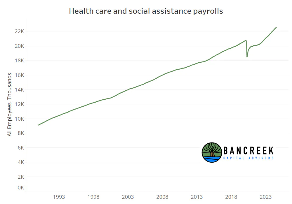
This naturally leads us to wonder what in the world is going on in Health care right now to drive such strength. But before we answer that question (because as you'll soon see, it's the wrong question), we must show you one more chart. This next chart shows you the historical growth in Health care and social assistance jobs going back to the start of the series in 1990.
Source: Bancreek Capital Advisors, LLC
When looking at this chart, what do you notice (aside from the COVID blip)? Our takeaway is that if we gauged the health of the economy from 1990 to today based on this chart there would have been zero recessions and a flat-lined rate environment over this period. However, over this period we have experienced multiple recessions and meaningful swings in interest rates. But health care jobs don't pay much attention to that stuff. Instead, they have just marched upwards in a near perfectly stable manner on their way to who knows where.
So, the correct question to ask with this chart as context is instead why has health care job growth been immune to macro?
Why health care job growth has been immune to macro
First off, it would require multiple books worth of writing to do justice to this answer. But underneath all of those words is, in our view, a key underlying driver that has allowed Health care to operate in a vacuum for at least the history of our data.
Simply put, health care is the only major U.S. industry (that we know of) that is permitted to hide actual net prices from not only the public, but from their very own customers. Without any transparency into pricing, competitive behavior doesn't work as it does in other industries, setting the table for less sensitivity to interest rates, economic slowdowns, etc.
But it gets worse. The prices are not only hidden from consumers, but they are not even directly paid by consumers but rather by insurance companies, whose economic incentives aren't necessarily to pay lower prices for services. Sure, in a single year, the lower the claim dollars, the better an insurance company will do. But what if we look over a longer time horizon? If claim dollars rise, insurers can put upward pressure on premiums, driving their revenue up. In other words, if prices keep rising for health care, insurers can pass that through to end payers collecting the same slice of a larger pie.
And then it gets even worse, as the prices that are hidden and highly variable from one payer to the next, come laden with rebates (at least in the case of drugs) that further obfuscate the actual net price of medicines.
We could go on and on, as our Chief Analytics Officer, Eric Pachman, was formerly the Founder and President of non-profit drug pricing watchdog 46brooklyn Research. But we'll stop here and instead stress how important it is to understand the unique "features" of our health care system, and how much flexibility these "features" give the industry to engineer its own growth. We believe that these "in the weeds" factors are what matters for health care, and its resulting job growth, far more than what's going on at the Fed.
Lastly, if you are interested in really diving deep in the weeds on how this all works, at least when it comes to pharmaceuticals, do check out 46brooklyn Research's research and data visualizations.
Government job growth takes a meaningful step down
Our second key takeaway from today's data is the slowdown in government job additions, which has been a strong driver of job growth for the past year. Government added just 17k jobs this month, down from 43k last month. But most notably, last month's number was revised down from 70k this morning. So, in one month Government job adds have dropped from one of the front runners of overall job growth in June, to a largely inconsequential footnote in July.
But we can't quite close the book on our discussion on Government jobs. This industry deserves a bit more attention, in our view, as we think the media is judging the strength in recent job adds out of historical context. The good news is that this is what our data visualization is for - to help organize a boat load of historical data for you so you don't fall prey to this recency bias trap.
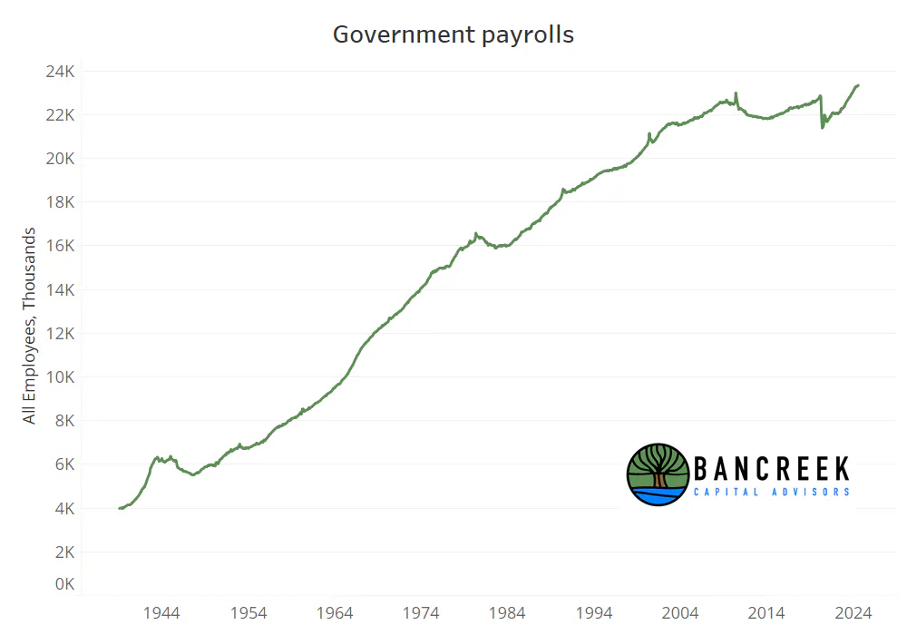
That said, let's look back in time to add context to the recent Government job adds. The following chart takes you all the way back to 1939! Right now, there are 23.3 million Government jobs per the BLS. That's up more than one million jobs over the past two years. In other words, Government has been a strong growth driver of the jobs data since the middle of 2022.
Source: Bancreek Capital Advisors, LLC
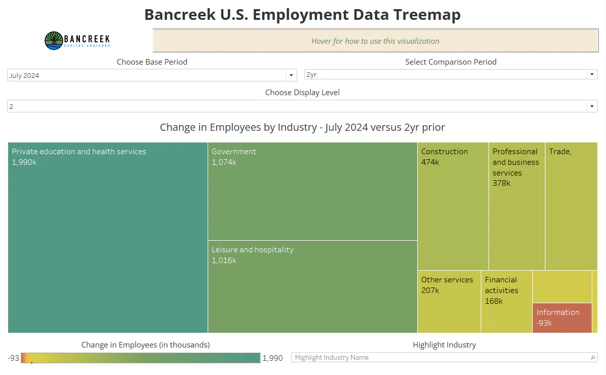
Another way to more directly see the impact of Government jobs over the last two years, especially in context of other industries, is to change the "Comparison Period" within our Bancreek U.S. Employment Data Treemap to "2yr" and set the "Display Level" to "2." This following image is the view that should appear with those two filters chosen, which clearly shows that Government has been the second largest driver behind Private education and health care, of which 97% of the job adds were driven by - you guessed it! - Health care and social assistance.
Source: Bancreek Capital Advisors, LLC
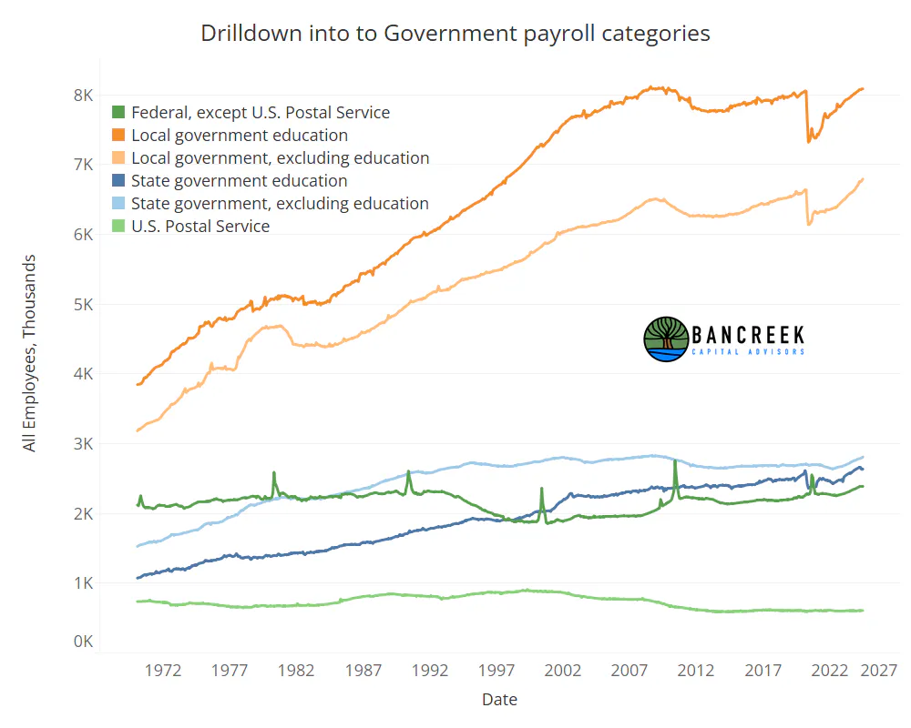
One thing to note when analyzing Government jobs is that the BLS provides helpful granularity in this supersector. As such, we drilled down to the next level of detail in the data to generate the following chart.
Source: Bancreek Capital Advisors, LLC
The above chart provides extremely helpful context to better understand the broad Government job category. First off, before getting educated by this data, when we heard the word "government" we immediately thought of the Federal government. From a jobs perspective, this couldn't be further from what "Government" means, as Federal government jobs only comprise 10% of overall "Government" jobs. Also a fun fact on Federal government jobs is while there have been some adds recently, overall jobs are essentially no higher than they were in 1991. That's despite a 123% rise in GDP over the same period.
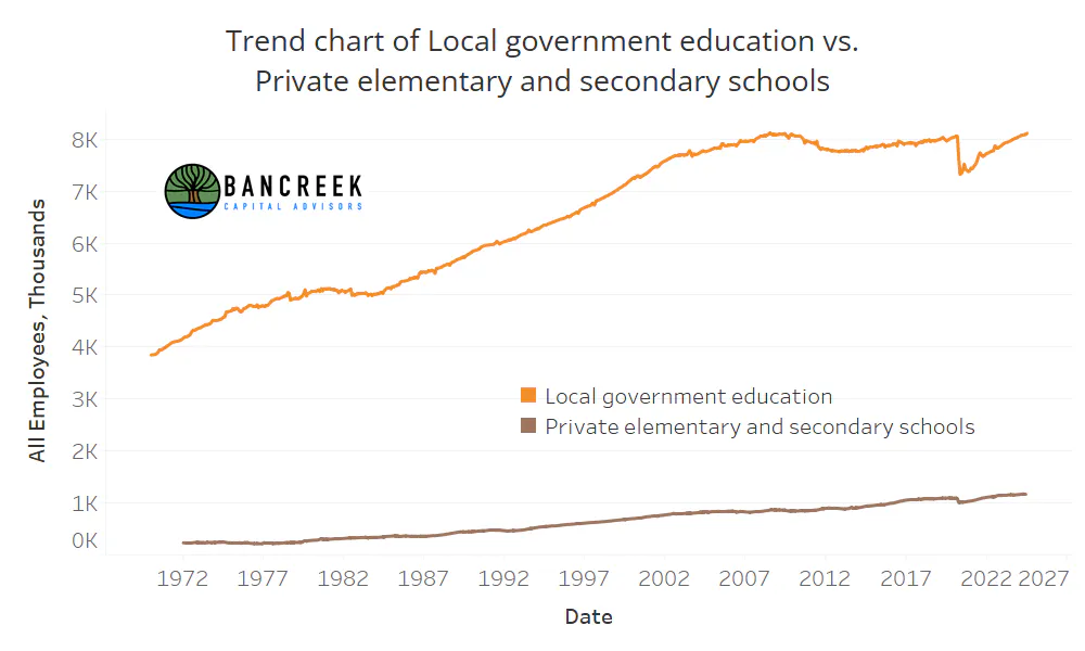
So if "Government" is not Federal government, then what is it? As shown above its largely Local government, which is represented by the top two orange lines. Then within Local government, there is "Local government education," which based on our call to the BLS' help desk, we best understand to be K-12 public school teachers and administrators. As of this month, the BLS reported 8.1 million jobs in this bucket, which as shown below, happens to be exactly where this series peaked in July 2008. In other words, we have added no net new teachers and administrators to our public school system in the last 16 years. For comparison, we have added another BLS category to the below chart: Private elementary and secondary schools. This group of employees is up 35% over the same period. Another way of looking at this... In 2008, for every job in private K-12 schools there were 9.4 jobs in public K-12 schools. Fast forward to today, and that ratio is down to 7.0.
Source: Bancreek Capital Advisors, LLC
Our point in presenting this is not to opine whether this trend is "good" or "bad." It just is what the data says. Rather it's to cut through the recency bias within this broad category. When we look at the totality of the data, it seems highly unlikely that Government jobs are going to become some strong growth engine going forward. They do appear to be undergoing a (much needed?) correction, but unlike in health care, there is simply no historical data to suggest that this trend can be rolled forward with any certainty.
Will another industry step forward to drive growth from here?
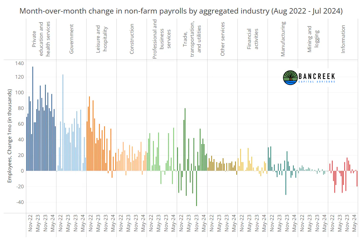
That leaves us with the job growth in all other industries, which as shown in the below chart, we'll sum up as lackluster.
Source: Bancreek Capital Advisors, LLC
It's not that there weren't some bright spots elsewhere this month. In isolation, Leisure and hospitality posted a decent month, up 23k, but its way down from the 40k+ jobs were getting from this industry last year. Construction and Trade, transportation, and utilities also rose by more than 20k jobs in July. But the chart shows that Trade, transportation, and utilities is highly volatile, while there's not much precent for Construction to give us much more than it is at the moment. Meanwhile, one of the most significant drivers of job growth over the past 10 years - Professional and business services is M.I.A. right now. For context, this industry has given us 3.8 million jobs over the last 10 years. It was down 1k jobs this month. And then as we move to the right on this chart, all the other industries look completely uninspiring.
A bleak payroll report
So here we are, witnessing the sputtering out of all of the growth engines that have powered the economy out of COVID - except one (health care). It's like there is one remaining thruster left on this rocket which we are all hoping and praying won't fall off as well, leaving the "rocket" to float around aimlessly without any momentum. And to be clear, while the long term chart makes it appear that Health care and social assistance marches upwards at the exact same rate each month, there have been many examples of it growing at, say, below 30k in a month. To be more precise, out of the 414 data points we have for this series, 150 came in below 30k. In other words, these "weaker" prints tend to come in just over 1/3 of the time. With that context, we are on a seriously hot roll with Health care and social assistance right now, having come in north of 50k adds per month for the last 30 readings in a row! Our point is that even a freight train like health care is bound to take a month off now and again. And what happens when it does and we lose that last remaining thruster, even for just one month? We may soon find out.
Enjoying this post?
Tell others about it.

Bancreek's Actively Managed ETFs
If you are interested in learning more about Bancreek Capital Advisors' actively managed ETFs click the link below
Learn MoreMore articles like this
Fetching Related Posts
There are no other articles tagged with Research