
Key takeaways from September 2024 jobs data

Eric Pachman
Published
October 4th 2024
Eric Pachman
Published
October 4th 2024
Nonfarm payrolls surge by 254k in September. Private payrolls up 223k.
This morning the Bureau of Labor Statistics (BLS) released September 2024 Nonfarm payroll data. Total nonfarm payrolls rose by 254k, inclusive of a 223k increase in Total private jobs. Today's release also included a two-month payroll net upward revision of 72k jobs. This upward revision raised August 2024's month-over-month job additions to +159k jobs, 114k of which were private jobs.
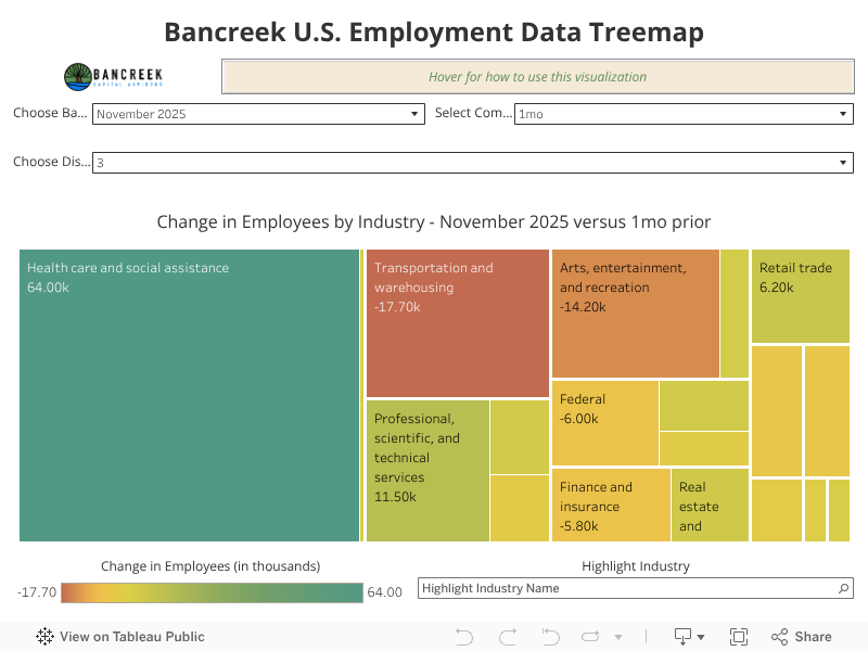
Before we dive into our take on all the moving parts in today's Nonfarm payroll data release, we'll first share that we've updated the Bancreek U.S. Employment Data Treemap with today's data (embedded below). So, if you are the type that just wants the visualization and less words, here you go. Also, as a heads up, it usually only takes us 10-15 minutes to update and repost this visualization on bancreek.com, versus a few hours to gather, write, and publish our thoughts. So, if you want to play with this viz as soon as its ready on Nonfarm payroll data release day, make sure to bookmark this page.
Health care job growth continues to be strong (what's new)
Another month of jobs data has brought yet another month of very strong job growth in Health care and social assistance. This month, this industry (which is becoming the bedrock of job growth for the entire U.S. economy) added another 72k jobs. To give you a sense for how significant the job growth in this one industry has been over the years take a look at the following stats:
- Over the past year, Health care and social assistance has added 926k jobs, or 48% of all new Total private jobs
- Over the past two years, Health care and social assistance has added 1,896k jobs, or 42% of all new Total private jobs
- Over the past 10 years, Health care and social assistance has added 4,554k jobs, or 25% of all new Total private jobs
- Over the past 20 years, Health care and social assistance has added 8,129k jobs, or 32% of all new Total private jobs
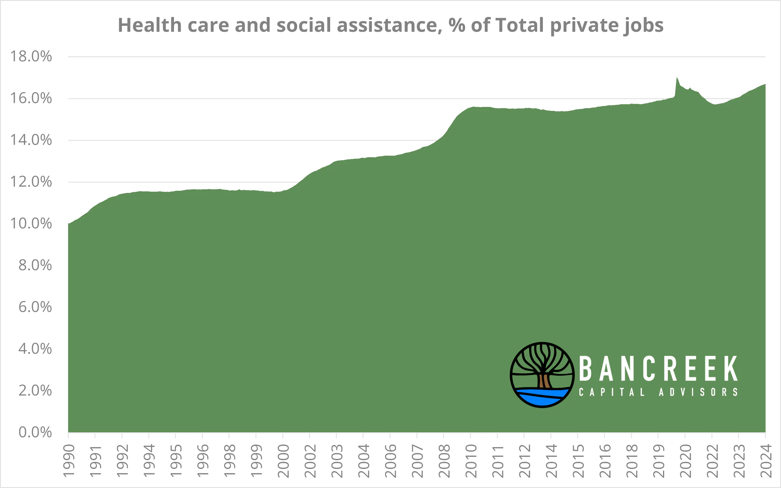
What's clear from the stats provided above is that we should all be very grateful for the recent job growth in health care, because without it, job growth over the past 1-2 years would have been quite anemic (pun intended). As we go back further into history, health care job growth seems to have had a more muted relative impact. This may be true relative to the past few years, but it's very untrue if we provide you with appropriate context. That said, consider that 20 years ago, Health care and social assistance jobs comprised just 13.2% of the Total private workforce. Today it's responsible for 16.7% of Total private jobs. Over 20 years Health care and social assistance jobs have increased 56%, versus an 18% increase in all other Total private jobs.
Source: Bancreek Capital Advisors, LLC
Long story short, what's going on with Health care job growth isn't a fluke. Rather it's a structural design of our health care system. As a result, we shouldn't be surprised when this industry clamors to hire as many folks as it can month after month, irrespective of the economic climate.
Food services and drinking places to the rescue!
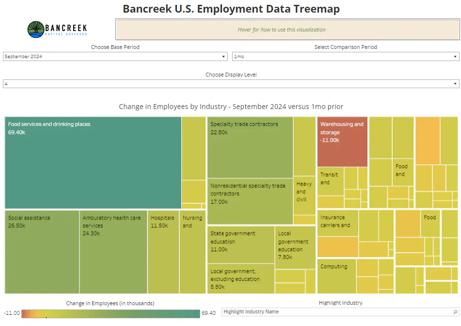
Typically, Health care and social assistance steals the show in any update on nonfarm payroll data. Not this month! This month, that honor goes to Food services and drinking places, which added an astounding 69k jobs this month. If you want to get a sense for how meaningful this increase was, scroll back up to the embedded viz earlier in this post and change the "Display Level" to 4 (which will take you one level deeper in the BLS' hierarchy). Then just let your eyes settle on the biggest, greenest box in the treemap. As shown in the screenshot below, no other industry comes close to touching the job adds seen in Food services and drinking places this month.
Source: Bancreek Capital Advisors, LLC
Everything else was.... actually, pretty good
First off, we would strongly encourage those readers that want to analyze all the moving parts in today's release to spend some time with our visualization. Clearly, there are many stories that the data can tell beyond what we choose to write about in this post. So, have fun exploring the data and uncovering the many other moving parts that the viz can help highlight.
That said, our own opinion is that this month's data can be boiled down to a story of Food services, Health care, and "everything else." And in September, everything else was (for a change) quite good!
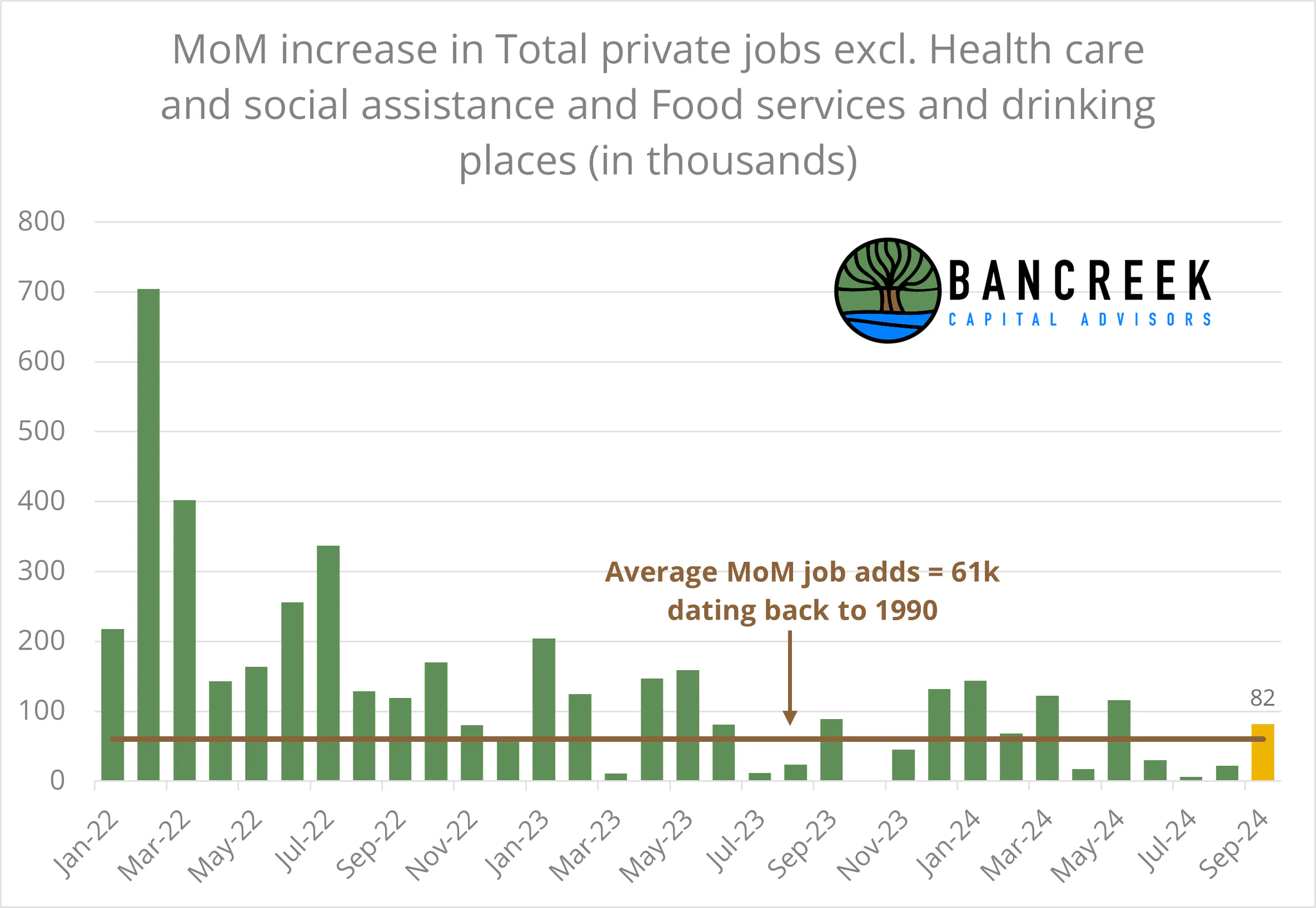
The chart below shows the month-over-month increase in Total private jobs less Health care and social assistance and food and drinking places back to the start of 2022. This month we added 82k jobs, which is a nice turnaround from the prior three months which posted (after today's revisions) job adds of just 30k, 6k, and 22k, respectively. 82k job adds may not seem like a lot compared to what we experienced coming out of COVID, but when compared to the average job gains dating back to 1990 (+61k per month) it is a solid number.
Source: Bancreek Capital Advisors, LLC
What a difference two months makes: Analyzing the head fake in the household survey data
That's all we'll write about the nonfarm payroll data, otherwise known as the "establishment" survey data release. We now would like to move on to the "household" survey data release, from which the unemployment rate is derived.
To set the table a bit for those unfamiliar with these databases, the two databases are completely different and, actually, physically separate on the BLS' website. Over long durations, we have found they tend to tell a similar story (which is reassuring since they aim to measure the same thing) but over shorter periods, they can at times get significantly disconnected from each other.
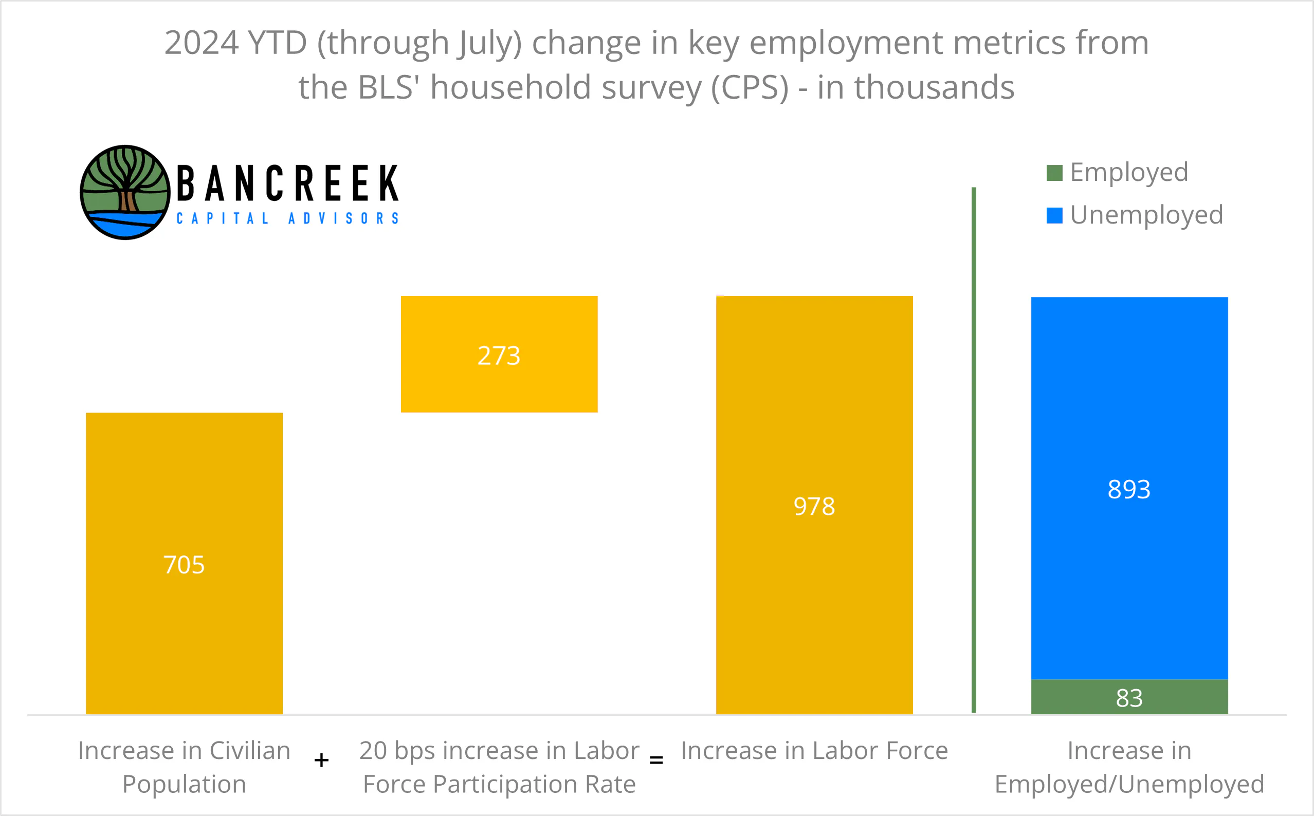
Table now set, two months ago, we were terrified by the picture painted by the household survey data. As shown in the waterfall chart below, through July 2024 the U.S. had added 978k people to the labor force, 705k from an increase in the civilian population and 273k through an increase in the labor participation rate. So what happened to these people? According to this database, the vast majority went unemployed, with the Employed population rising only by 83k since the end of 2023.
Source: Bancreek Capital Advisors, LLC
This was certainly a bleak picture, and we suspect it was one that didn't get lost on the Fed as it aggressively cut rates to aid the labor market.
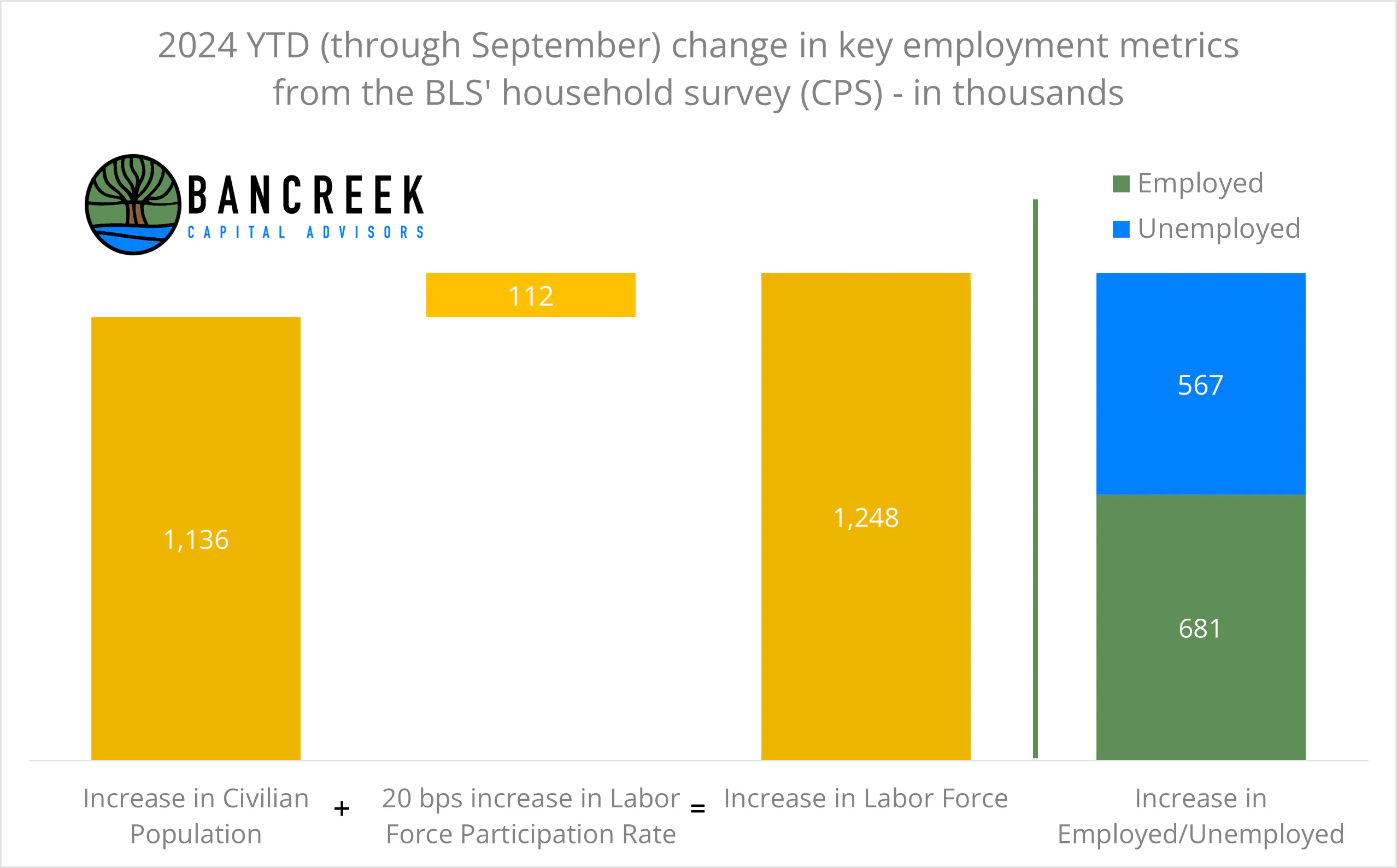
But now let's fast forward to today's data. Here is the exact same YTD 2024 chart, through September 2024.
Source: Bancreek Capital Advisors, LLC
Clearly, this chart paints a completely different picture of the economy. Now we have data that suggests we have added 681k people to the Employed population and only 567k people to the Unemployed population. The Unemployed population has decreased by 326k (4.5%) since July despite the fact that we added another 270k people to the labor force over the two months. This is not only not the trainwreck we saw in the July data. This is, dare we say, quite healthy?
How much noise is in monthly economic data?
Ironically, the more time we spend analyzing monthly labor data, the less value we start to see in nitpicking the month-to-month changes. To be clear, there is tremendous value in doing this since the market swings wildly on each release. So, for those of us brave enough to participate in the market, we should know what's going on. The lack of value in this data instead relates to the read through to the condition of the real economy, as opposed to the condition of the market's perceived economy. It doesn't take a veteran economist to understand that the flip flop in the household data that occurred over the past two months doesn't necessarily tell us that the job market is roaring back, sucking up all new entrants into the labor force with reckless abandon. If you believe in Occam's razor, it probably points to the data just being wrong. Which data is wrong? Who knows! Maybe July's data. Maybe September's data. Likely both to some degree. It is simply unreasonable to expect no measurement error when it comes to such a massive economic survey. Over longer periods of time, this error starts to drop away, providing a clearer picture of the condition of the real economy. But over short periods of time (like one month) we are left wondering if this data is an indication of anything real, or if it is just, well, a collection of numbers.
One thing we do know is real value is created and lost on these numbers. And real decisions are made by the Fed based on these incremental monthly datapoints. In that sense, this data is very real.
So, let's not overthink this. At least for today, we can celebrate the robustness of the job market. Both surveys are showing the U.S. job market flex its strength, laughing in the face of recessionary concerns. But, we also shouldn't be surprised if next month the data flips on its head, telling us a completely different story. And we also shouldn't anxiously grasp for answers to explain why this has happened. Because the answer is that this is just monthly data being monthly data. We realize that this is not the most satisfying way to conclude this post, but it's the most honest way we could think to summarize our experience analyzing labor data in 2024.
We hope this analysis has been useful in putting this month’s employment data into context, and, more importantly, in understanding what the numbers may, and may not tell us about the underlying U.S. economy. Monthly labor data will always contain some noise, but looking at the broader trends can help provide a clearer picture of where the job market is actually heading.
As always, we’ll continue to track these developments and share our perspective as new data becomes available. In the meantime, feel free to reach out to us with any questions, comments, or observations.
Enjoying this post?
Tell others about it.

Bancreek's Actively Managed ETFs
If you are interested in learning more about Bancreek Capital Advisors' actively managed ETFs click the link below
Learn MoreMore articles like this
Fetching Related Posts
There are no other articles tagged with Research