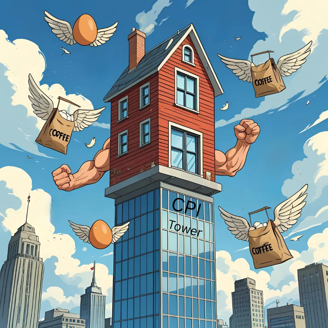
Core inflation rises less than expected on muted shelter inflation

Eric Pachman
Published
June 11th 2025
Eric Pachman
Published
June 11th 2025
May 2025 year-over-year inflation (CPI) inches up to 2.35%
This morning the Bureau of Labor Statistics released the May 2025 US CPI report for All Urban Consumers (CPI-U). Overall CPI-U was reported at 2.35% year-over-year (YoY) for May, up just four basis points from 2.31% YoY last month.
As a reminder, Bancreek publishes two visualizations that can help you explore CPI-U in granular detail. Both of these visualizations have now been updated through May and are embedded below:
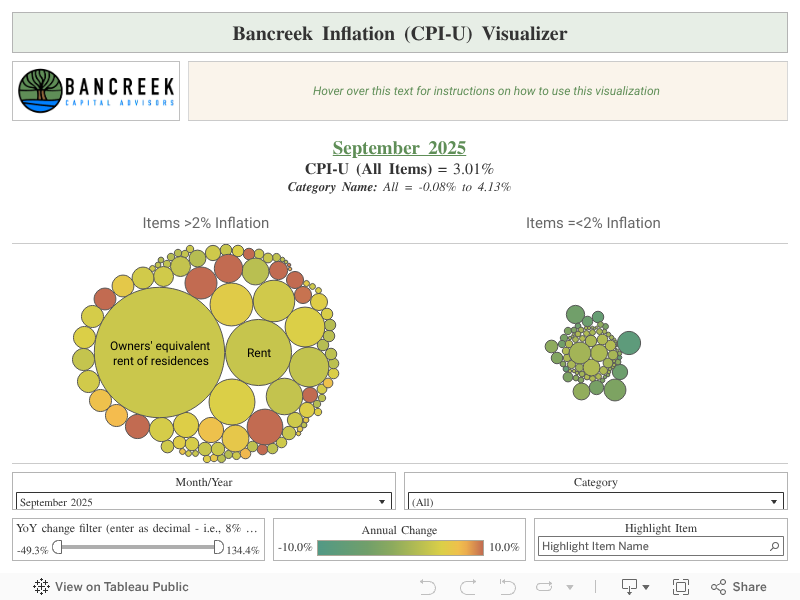
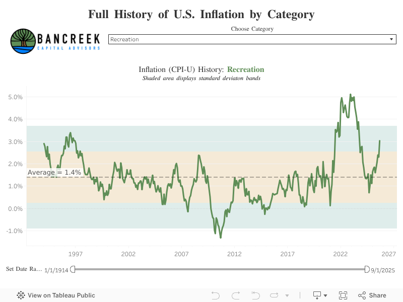
This post hopefully will further assist in your analysis of the moving parts underlying this month’s CPI report. Its goal is not to provide a comprehensive analysis of the nearly 180 items we track (that’s what the visualizations are for), but rather just to point to the most meaningful changes from one month to the next.
To perform this analysis, we track a measure we call “inflation impact,” which we calculate by multiplying each item’s YoY inflation by its weight in the prior year period. You can think of this as “weighted inflation” as opposed to the “unweighted inflation” that is more commonly reported by the media. Each month we take the weighted inflation of each item we track in CPI-U and then sum them up to overall CPI-U. Then we compare these weighted inflation numbers from one month to the next to see what drove the sequential increase or decrease. In this way, we can precisely identify the most significant drivers in the change in YoY CPI-U from one CPI report to the next.
The dominant force that is Shelter
It's now been 16 months since we started publishing and writing about the Bancreek Inflation (CPI-U) Analyzer. Each month since, almost without fail, we have talked about Shelter inflation. Why? Because it's weight is completely disproportionate to any other collection of items in the CPI measure. To hammer this home, think of CPI like a test with 180 questions. But the questions to this test aren't all worth the same amount. Two "questions" - Owners' equivalent rent of residences ("OER") and Rental of primary residences ("Rent") - determine over 34% of your grade. Meanwhile, another random question called "Coffee," determines just 0.18% of your grade, while the "Airline fares" question determines 0.85% of your grade.
Now, if you were taking your test, where would you focus your time and energy? Or stated differently, what does this test really assess?
This is a troubling question to ask, especially as the market anxiously awaits any evidence in CPI or PCE that tariffs are driving inflation higher. We may need to accept that this evidence may not arrive... not because tariffs aren't driving prices of goods higher, but because the shelter (and more broadly, services) component is so large that any easing of it could overwhelm rising costs of goods.
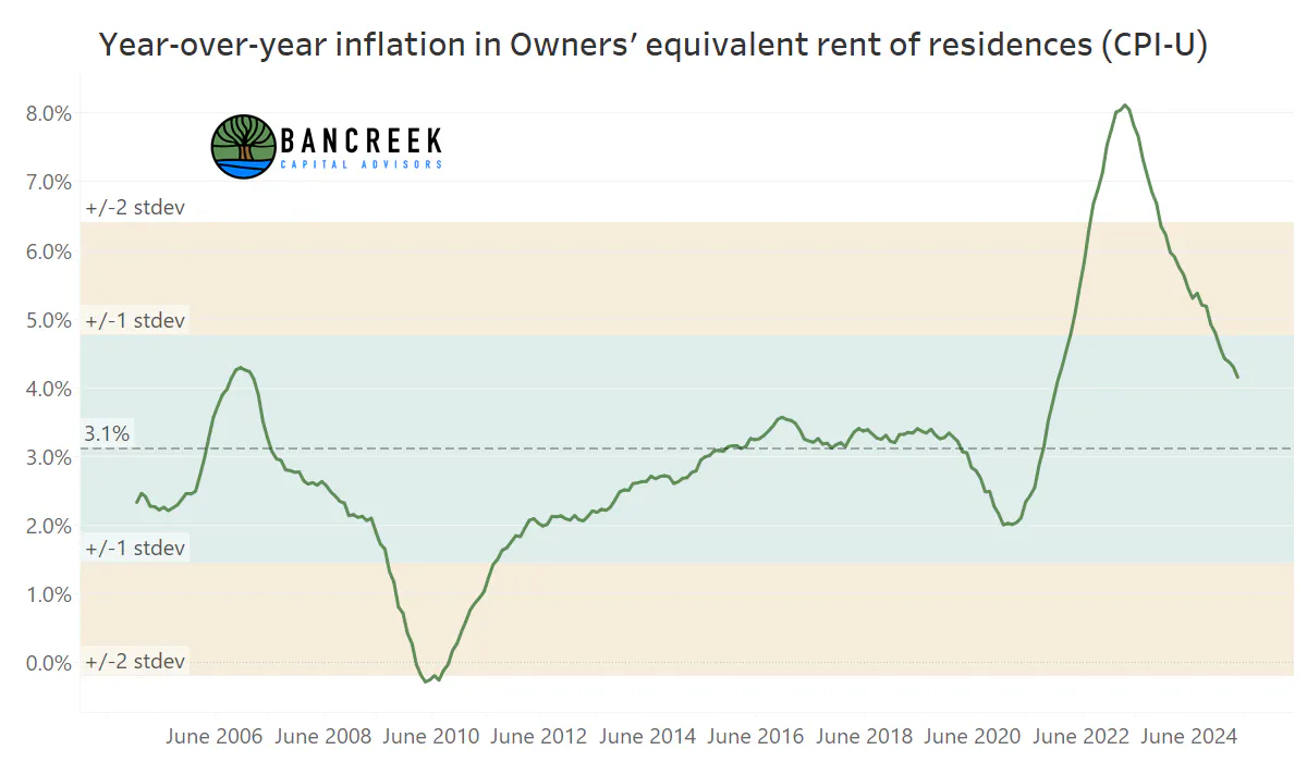
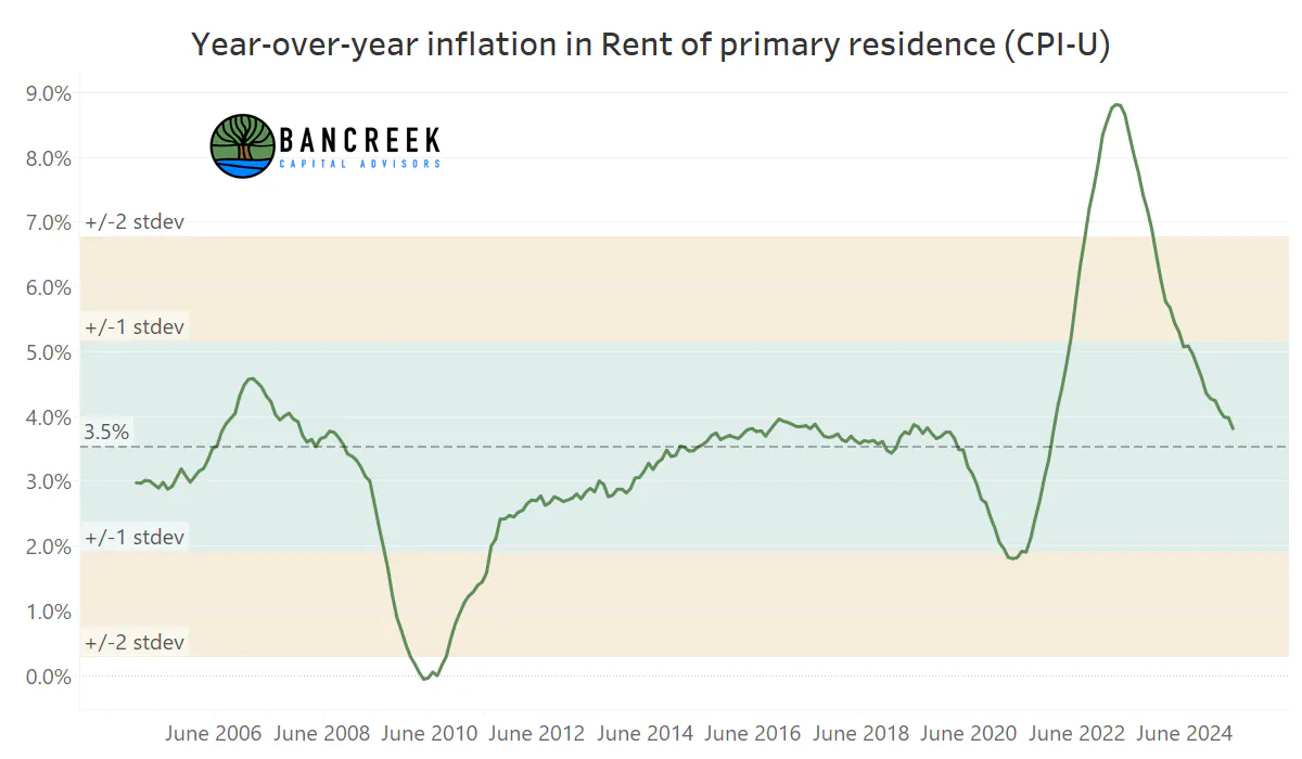
This is largely what happened in May. Shown below is the sequential (i.e., month-over-month, or "MoM") inflation of the two dominant components of shelter, OER and Rents. In May, OER rose by 26 basis points MoM while Rents advanced by just 17 basis points MoM. Note that this MoM increase in Rents was the lowest print we have seen since April 2021.
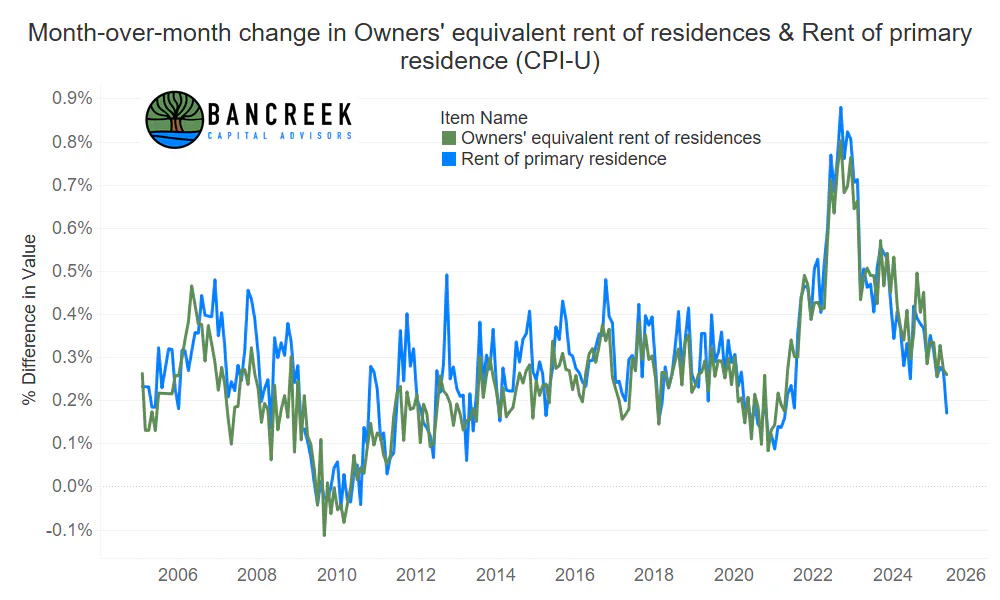
Source: Bancreek Capital Advisors analysis of data from bls.gov
Easing MoM inflation of course weighs on year-over-year (YoY) inflation, as shown in the two below images.
Source: Bancreek Capital Advisors analysis of data from bls.gov
Source: Bancreek Capital Advisors analysis of data from bls.gov
Note that both OER and Rents are still elevated compared to their historical average, but that's only on a YoY basis. If you scroll up and look at the MoM inflation trend for these two items, you can see they have been at, or even below, their historical average for a few months now. As such, for modeling purposes, let's assume they both maintain their historical MoM averages going forward. We would then expect OER and Rent to settle in the low-3% neighborhood on a YoY basis. If we apply the weight of these items, this would shave another 28 basis points off CPI.
How much inflation do we need in goods to offset shelter tailwinds?
To illustrate our point on the limitations of CPI in assessing the impact of tariffs, we need to consider what would be most impacted by tariffs and then see what the weight is of these items in CPI.
Disclaimer: Please note that the following analysis is not meant to be precise. Rather it's meant to just illustrate the problem with CPI in broad-brush strokes. If you conduct this analysis on a detailed line-by-line level, please let us know what you come up with and we'll call you out in a future Bancreek post! Disclaimer over.
First off our highest level assumption is that goods would be much more impacted by tariffs than services. So, what is the weight of goods in CPI? The answer is 36%. However, nearly half of the 36% weight in goods is comprised of food (13.6 points) and energy (3.2 points). This leaves just a 19% weight of CPI in "core goods," 6.7 points of which is new and used vehicles. Adjust core goods for vehicle purchases and that leaves just a 12% weight in non-vehicle core goods. This means that the entirety of non-vehicle core goods carries a weight that is just over one-third of shelter.
Herein lies the problem. For every one point reduction to YoY shelter inflation, we need to see around a three point rise to non-vehicle core goods to just offset the expected future shelter benefit we should see over time. If we include vehicle inflation, that ratio is still 1.8 to 1. In conclusion, we need to see substantial inflation in core goods for any net impact to show up in core inflation in the coming months simply because of the expected tailwind from a much larger shelter component.
Gasoline deflation appears to have peaked for now
If we look at non-core inflation, CPI has been benefiting immensely from gasoline deflation, which slashed a whopping 44 basis points off headline CPI in May. In other words, had we not had this deflation, headline CPI would have instead been 2.8%.
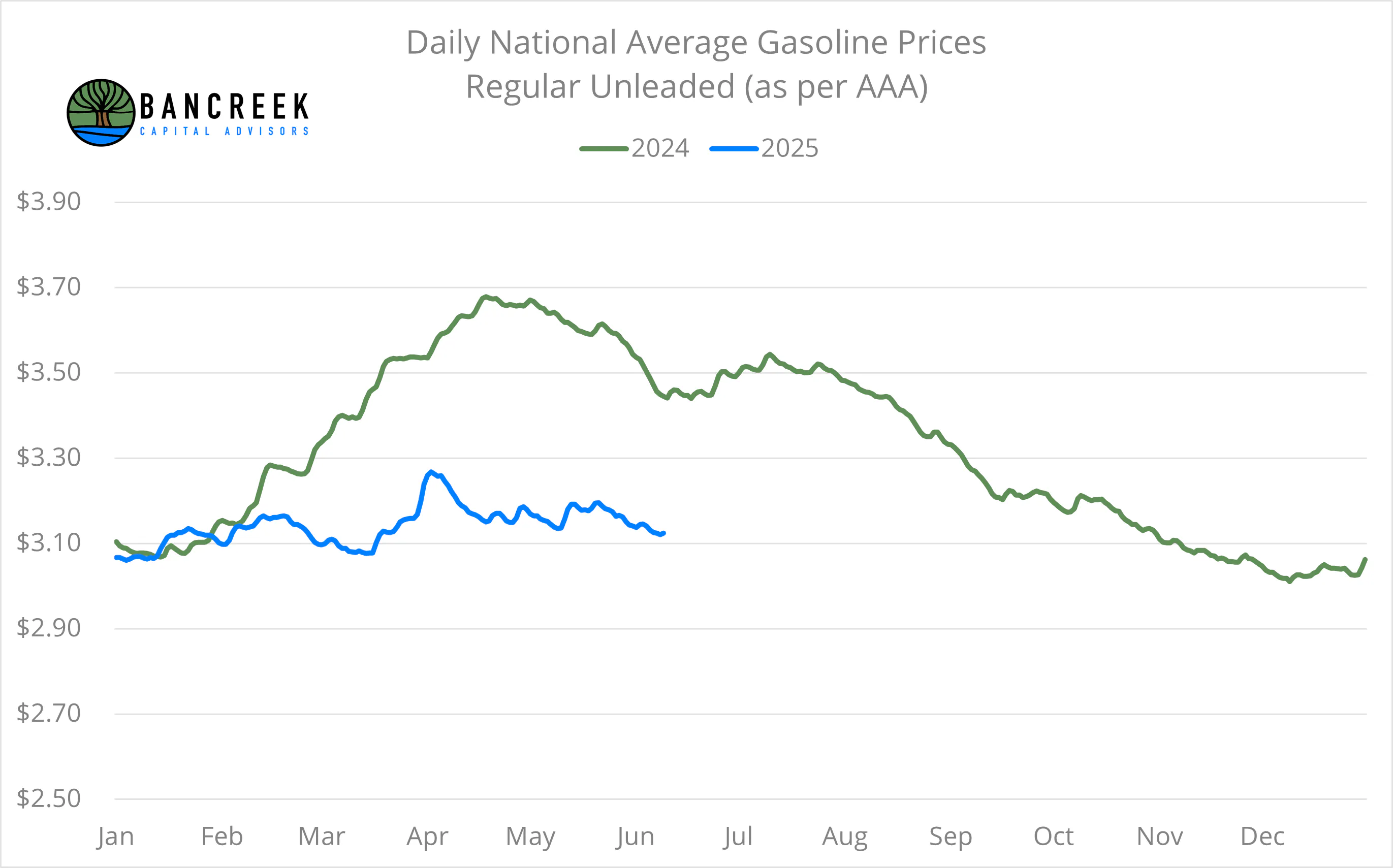
But this dynamic appears set to reverse now as we start to cycle a decline in gasoline prices in the summer of 2024, making the comparisons harder throughout the rest of the year. Note that, as shown below, the steep fall off in gasoline prices last year didn't occur until late August, so we have a few months before we have to cycle the worst of this. But we still forecast three points less of YoY gasoline deflation in June vs. May, based on average gasoline prices through June 10th. This alone would add 10 basis points to inflation in June vs. May.
Source: Bancreek Capital Advisors analysis of data from Bloomberg
The outlook for the CPI measure looks good, but it's time to acknowledge CPI does not reflect the public's experience of inflation
So, as we pull ourselves out of the weeds, we realize there is some good news and some bad news when it comes to "inflation." The good news is that CPI is completely dominated by shelter at the moment, and shelter has consistently proven that it woefully lags leading indicators for the housing market. In addition, the collective weight of all the items that one would logically expect to inflate with tariffs pales in comparison to CPI's lagging shelter measure. Put these factors together, and the outlook for CPI doesn't look too troubling.
But the bad news is CPI doesn't measure how the public experiences inflation anymore. Our experience of inflation comes from the frequency of purchasing items. We buy food and gasoline every week, and see those price changes in real time. But the market powers that be have stripped out the items that most influence our experience of inflation simply by labeling them "non-core." This problem only compounds by studying the items that are left behind - items like OER, which is a completely hypothetical survey-based number that no one experiences in real time.
To be fair, it's actually not appropriate to call this a problem. The CPI measure just is what it is. The problem comes into play when people try to use aggregate CPI to assess tariff-driven inflation, which sadly is all too common right now.
If you want to assess tariffs how tariffs are impacting inflation, save yourself some time and use Bancreek Capital Advisors data visualization. Good luck out there and may your data analytics efforts be fun and fruitful.
Enjoying this post?
Tell others about it.

Bancreek's Actively Managed ETFs
If you are interested in learning more about Bancreek Capital Advisors' actively managed ETFs click the link below
Learn MoreMore articles like this
Fetching Related Posts
There are no other articles tagged with Research