
July 2025 PCE - Market win streak pulls up core inflation

Eric Pachman
Published
August 29th 2025
Eric Pachman
Published
August 29th 2025
July 2025 year-over-year core PCE creeps higher
This morning, the Bureau of Economic Analysis released the July 2025 PCE inflation report. Overall PCE was reported at 2.60% year-over-year (YoY) for July, up four basis points from 2.56% (revised) year-over-year last month. Meanwhile, core PCE increased to 2.88% in July 2025 from 2.77% (revised) in June 2025.
Winning stocks puts upward pressure on core PCE
We're going to try something new this month to save us all some time. This morning, we put out some posts on socials (X and LinkedIn) which hit all the main points we planned to share with you in today's analysis. As such, we've embedded these two posts below, after which we'll share one last bit of information to help you connect the dots that we have not shared on socials.
By the way, if you are not following us on socials, consider doing that as this is the medium we typically use to get out our quick takes on data releases.
Here's our first post this morning, which shows the main drivers of the change in inflation impact from June 2025 to July 2025.
Please wait...
And then here is our second post, in which we dig deeper into the conundrum that the higher stocks go, the more upward pressure that puts on core PCE.
Please wait...
This last chart is just for you... our loyal Bancreek subscribers/readers. This shows the relationship between S&P 500 trailing-12 month returns and the YoY change in PCE's Portfolio management and investment advice item. As you can see, the correlation is directionally very strong. However, the market's absolute YoY change is considerably more volatile than the YoY change in PCE's Portfolio management item.
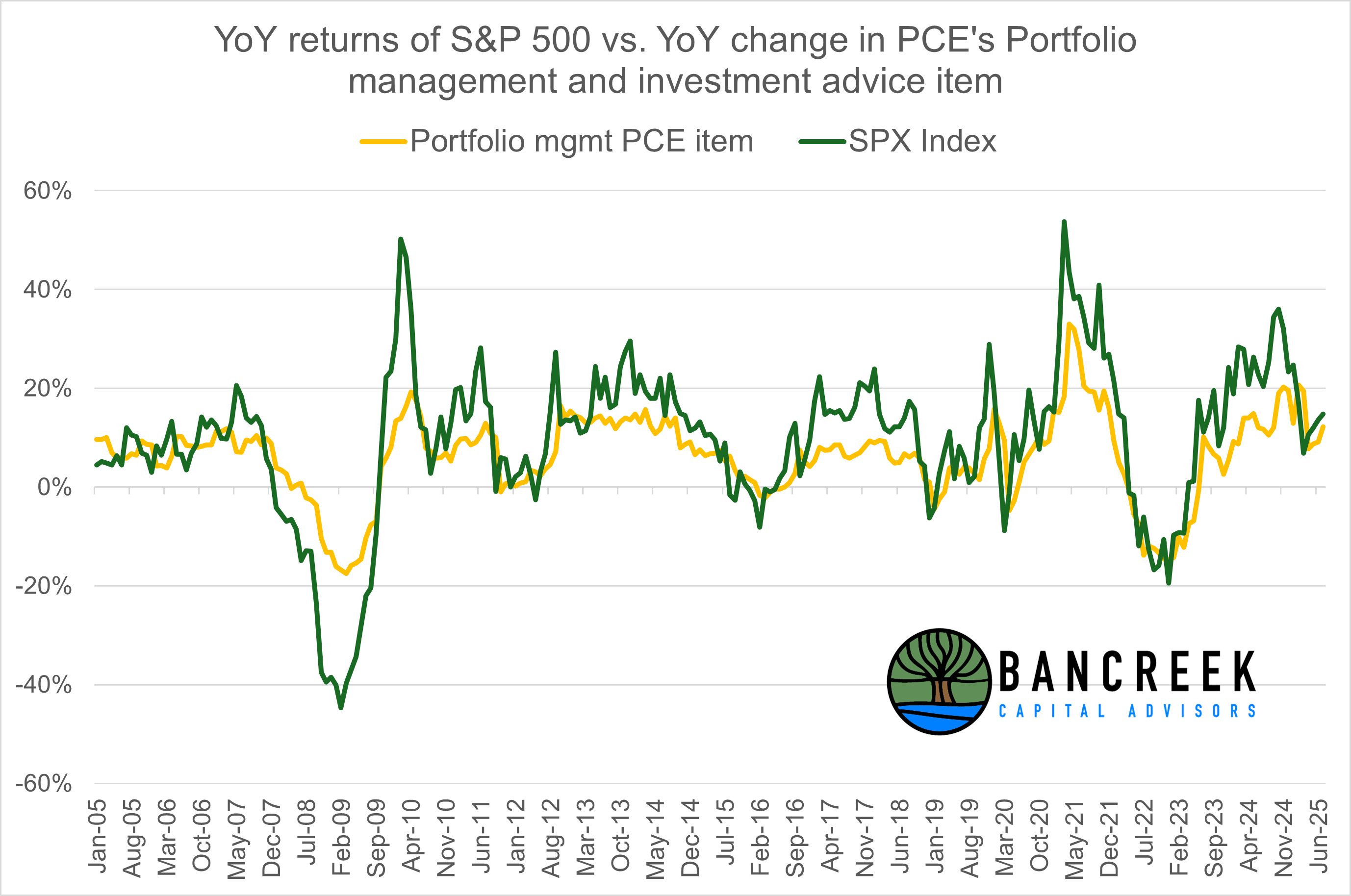
Source: Bancreek Capital Advisors, LLC analysis of data from bea.gov and Bloomberg
Feel free to explore our two PCE data visualizations to see the other moving parts in today's PCE data release! For your convenience, we have embedded them below.


As a reminder our main "bubble chart" visualization relies on a measure we call “inflation impact,” which we calculate by multiplying each item’s YoY inflation by its weight in the prior year period. You can think of this as “weighted inflation” as opposed to the “unweighted inflation” that is more commonly reported by the media. Each month we take the weighted inflation of each item we track in PCE and size the bubbles based on this value. As such, you should be able to quickly glance at this visualization and quickly "see" the items that are the biggest drivers of PCE in the selected month.
The second visualization is a drilldown that displays both the historical weight and YoY inflation for any item within the BEA's item hierarchy.
Countdown to "Labor day"
With the largely telegraphed PCE now in the rear view mirror, we can count down to Labor day. And we don't mean the Labor day on 9/1... we mean the "Labor day" on 9/5 when August nonfarm payroll (NFP) and unemployment data is released by the BLS. Remember, just one month ago the BLS shocked us all with significant downward revisions to the NFP data. By the end of the day the organization's head was canned for said revisions. So this month's "Labor day" data release is set up to be must watch reality television. Make sure you stay tuned in to Bancreek for a dissection of the data that you can actually trust.
Enjoying this post?
Tell others about it.

Bancreek's Actively Managed ETFs
If you are interested in learning more about Bancreek Capital Advisors' actively managed ETFs click the link below
Learn MoreMore articles like this
Fetching Related Posts
There are no other articles tagged with Research