Personal Consumption Expenditures (PCE) Visualization Tools: Methodology

Eric Pachman
Published
April 24th 2024
Eric Pachman
Published
April 24th 2024
This post describes the methodology Bancreek used to create the Bancreek Inflation (PCE) Visualizer and the Bancreek Detailed PCE Item Analyzer.
Sources
Both visualizations rely on two tables published by the Bureau of Economic Analysis (BEA):
- Table 2.4.4U. Price Indexes for Personal Consumption Expenditures by Type of Product, and
- Table 2.4.5U. Personal Consumption Expenditures by Type of Product
Using the BEA’s interactive data application, we downloaded monthly data for both databases going back to the start of 1989.
Transformations
Excel
Given the very manageable size of the two data files, we opted to use Excel for the initial data transformations.
Our first task was to remove the data header, footer, and any intermediate blank rows to create one contiguous data table. We converted the date field from two rows (year in row 1, month in row 2) to one row (formatted MM/DD/YYYY).
Next, we added a field to keep track of the hierarchy of the underlying items. We noticed that while the BEA doesn’t provide a field that explicitly notes where items live in the hierarchy, they consistently indent the item name depending on the item resides in the hierarchy. For example, a top-level item (we call hierarchy = 0) like “Goods” will have no indentation. An item on the next level down (hierarchy = 1) such as “Durable goods” was indented by four spaces. The next level down (hierarchy = 2) has eight spaces of indentation. It turns out that these increments of four are consistent throughout the table, which meant that we could simply count the number of spaces before the Item text to figure out the hierarchy.
We then added one more field to the table called “Include.” Include is a binary field that flagged the items that we wanted to display on the Bancreek Inflation (PCE) Visualizer. It’s critical to note that the purpose of this particular visualization is to display the lowest level collection of underlying items that sum to overall PCE inflation in a bubble chart, sizing the bubbles by the inflation impact of each item. As such, we needed to ensure that the items we selected to display on the visualization added to overall PCE. Recall, since the items are presented in a nested hierarchy, we could not simply add all of them up since many items would be double counted. So, we had to go through the BEA’s list and choose the lowest level mutually exclusive item list. The good news is that the BEA makes this process quite easy using Table 2.4.5U since this table provides nominal dollars for each item. All we had to do was choose the items we wanted (flagging them with a “1”), sum them up, and make sure it added to overall Personal consumption expenditures.
Our last step was to estimate the weights in each period, which also is quite straightforward using Table 2.4.5U. We simply divided each item by Line 1 (Personal consumption expenditures) to convert the nominal dollars spent into percentage of total.
We then loaded both files (indexes and weights) into Tableau Prep to perform the rest of the data transformations.
Tableau
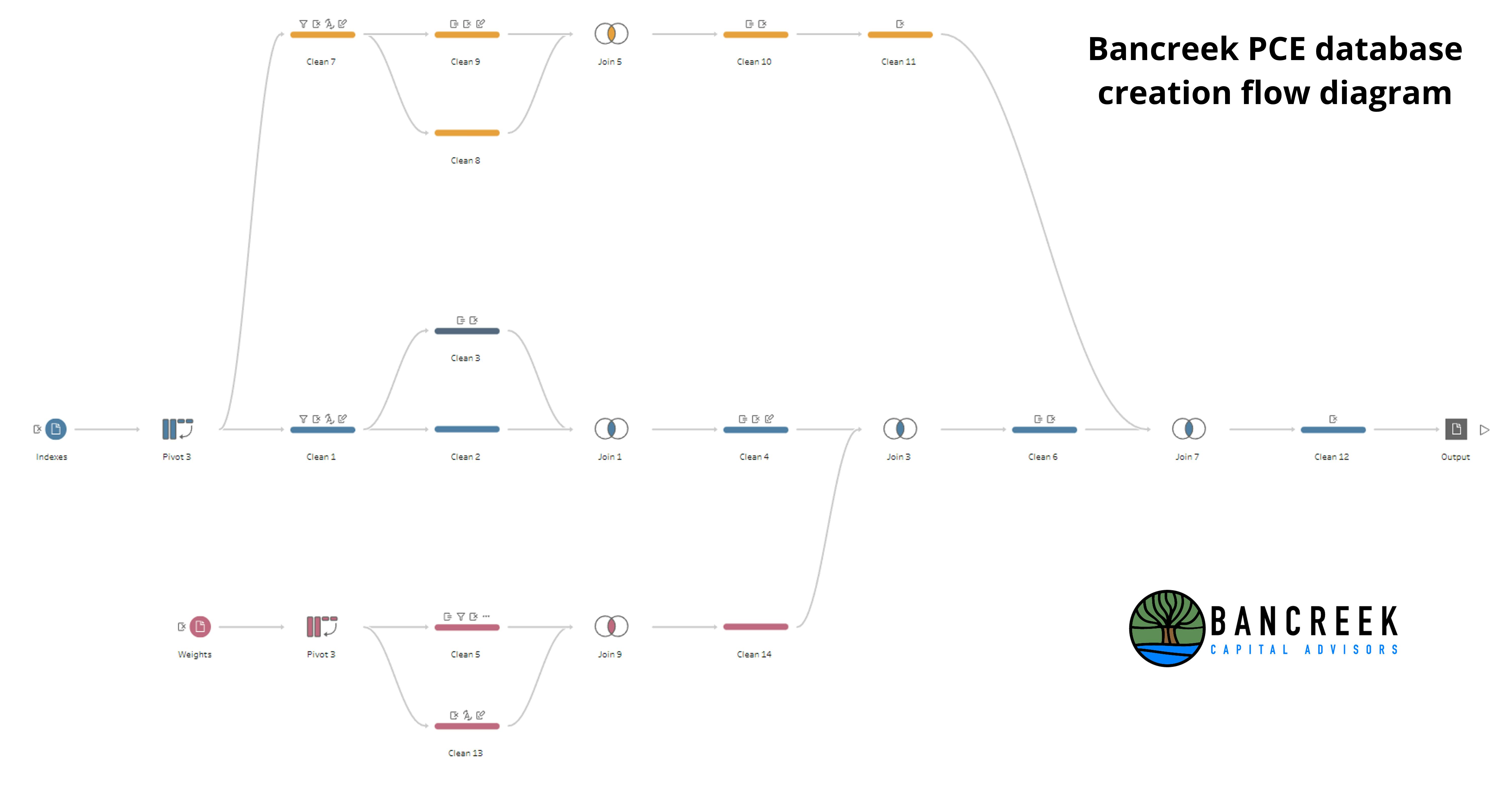
We’ll use the following Tableau Prep flow diagram to explain each step of the data prep process within Tableau.
Source: Bancreek Capital Advisors, LLC
First off, please note you should read this flow diagram from left to right and that each block is a different transformation element. Also note that there are three tracks in this flow, separated by color. The three tracks are:
- Blue: Index values from Table 2.4.4U are transformed into year-over-year percent changes
- Pink: Weights derived from Table 2.4.5U are joined into the blue track to be able to calculate estimated weighted inflation for each item
- Yellow: This track isolates only overall PCE from the rest of the items, so we could join this back into the database as a separate column, which facilitated the validation exercise described in the next section.
We’ll call your attention to a few other items which may be less intuitive from the visual:
- The BEA’s tables are formatted where the data for each period is provided in a new column. While this formatting is easier to work with in Excel, it’s not ideal for data visualization software, which prefers all values to be formatted in new rows. This is why we added a pivot block at the start of the blue and pink tracks – to pivot columns to rows.
- In all three tracks you’ll notice we separated the data into two “Clean” blocks, and then proceeded to join them back together. The point of doing this was to offset the index values in one of the Clean blocks by one year. Then, when we joined the two Clean blocks together, we had two fields of values for each item – one for the current year and one for the prior year. After this transformation, we were easily able to calculate year-over-year percent changes.
- In the Bancreek Detailed PCE Item Analyzer we wanted to add a bit of context to the item name to facilitate navigation of the tool. As such, we used the hierarchy calculation described in the prior calculation to add a hierarchy number, and to edit the spacing to display better within our visualization. We used the following calculated field to create this enhanced item name, which is displayed in the upper table in the visualization.
IF
[Hierarchy] + 1 = 0 then STR([Hierarchy]+1) + ". " + [Item Name]
ELSEIF [Hierarchy] + 1 = 1 then " " + STR([Hierarchy]+1) + ". " + [Item Name]
ELSEIF [Hierarchy] + 1 = 2 then " " + STR([Hierarchy]+1) + ". " + [Item Name]
ELSEIF [Hierarchy] + 1 = 3 then " " + STR([Hierarchy]+1) + ". " + [Item Name]
ELSEIF [Hierarchy] + 1 = 4 then " " + STR([Hierarchy]+1) + ". " + [Item Name]
ELSEIF [Hierarchy] + 1 = 5 then " " + STR([Hierarchy]+1) + ". " + [Item Name]
ELSEIF [Hierarchy] + 1 = 6 then " " + STR([Hierarchy]+1) + ". " + [Item Name]
ELSEIF [Hierarchy] + 1 = 7 then " " + STR([Hierarchy]+1) + ". " + [Item Name]
ELSEIF [Hierarchy] + 1 = 8 then " " + STR([Hierarchy]+1) + ". " + [Item Name]
END
Please note that this section is not aimed to be a comprehensive overview of every minor filter and calculated field we used to help generate our final database, but rather is intended to broadly describe the process we used to transform the BEA’s raw data. If you are interested in more detail on each step of the transformation process, please contact us and we will gladly answer more detailed questions.
Validation
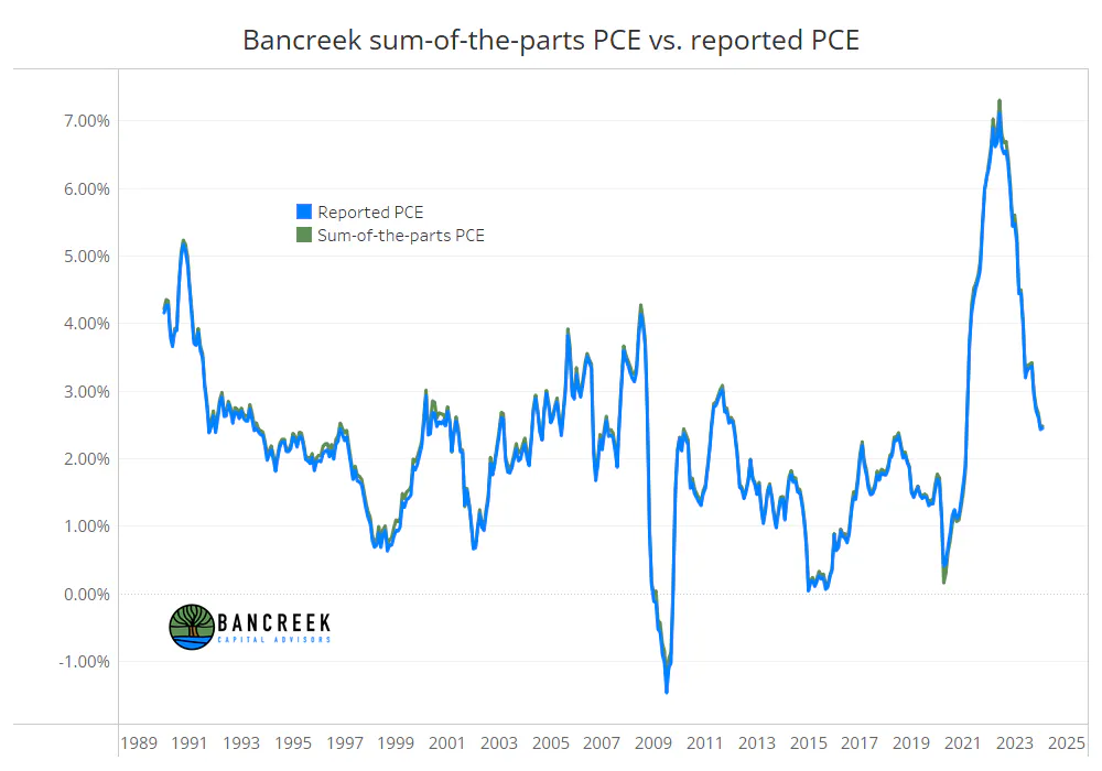
As was the case with our CPI-U work, the goal of this process was to be able to deconstruct inflation into its more granular components and use those components to quickly and cleanly display the drivers of inflation each month. Therefore, the main measure of success was to see if we were able to recreate headline inflation in each month by summing up our weighted inflation estimates at the item level. The following chart shows the comparison of our bottoms-up calculated inflation versus reported headline inflation:
Source: Bancreek Capital Advisors, LLC
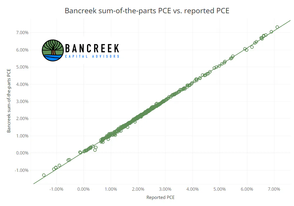
As shown above, the fit between our calculated inflation and reported headline inflation was extremely tight. We also found the R^2 between our calculated inflation and the BEA’s reported inflation to be 0.99892, indicating that the two data sets were nearly identical.
Source: Bancreek Capital Advisors, LLC
This validation exercise gave us confidence that the data transformations and assumptions described throughout this post were performed with enough accuracy to use as the basis for our visualizations.
Enjoying this post?
Tell others about it.

Bancreek's Actively Managed ETFs
If you are interested in learning more about Bancreek Capital Advisors' actively managed ETFs click the link below
Learn MoreMore articles like this
Fetching Related Posts
There are no other articles tagged with Research