
Visualizing Changes in Nonfarm Payroll Data

Eric Pachman
Published
April 8th 2025
Eric Pachman
Published
April 8th 2025
A primer on how to use the Bancreek U.S. Employment Data Treemap data visualization
Reintroducing our nonfarm payroll data visualization
We are going to take a different approach with this month's nonfarm payrolls report. Rather than provide you with what believe to be the key takeaways of this report, we instead are going to offer a (long overdue) overview on how to use the Bancreek U.S. Employment Data Treemap. The longer we work with this nonfarm payroll chart, the more powerful it has become for us. Within a minute or two and a few clicks we can see the entirety of the jobs story each month, after which it feels somewhat anti-climactic to extract a couple key takeaways to hammer our complete and nuanced understanding of the nonfarm payrolls report into a digestible blog post. In other words, using words to try to cover the jobs data is clearly insufficient. Words pale in comparison to the value of communicating the story through our data visualization.
So with that said, we'll repurpose the words we use in this post to explain how to use the tool. Hopefully today's "teaching to fish" post will keep you "well fed" for many nonfarm payroll prints to come.
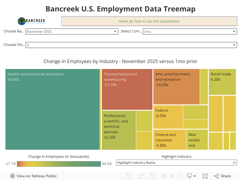
Without further delay, let us reintroduce you to the Bancreek U.S. Employment Data Treemap.
How we built this visualization
All data visualizations start with data, so that’s probably a good place for us to start in our explanation of this tool. All the data used to construct this tool is published by the BLS once a month at download.bls.gov - /pub/time.series/ce/. From the myriad files available for download on this site, we used the following:
- ce.data.0.AllCESSeries
- ce.series
- ce.industry
- ce.supersector
- ce.datatype
Think of ce.data.0.AllCESSeries as the brains behind the operation. This single file houses a dizzying amount of employment data (e.g., employees, hours, payrolls, etc.) on 800+ different industries going back to the 1930s. We’ve only started to scratch the surface on what can be done with this file in the Bancreek U.S. Employment Data Treemap as right now we are only using a single data type – employee counts. An entirely new dimension will open when we start working with average hourly wages for each industry!
But we are getting ahead of ourselves. Back to the files.
Think of the other four files as decoders that we used to make sense out of the AllCESSeries file. We joined each of these decoder files together with the AllCCESSeries file to bring in helpful descriptor fields like Industry Name, Data Type (e.g., employees, hours, payrolls), Supersector, and Display Level (which we’ll discuss at length later).
Once the joins were complete, we did a bunch of data transformations (i.e., math) to turn absolute employee counts into comparisons across different periods. We decided to offer eight different period comparisons in the viz, which all are relative to the latest month of fully reported data — typical for a nonfarm payrolls report:
- one-month prior period
- one-year prior period
- two-year prior period
- three-year prior period
- five-year prior period
- ten-year prior period
- fifteen-year prior period
- twenty-year prior period
To provide an example, the latest month of fully reported data is March 2025. It follows then that:
- the one-month prior comparison is to February 2025
- the one-year prior comparison is to March 2024
- the two-year prior comparison is to March 2023
- and so on…
How to use this visualization
Treemap
First off, we should address the term “treemap” as it may be new to some folks. Treemaps are data-visualization techniques that help display not only the value of an individual data element, but also the structure of the data hierarchy. This makes them ideal for presenting complex data like a nonfarm payroll chart. As such, treemaps are helpful for visualizing complex, hierarchical databases – which happens to be a perfect description of the BLS’ employment databases.
Looking at this treemap, you’ll see boxes of different sizes shaded with different colors. Both the color and the size of the box denote the change in aggregate hours over the selected period. However, note that the color uses a traffic light color scheme, where green denotes an increase in employees and red denotes a decrease in employees. You will find a legend for this color scale at the bottom left of the viz. The size of each box is based on the absolute value of the change in hours.
Supersector
One other feature to note is that we grouped all industries in this viz by industry “supersector.” There are 22 supersectors in the BLS’s databases:
- Construction
- Durable Goods
- Financial activities
- Goods-producing
- Government
- Information
- Leisure and hospitality
- Manufacturing
- Mining and logging
- Nondurable Goods
- Other services
- Private education and health services
- Private service-providing
- Professional and business services
- Retail trade
- Service-providing
- Total nonfarm
- Total private
- Trade, transportation, and utilities
- Transportation and warehousing
- Utilities
- Wholesale trade
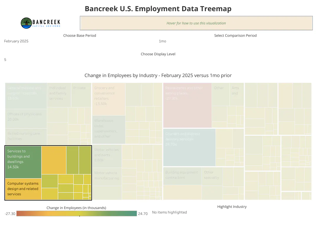
The viz automatically places industries into clusters grouped using these 22 supersectors and separates these clusters with thicker white lines. To illustrate, we have highlighted all the industries in the Professional and business services supersector in the following image:
Source: Bancreek Capital Advisors, LLC
Display Level
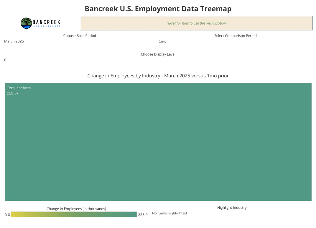
Towards the top of the visualization there is a filter labeled “Choose Display Label.” Display Level is the BLS term to refer to where an industry "lives" in industry hierarchy. Display Level = 0 is the top level of the hierarchy and only is home to a single industry: Total nonfarm. The number that shows up below Total nonfarm should be familiar in the below image – that’s the month-over-month change in payrolls reported by the BLS last Friday (4/4/25).
Source: Bancreek Capital Advisors, LLC
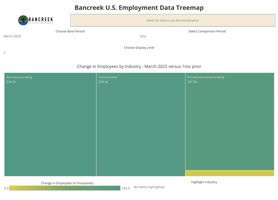
The higher the Display Level, the deeper you venture into the BLS's industry hierarchy. For example, if you switch the Display Level to 1, you’ll see four industries:
- Total private
- Service-providing
- Private service-providing
- Goods-producing
Source: Bancreek Capital Advisors, LLC
Move to Display Level = 2 and you’ll see 11 industries.
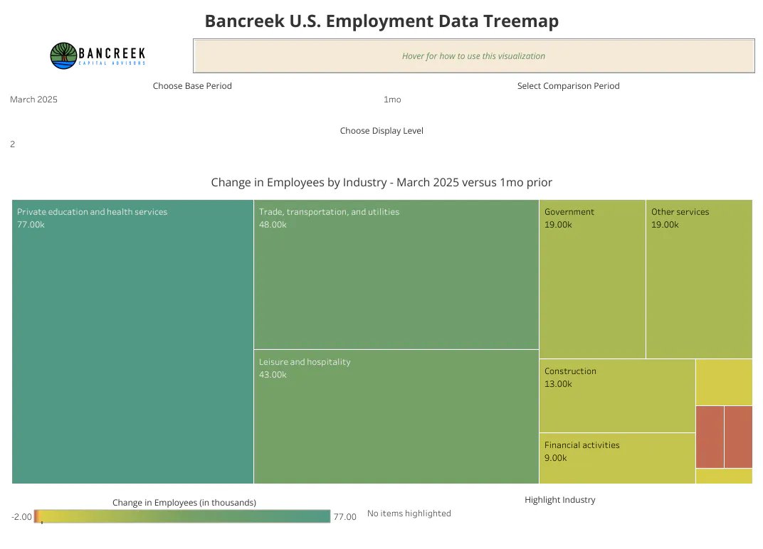
Source: Bancreek Capital Advisors, LLC
You get the point… as shown below, the number of industries by Display Level grows markedly through Display Level = 6, before dropping at Display Level = 7.
- Display Level = 3: 19 industries
- Display Level = 4: 84 industries
- Display Level = 5: 241 industries
- Display Level = 6: 315 industries
- Display Level = 7: 156 industries
It is critical to note that the total employees at each Display Level do not necessarily add up to Total nonfarm employees. In fact, Display Level = 2 is the only one that perfectly ties to Total nonfarm employees. All other Display Levels consistently total to a lower number than Total non-farm employees except Display Level = 1, which sums to a far higher number of employees than Total nonfarm because the four industries at this level are aggregates with considerable overlap. Going back to 1990, the average total employees at Display Levels 3 through 7 divided by Total nonfarm employees is as follows:
- Display Level = 3: 89% of Total nonfarm employees
- Display Level = 4: 93% of Total nonfarm employees
- Display Level = 5: 86% of Total nonfarm employees
- Display Level = 6: 45% of Total nonfarm employees
- Display Level = 7: 25% of Total nonfarm employees
The following image compares total employees for each Display Level to Total nonfarm employees (the blue line, Display Level = 0) back to 1990.
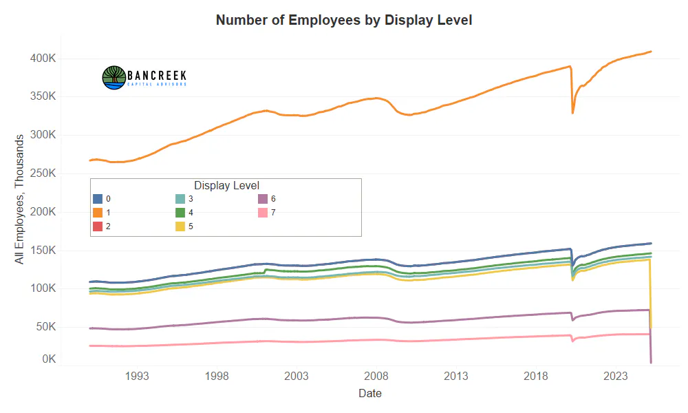
Source: Bancreek Capital Advisors, LLC
It's important to note that there is nothing inherently wrong with each Display Level not tying to Total nonfarm. This is by design. The BLS simply offers more drilldown granularity for some industries than it does for others. This is just a quirk of the data to be aware of if you are trying to fully explain changes in Total non-farm employees. If this is your goal, and you require 100% precision, stick to Display Level = 2. But if your experience is anything like ours, to really learn from this data set you’ll likely end up flipping back and forth through all the Display Levels to inspect as many industries as possible.
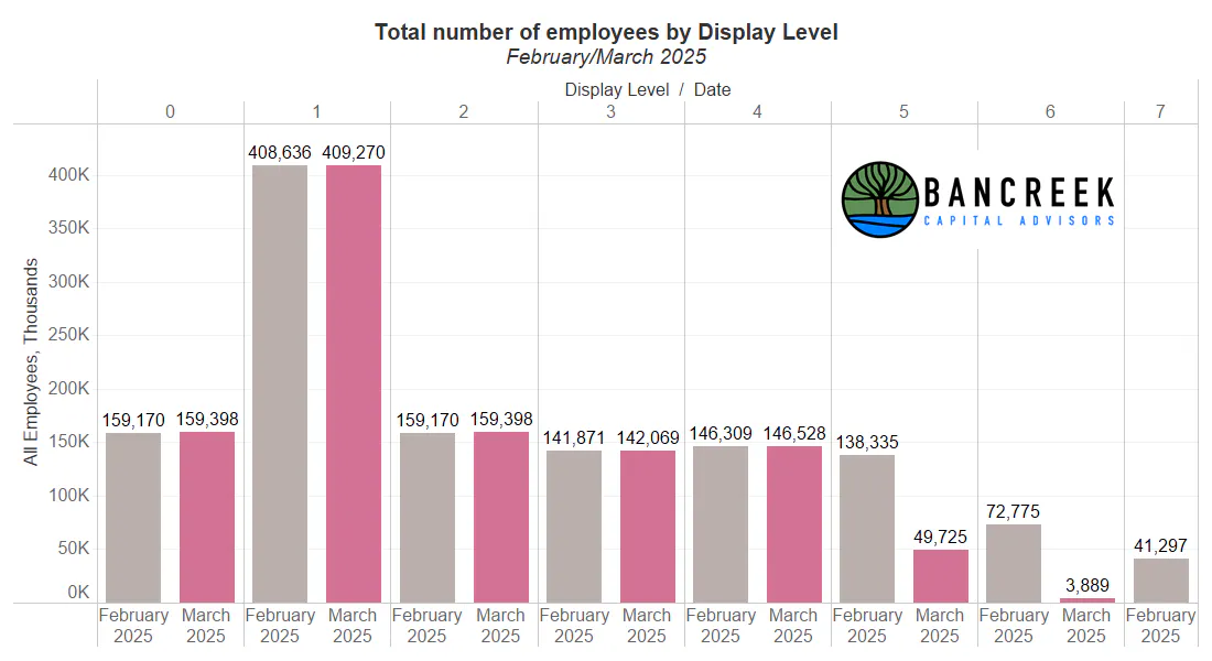
Before we move on, if you look closely at the last chart, you may notice the number of employees in Display Levels 5, 6, and 7 nosedive in the most recent monthly print. This is something to be aware of when working with this data. The most recent month of data always is short on details at the most granular Display Levels. One month later, those finer details then get populated in arrears.
To help you see this a bit better, take a look at the next chart which shows the number of employees by Display Level for the last two months. You can clearly see that Display Levels 0 through 4 are similar in both months (and tie out to the change in nonfarm payrolls we all know and love). This is not the case with Display Levels 5-7, which are far lower in the March 2025 data than in the February 2025 data. This is the reporting lag issue we're highlighting for you. So, if you are trying to drill down into the depths of this database for the latest month's payrolls and notice the data just seems to go missing, don't be alarmed. Instead, be patient. The BLS has always filled in these blanks in the next month's release. And when they do, we'll revise our database to include this enhanced level of detail.
Source: Bancreek Capital Advisors, LLC
Highlight industry
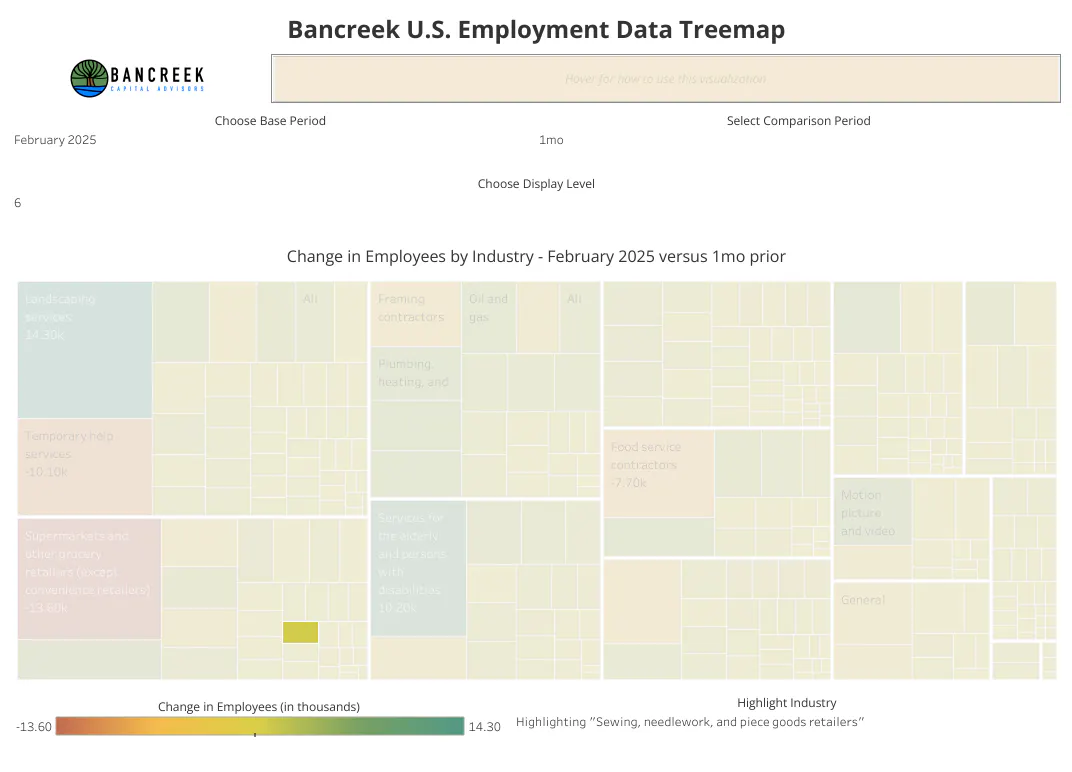
That brings us to the Highlight Industry feature on the bottom right of the visualization. With 831 total industries available to view each month, spread across seven Display Levels, we needed to provide you with some assistance finding an industry of interest. Simply start typing a keyword in the search bar and a list will pop up of available industries that contain that keyword at the Display Level currently selected in the tool.
For example, in the below image we changed Display Level to 6 and then typed “needle” into the search bar. As you can see, the tool found “Sewing, needlework, and piece goods retailers” and highlighted this industry in the visualization. That’s, quite literally, how you find a needle in a treemap. 😊
Source: Bancreek Capital Advisors, LLC
Choose base period
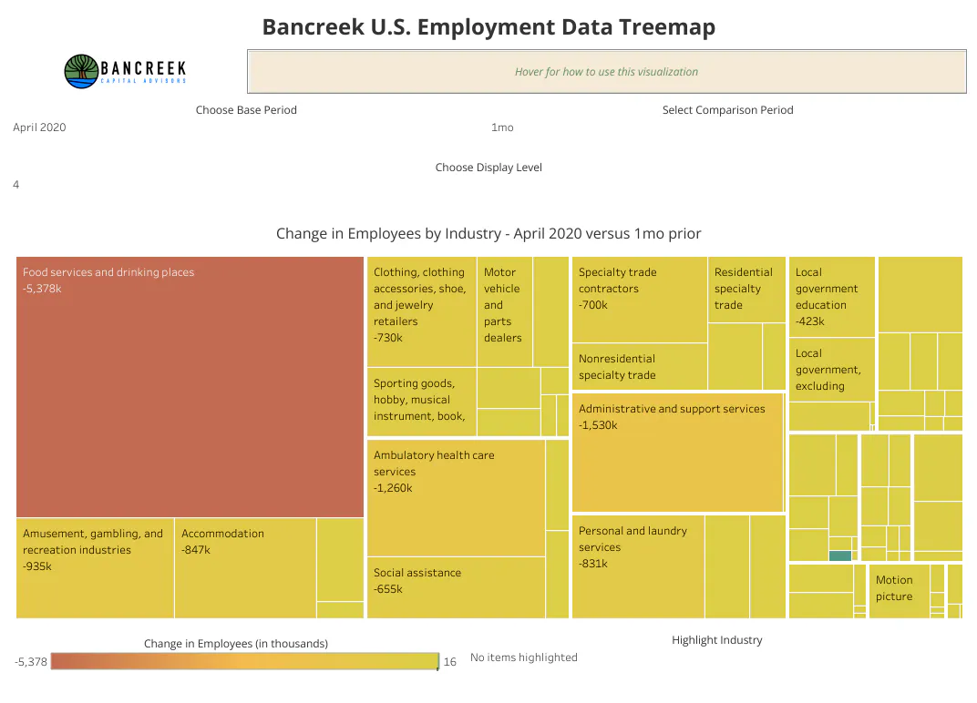
At the top left of the visualization you will see a dropdown filter called, "Choose base period." This filter lets you change the base period for your analysis. So, say you were curious what the month-over-month change in nonfarm payrolls looked like when the U.S. economy literally shutdown due to COVID in April 2020. All you would have to do is choose April 2020 from this filter to create the following bloodbath of a chart.
Source: Bancreek Capital Advisors, LLC
Select comparison period
But as we all know now, at least from a jobs perspective, the worst of the COVID depths didn't last long. We can really visualize this information using the last filter we have created for you within the tool - Select comparison period, which can be found in the upper right corner of the visualization.
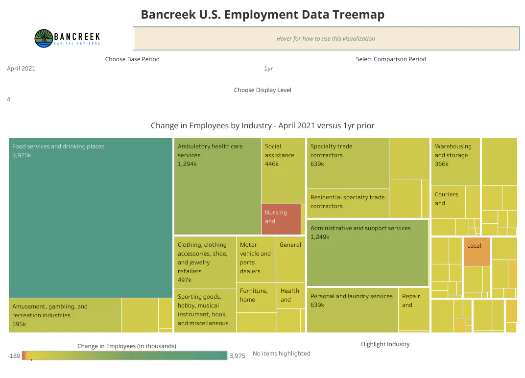
To visualize how quickly the job market rebounded, let's set the Base period to April and the Comparison period to "1yr." Doing this will output the following chart, which shows an almost complete reversal in the April 2020 job losses, especially in the Food services and drinking places industry.
Source: Bancreek Capital Advisors, LLC
As data analysts and students of the U.S. economy, we especially love the Select comparison period feature, as it unlocks the ability to really learn from this dataset. For example, can we use this dataset to, in seconds, quantify the changing nature of our economy over the past 20 years? We all likely know that the U.S. economy has been shifting from goods to services for quite some time. But do we know by exactly how much? And exactly which parts of the job market (and thus, economy by extension) have been the biggest winners and losers in this evolution? That's probably not information you can get in a few clicks for free, unless you use this data visualization.
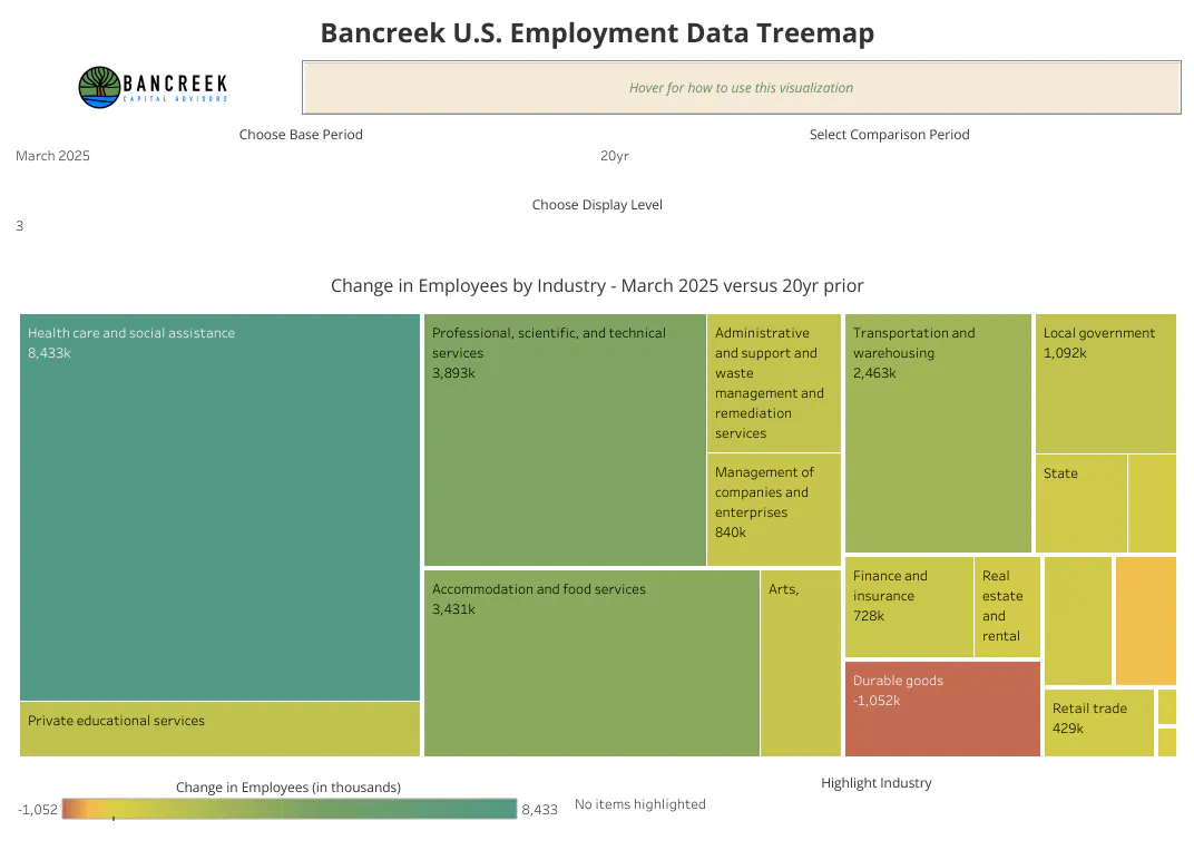
To illustrate, we simply changed the Select comparison period to "20yr" to output the following chart. Within seconds, we can learn that Health care and social assistance has been the most notable winner over the past two decades, adding over 8.4 million net jobs. That's unsurprisingly followed by other "services" industries (Professional, scientific, and technical services and Accommodation and food services). And those two are followed by massive gains in Transportation and warehousing jobs, which may seem like an outlier until you start to think back to how long it used to take to get a trinket ordered on the internet in 2005 and compare that to the coffee filters you ordered from Amazon before starting to read this post that likely will arrive at your home by the time you are done with this post (i.e., lots of people are needed to pull off this logistical magic trick). On the flip side of the ledger, Durable goods has shed over 1 million employees over the past 20 years.
Source: Bancreek Capital Advisors, LLC
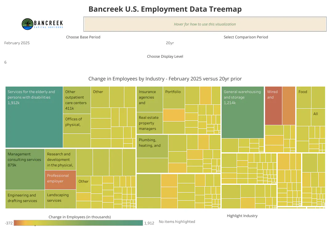
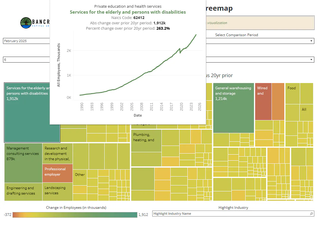
Of course, if the change in the U.S. economy over the past two decades is something you are really curious about, the last chart is just the start of your research process. You can now use the tool to drill deeper into the hierarchy, and learn that Services for the elderly and persons with disabilities is the single largest driver of jobs at Display Level 6, adding over 1.9 million jobs over the past 20 years! That's a 263% increase. Now we are really getting to the valuable nuance that is hidden within the data.
Source: Bancreek Capital Advisors, LLC
Historical industry trend charts
Throughout your research process, you may find it helpful to visualize trend charts for a given industry. To do this, simply hover over any box/industry within the treemap and the historical trend chart for this industry will appear. The chart below shows this functionality for the aforementioned Services for the elderly and persons with disabilities.
Source: Bancreek Capital Advisors, LLC
NAICS code lookup
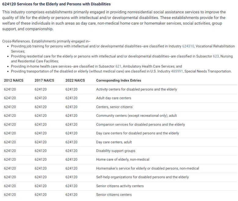
One final feature to which we’d like to draw your attention is the NAICS code, which you can find for each industry on the viz on hover. For example, if you hover over Services for the elderly and persons with disabilities, you’ll find its NAICS code to be 62412. This number may seem meaningless until you combine it with the lookup tool that can be accessed through the census.gov website. Simply enter this code into the box at the top left of website, and the tool returns very helpful descriptions about this industry which, at least for us, really helped us understand the real jobs that rolled up to the industry groups reported by the BLS. See below for the description offered by the lookup tool for NAICS code 62412, which we grabbed directly from census.gov. We recommend using this lookup tool in conjunction with our visualization if you are looking for more context on what jobs are counted within a given industry — especially useful when interpreting a nonfarm payrolls report by sector.
Source: census.gov
Congratulations, you are now officially a nonfarm payroll data expert
If you have made it to the end of this tutorial post, we have great news for you - you now are an expert on analyzing the inner workings of nonfarm payroll data. And even better news is you likely have a real edge versus your peers in this department, as we suspect you are among a select group that kept reading this post once you realized we weren't going to tell you what to think about this month's nonfarm payrolls report, but rather, teach you how to research it yourself.
So, with that, we now release you to go interact with the data. What are your key takeaways? What are you surprised by? Feel free to let us know. We love hearing from folks who use our tools. Or better yet, consider letting others know your thoughts on this data on LinkedIn and make sure to tag us!
Happy researching, and best of luck out there!
Enjoying this post?
Tell others about it.

Bancreek's Actively Managed ETFs
If you are interested in learning more about Bancreek Capital Advisors' actively managed ETFs click the link below
Learn MoreMore articles like this
Fetching Related Posts
There are no other articles tagged with Research